- Nothing ‘strong’ about June jobs report as bond yields drop
- We can now pencil in a 25 bps rate cut for Sept or Nov
- Employment is weakening – pay attention to Sahm’s Rule
The much awaited June jobs report hit the tape today.
Here’s NBC’s summary:
The economy added 206,000 jobs last month, according to fresh government data, but unemployment inched above 4% for the first time in over two years.
The June jobs report, released Friday morning by the Bureau of Labor Statistics, showed somewhat hotter hiring than the 200,000 nonfarm job gains economists had expected. That marked a slowdown since May, whose level was revised down to 218,000 from 272,000.
April’s job gains were also revised sharply lower, showing 111,000 fewer roles added during those prior two months than earlier thought
“The June rise in nonfarm payroll was slightly higher than expectations, but the big downward revisions to April and May are the story,” Kathy Jones, chief fixed income strategist at Charles Schwab, posted on X Friday. “Job market is slowing down.”
This is what I warned of only yesterday…
The economy is slowing down sharply and Wall Street could be missing it.
Employment is always a lagging indicator.
Case in point…
When the job data hit the tape – I had CNBC on in the background.
Various ‘expert talking heads’ were giving their take on ‘how good‘ the report was. The terms ‘goldilocks’ was thrown around.
Here’s Josh Brown (which echoes most of mainstream):
“Today’s report should give the Fed the cover they need to give a hint at the July meeting that something is going to happen in September… yields are down but not a ton.
The good news is unemployment is still hovering around 50-year lows. The even better news is wage growth is cooling off at the same time we have continued new jobs being added.
That is really an immaculate situation and what none of us really believed was possible. We are getting the cooling off in wages we wanted but it hasn’t done substantial damage to the labor market.
And we are still printing a 3-month rolling average of 177,000 new jobs. We have had some revisions lower but they are not catastrophic.
So this is the set up right now… we have a healthy economy; wage growth cooling off; and the Fed are able to start cutting rates later this year”
That is precisely what analysts were saying in the year 2000 and 2007; e.g., the narrative of “a healthy economy”…”jobs continually being added”… and “unemployment near 50-year lows”.
Right?
But this is very typical of Ellis’ Stage 2 – where the weakening in jobs is gradual.
What Josh didn’t say (and I don’t mean to pick on him – he’s simply an echo chamber) is jobs are a lagging indicator.
The slowdown is already in motion… we see this clearly with the trends in Real PCE and Real GDP
And qualitatively – we see consumer sentiment at 3-year lows.
However the “catastrophic employment damage” he says we have avoided (which he didn’t think was possible) – it will only show up towards the end of the cycle.
That’s the difference… and what Wall Street could be missing.
Updating the Employment Charts
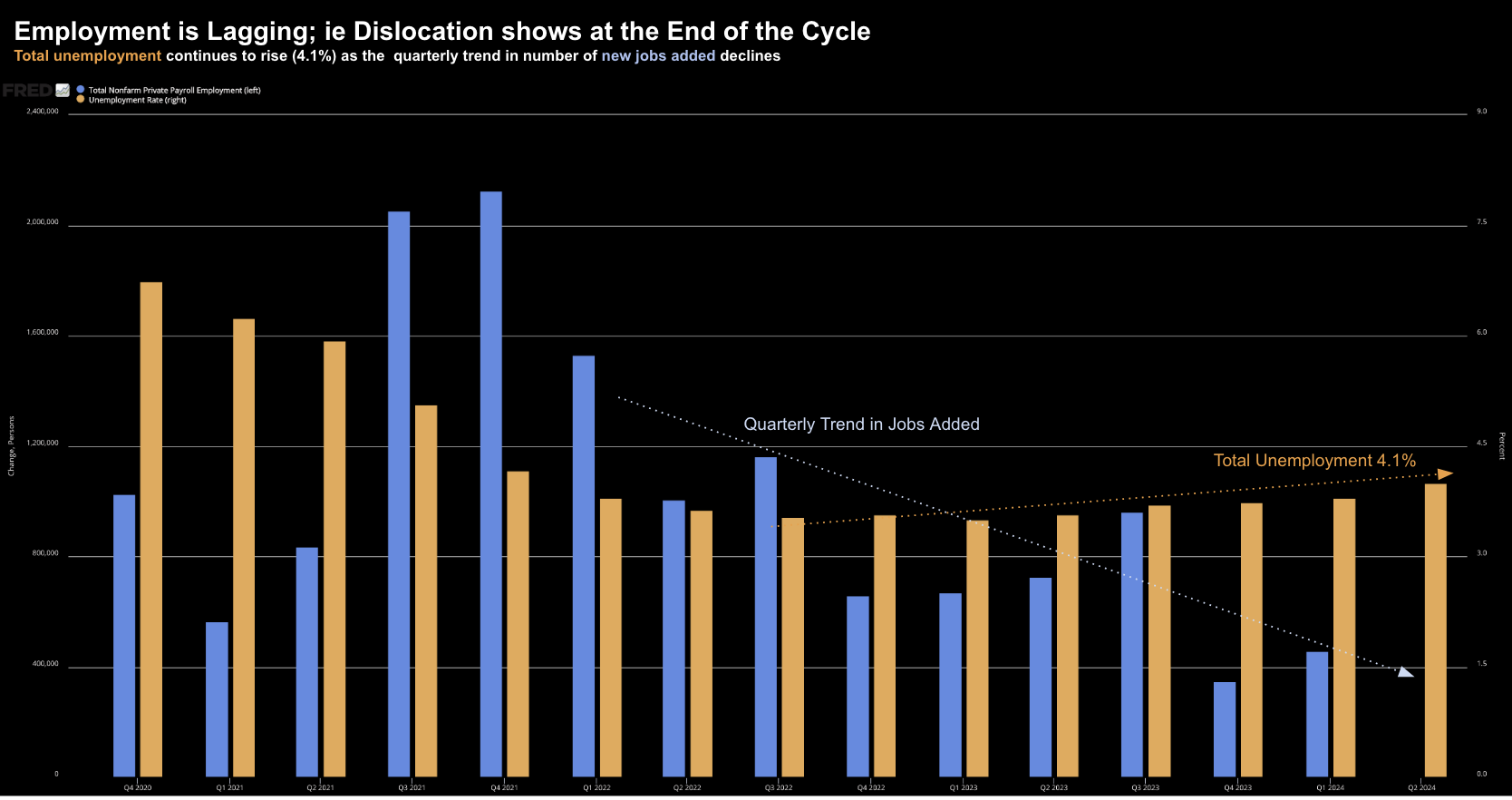
Adding to the framework I shared yesterday – below are the quarterly trends for:
- Total Unemployment (now 4.1%) – orange; and
- Quarterly Payroll Additions – blue
July 5 2024
With respect to total unemployment – we’ve seen this rise from 3.5% in Q1 2023 to 4.1% in Q2 2024
0.6% is a meaningful move higher (also not acknowledged by Brown)
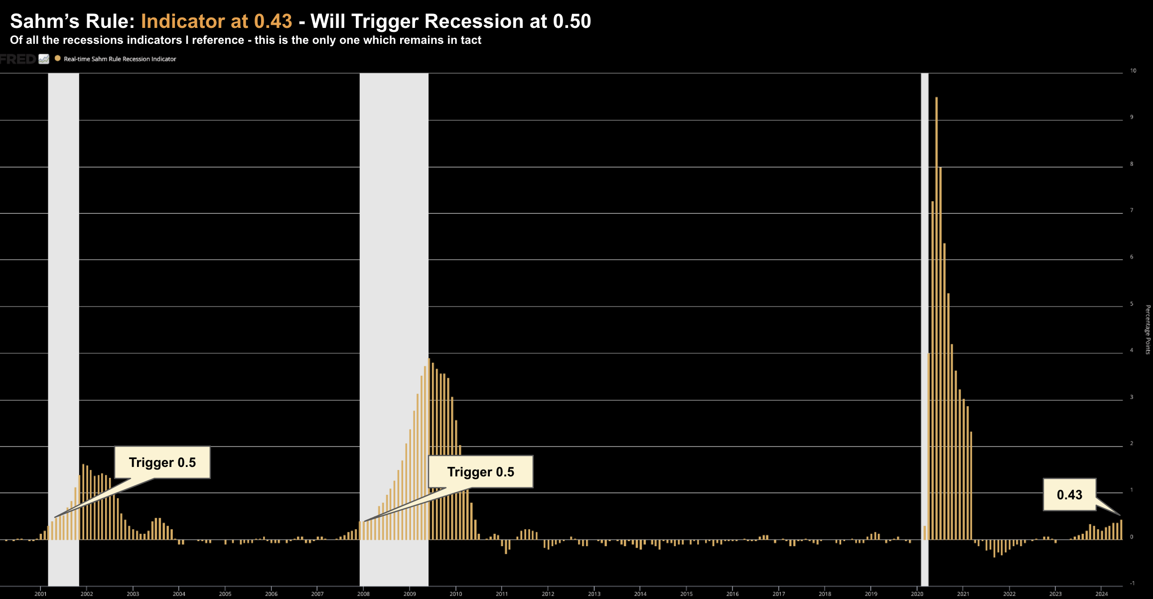
And it’s showing up in Sahm’s Rule – the only recessionary indicator with a 100% track record.
It’s moved from 0.37 to 0.43 with June’s employment report – and will trigger a recession should it hit 0.50
July 5 2024: Sahm’s Rule
Sahm’s Rule examines the difference between the current three-month average of the unemployment rate and the lowest three-month average over the past year.
And should we get another report similar to June – we could see this indicator trigger.
Coming back to the Fed….
The median Fed official anticipated the unemployment rate to average 4% in the fourth quarter – which is now below the latest reading.
In other words, as at their last meeting, they see things improving.
However, Powell is wise enough to know that labor market tends to weaken quickly.
Further to his most recent address the Chair said “waiting for that to happen is … not what we’re doing. You know, we’re watching very carefully; we’re looking at the balance of risks.”
Jobs Observations
What Josh Brown outlined today was misleading – but consistent with most Wall Street commentary.
For example, CNBC’s headline this morning was another “strong jobs report”
Perhaps their definition of “strong” differs from mine.
As an aside, if you want a terrific read on the true health of the jobs report – Mike Sherlock’s blog is one of the best (aka ‘Mishtalk’)
Mish provides a very detailed explanation as to where the gains (or losses) are coming from – but also position this in the frame of longer-term trends (which is more helpful)
As I often say, a singular weekly, monthly (or quarterly) data point is largely useless.
Here’s Mish’s latest read on the June print:
Jobs vs Employment
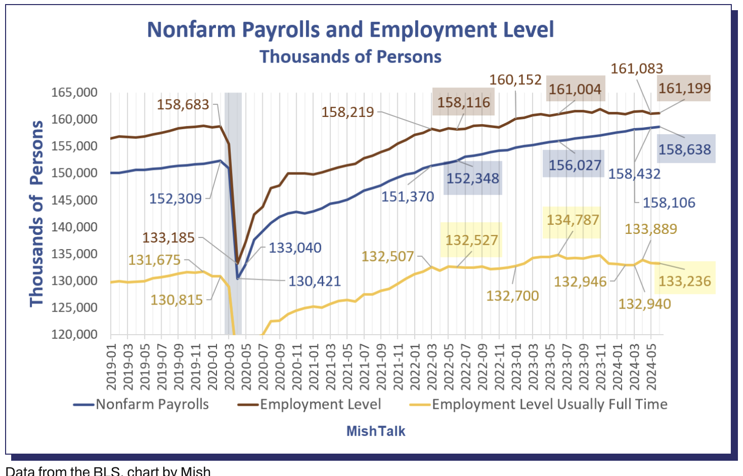
From September 2020 through early 2022, non-farm payroll job gains and full-time employment changes tracked together.
Starting around March of 2022, a divergence between employment and jobs became very noticeable
This month, employment rose by 116,000 vs payrolls up by 206,000.
Job Stats vs One Year Ago
- Nonfarm Payrolls (Blue): +2,611,000
- Employment (Red): +195,000
- Full Time Employment (Yellow line below): -1,551,000
Job Stats vs Two Years Ago
- Nonfarm Payrolls (Blue): +2,611,000
- Employment (Red): +6,280,000
- Full Time Employment (Yellow line below): +709,000
In the last year, nonfarm payrolls are up 2.6 million while full-time employment is down 1.5 million.
Where is the full-time employment stat in Brown’s language?
This is the kind of important detail which is rarely mentioned by mainstream
Where the Jobs Were Added
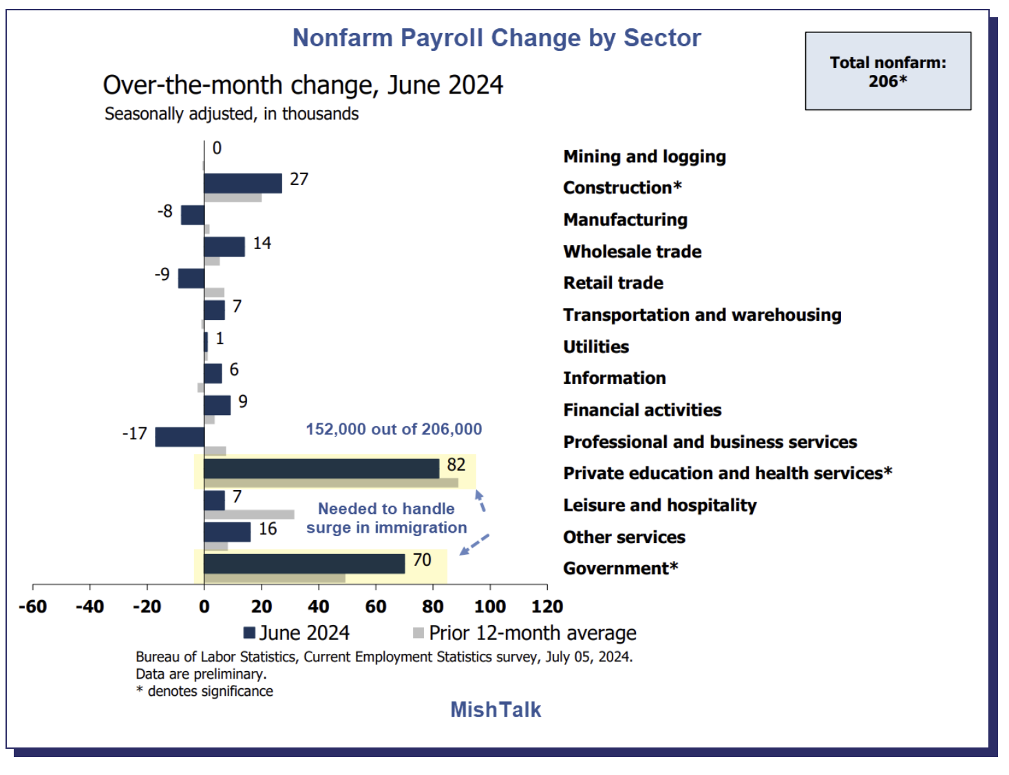
Consistent with previous months – the largest segment to add jobs were the government, health and private education.
Again, mainstream typically fails to address the composition of the job additions (as this paints a materially weaker picture)
Remember: public sector jobs don’t add to the nation’s income or output – they take from it (via taxes). What we want to see is the private sector investing and hiring. They are tax producing jobs.
Mish provides the breakdown:
As Mish correctly notes – the 152,000 new jobs across government, health and private education are required to meet the surge in immigration.
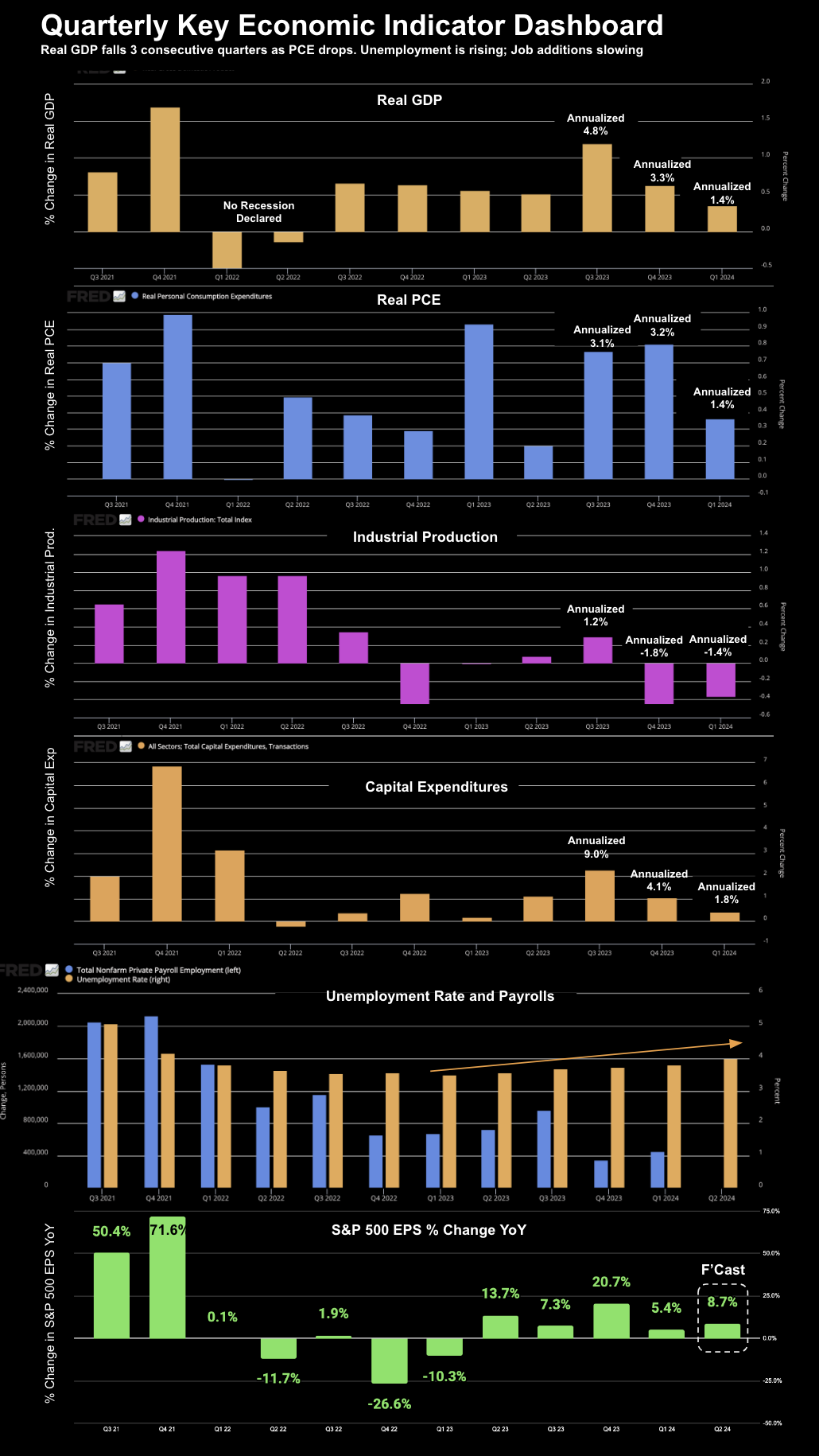
Quarterly Key Economic Indicator Dashboard
Further to yesterday’s post which asked questions of the ‘soft landing’ narrative – below is my “Quarterly Key Economic Indicator Dashboard”
Quarterly is a useful timeframe as it removes a lot of the noise we get with monthly prints.
For example, April’s monthly jobs were revised some 111K lower (which is the big story of the June print). May was almost 60K jobs lower.
We will also see similar (numerous) revisions to Real GDP.
When viewed over several years – quarterly prints help us remove (some) of the noise – getting a clear view of the longer-term trends.
And this is important when you consider the business cycle typically takes 4-5 years.
Below I’ve added two charts to complete the picture of key economic (change) indicators:
- Unemployment (together with Quarterly Payrolls) – fifth chart; and
- S&P 500 Earnings Per Share % Change over the year prior (bottom chart)
Note: the 8.7% YoY EPS growth for Q2 is forecast by Factset.
Now when I weigh the latest (weak) jobs report – I think the odds for a rate cut this year are much higher.
Call it either September or November.
Again, Sahm’s Rule will not go unnoticed by the Fed.
The probability of a recession moves to over 90% if this metric touches 0.5.
But looking at the forward looking indicators of consumption – the slowdown is already in play.
And Wall Street (so far) is yet to see it; i.e., more than happy to pay ~22x forward earnings (whilst accepting zero equity risk premium)
Putting it All Together
As I said yesterday, stocks can still trade higher from here.
Momentum is strong with AI stocks.
The tech sector (and specifically 5 names) are also what is driving the bulk of the earnings growth. They are cash machines.
It’s not the other 495 stocks.
With respect to employment – mainstream’s view is this was a ‘strong jobs’ report.
“Immaculate” was the word Josh Brown chose to describe it. Others cited the term “goldilocks”
I see things very differently…
I think we’re past peak Real GDP growth (Stage 1 of Joseph H. Ellis economic cycle) and well into Stage 2.
That’s the zone to be cautious.
Often we will see stocks correct to the tune of 10-15% through this phase.
Remember: past recessions have shown us that Stages 2 and 3 represent the first half to two-thirds of the economic damage.
My thinking now is the Fed Chair will likely cut in September (assuming a soft CPI print again next week).
And rarely is there just one rate cut.
My final thought:
- If the Fed is cutting rates where unemployment is not rising – this is generally very good for stocks.
- However, if the Fed are easing with unemployment rising – this typically does not bode well for stocks.
Keep your eyes on changes to employment, Real GDP and Real PCE.
Inflation is last year’s story.

