- Federal taxes as a ratio of GDP hit highs not seen since the ’70s
- Do the bulls or bears have the stronger case?
- How much credence to give this bear market rally
Are you a bull or a bear?
Whenever anyone asks me that question – my immediate response is what’s your timeframe?
6 months? 1 year? 5 years?
Longer?
For those that know me, over the long-term I will always say bullish.
No exceptions.
However, once we start reducing the time frame to less than 3 years… it gets harder.
And if you are talking less than 12 months – that’s a coin flip.
Today I will try and make the case for both the bulls and the bears.
Each have a valid case.
And when you think about it – that’s what makes a market.
But before I get to that… it’s important to know that stocks rise more often than they fall.
That’s a fact…. not an opinion.
Yes, last year was hard.
And no-one ever likes to see the market give back around ~18%.
Hopefully you managed your risk.
But the pullback was not a surprise (pending your lens).
For example, consider the S&P 500 returns the previous 3 years:
- 2019 up 31%
- 2020 up 18%; and
- 2021 up 28%
If we deduct the ~18% drawdown of 2022 – the S&P 500 is still up 60% since 2019 (i.e., 13% CAGR)
That’s staggering.
What’s more, it’s still ~2.5% better than the long-run average of around 10.5% total return.
So if you have been fully vested the past 5 years… you are still smiling.
And if you hedged your risk last year (i.e. had a minimal drawdown) – you are smiling a bit more.
The Long-Term Always Wins
Last week I was read a post from Ben Carlson’s blog ‘Wealth of Common Sense’.
Ben is a long-term investor and doesn’t get too caught up in the market’s year-to-year volatility (he embraces it).
He is always offering valuable perspective when it comes to markets.
As part of his post – he offered two terrific charts.
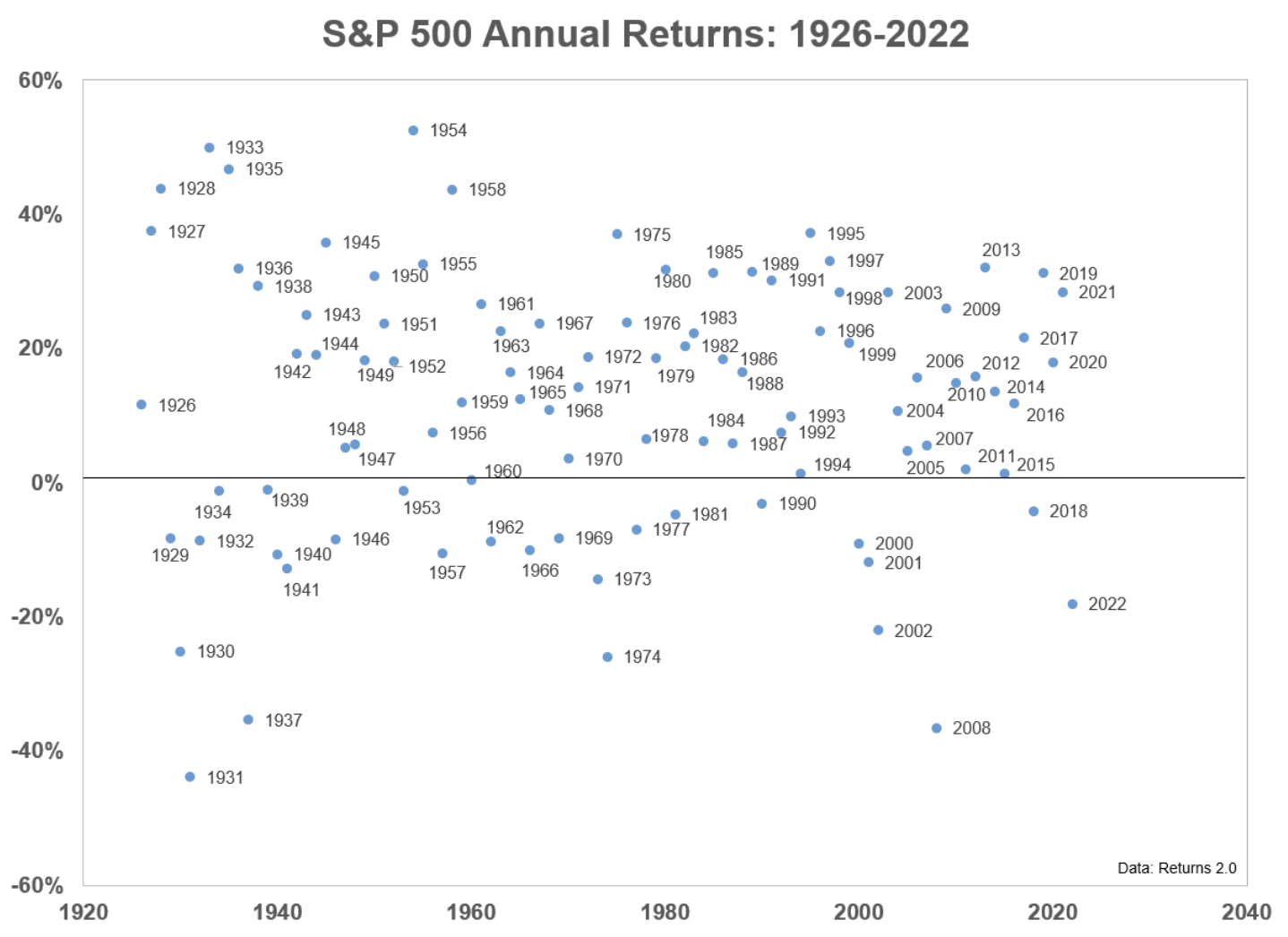
The first demonstrates how often stocks post positive returns vs negative. And here we see that there have only been 6 years worse than 2022 (i.e., 1930, 1931, 1937, 1974, 2002 and 2008)
Between 1926 and 2022 (97 years) – there were only 28 years (or ~29%) where negative returns resulted (1931, 2008 and 1937 the worst).
Put another way, the market posted gains 71% of the time (1933, 1935 and 1954 the best).
Think of it this way:
If I gave you a coin and told you that it was weighted 71% heads and 29% tails – which way would you bet?
Hopefully you would bet heads.
Right?
But from time to time… we get tails (like 2022).
And that’s fine.
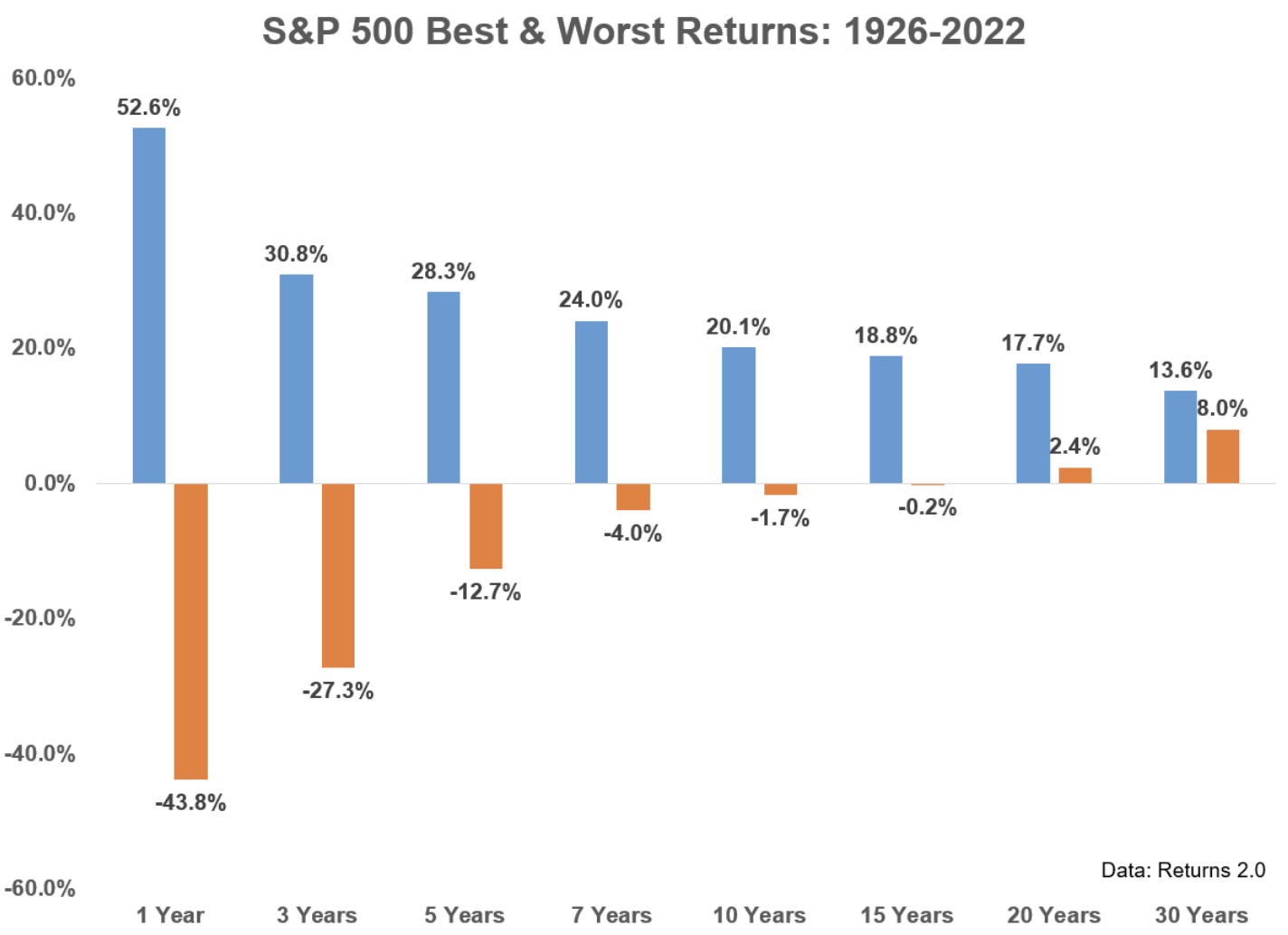
The second chart Ben put together shows the effect of time in the market.
He uses a range of outcomes over 1, 3, 5, 7, 10, 15, 20 and 30-year periods from 1926-2022:
The chart shows that the longer your time horizon – the greater probability of success.
For example, if you’re only “investing” for 1 year – you could see returns as high as +53% and as low as -44%.
You might say it’s almost an evenly weighted coin flip.
However, if we extend the time horizon to 5 years – this range drops to +28% vs -13%
And if we go all the way out to 15 years – your probability of loss is almost zero (assuming you’re investing in the Index)
Something to bear in mind when navigating difficult markets (and especially if you are taking a short-term view)
With that perspective, where are we today?
Thinking Through the Bull & Bear Case
Below I will try and make the case why I think probabilities still favour the downside in the short-term (e.g., 12 months).
However, I remain bullish long-term term and any meaningful dip will be a buying opportunity.
Hopefully Ben’s two charts help explain why this the case.
What follows is only my thesis and I’m not deeply attached to it. In other words, there’s every chance I am wrong.
The data will obviously change and it’s important we remain fluid.
Let me start with the bullish case and what I believe are the key arguments (this list isn’t meant to be exhaustive):
Key Bullish Thesis
- The third year of a Presidential term is almost always bullish (1939 the only exception);
- Rarely will stocks post consecutive losing years (4 times since 1926);
- We’re seeing very strong market breadth on the S&P 500 – typically a bullish indicator;
- The 10-day ratio of advancing to declining stocks triggered a rare buy signal (it’s 25th since 1949);
- Earnings are coming in better than expected (i.e., is the worst already priced in?);
- Commodity and goods inflation continues to fall – however will core inflation follow?; and finally
- The rate hiking cycle is closer to maturing.
- Market breadth – showing strong improvement; and
- 10-day ratio of advancing to declining stocks
With respect to the former – over the past decade – it’s been tech and growth carrying the market forward.
This has led to many arguing that if tech can’t rally (especially big cap tech) – it’s going to be difficult to see the market rally.
And there is some logic to that argument (given tech’s ~25% market weight)
However, over the past 12 months, non-technology sectors have led the way forward (e.g., energy and health-care)
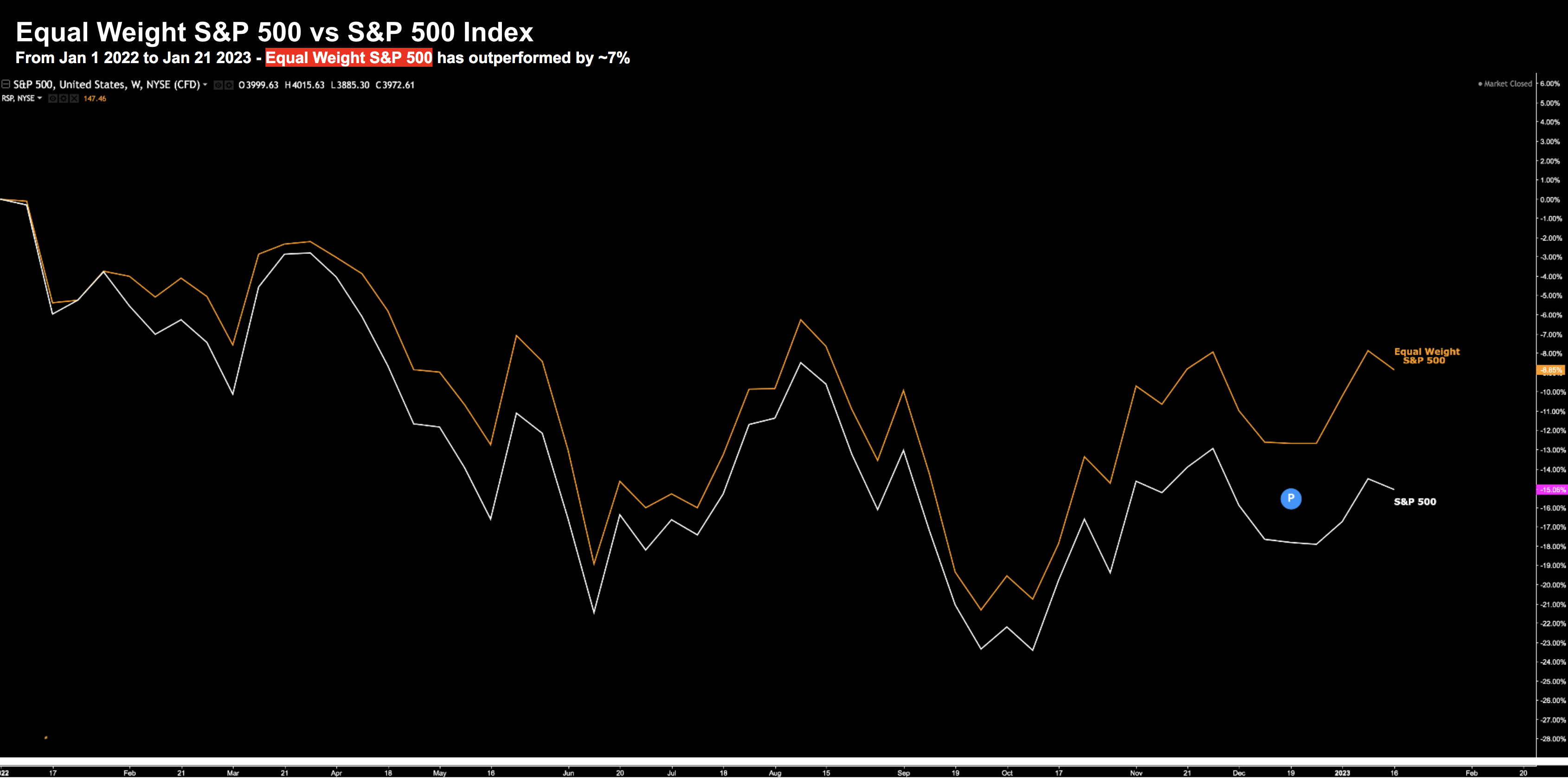
For example, if we look at the equal weighted S&P 500 vs the standard index (e.g., where “Apple” is given the same weight as say “Bank of America” or “Boeing” etc) — you can see the relative out-performance:
Jan 21 2023
Today, the market continues to show great breadth — which is a good sign for the bulls.
You want to see more sectors of the market participating – including both large and small cap.
With respect to the ratio of advancing to decline stocks (known as a “breakaway” indicator) – this is more of a technical argument.
However, it’s worth highlighting as this indicator has a strong track record of predicting higher prices.
According to this article published on the Street.com:
- Breakaway momentum occurs when the ratio of advancing to declining stocks exceeds 1.97 over ten days.
- This breadth thrust measure is uncommon, only occurring 25 times since 1949; and
- The S&P 500 has posted positive full-year returns in 23 of 24 past occurrences.
23 out of 24 is not a bad strike rate.
Breakaway momentum is a term coined by long-term technical investor Walter Deemer. Here’s how he explains it:
Downside momentum usually peaks at the end of a decline, as prices cascade into a primary low. On the upside, though, momentum peaks at the beginning of an advance, then gradually dissipates as the advance goes on, and the more powerful the momentum at the move’s beginning, the stronger the overall move; really strong momentum is found only at the beginning of a really strong move: a new bull market or a new intermediate upleg within a bull market.
In Martin Zweig’s classic book “Winning on Wall Street”, he includes data showing returns in the months following a 10-day advance-decline ratio above 2.0.
Between 1953 and 1996, the ratio exceeded 2.0 only 11 times.
The S&P 500 was higher every time three and six months after the signal, returning an average of 7.5% and 15.2%
That said, it’s also very common to see 7.5% to 15% type rallies in bear markets!
Interestingly, the success ratio for those 43 years was 100%, with annualized returns far exceeding the normal average annual returns for the market.
So that’s some of the leading bullish arguments…
What about the other side?
The Bearish Thesis
- Fed will more likely over-tighten to kill unwanted (services) inflation at the risk of a recession;
- Central bank also reducing its balance sheet (QT) by $95B per month (or almost $1 Trillion in 2023);
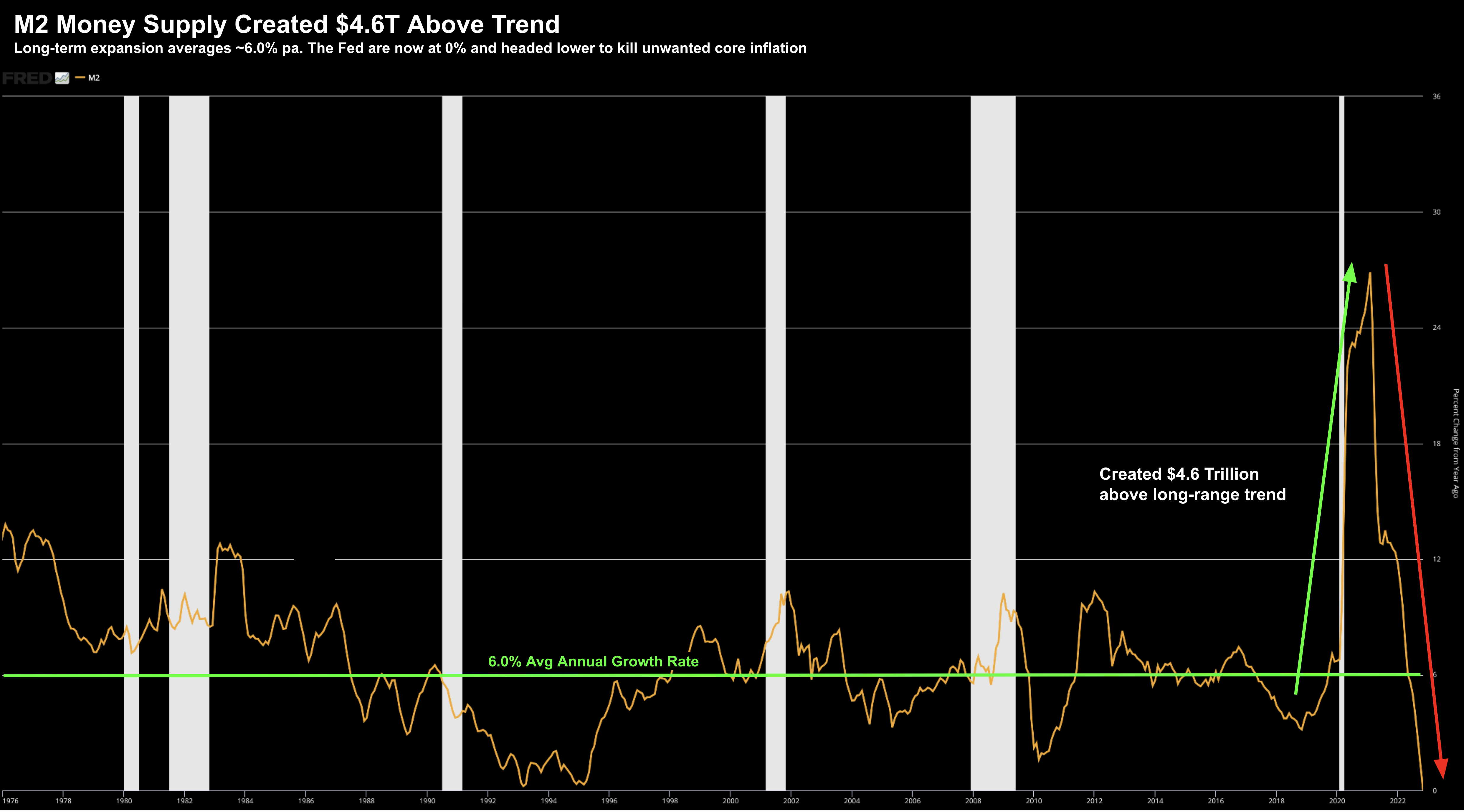
- We have money supply contracting the fastest rate we’ve seen;
- Earnings expectations for 2023 are far too high – where consensus sees 4% growth;
- If we are to see a recession in 2023 – the average EPS contraction is ~18%;
- Fed targeting levels of 5%+ unemployment (i.e., only way to eliminate unwanted core / service sector inflation);
- The market is not a discount at 17.5x forward earnings – arguably a much higher should earnings decline; and finally
- Federal tax receipts as a function of GDP are the highest since the ’70s – which always results in recession
I’ve written at length on most of these points over the past few months.
However, I want to spend a minute on (a) M2 money supply contraction; and (b) tax receipts as a function of GDP.
The latter is rarely spoken to but important.
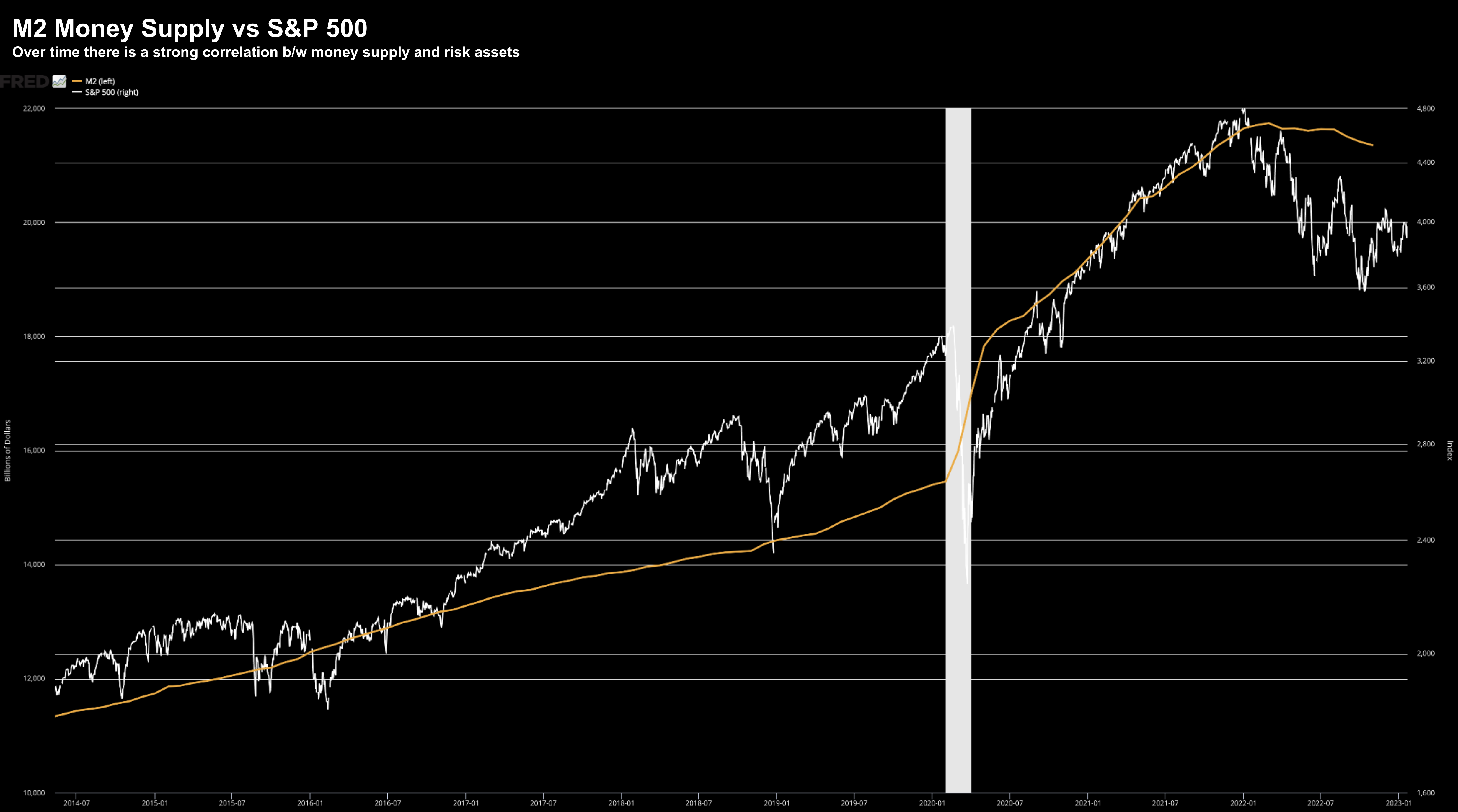
First, what we see with money supply (M2) contraction and the correlation to risk assets:
Over the long-run – when money supply is expanding – so too are the prices of risk assets (i.e. stocks and houses)
However, when money supply is shown to contract, risk assets tend to under-perform.
Below is the unprecedented contraction we are seeing in money supply:
From mine, this chart explains why the S&P 500 added ~20%+ returns the past two years.
In short, the $4.6 Trillion incremental dollars washed up in risk assets.
And in this case, the Fed’s rising tide lifted all boats (even the ‘leaky boats’ owned by Cathie Wood!)
Go figure…
However, the Fed’s economic experiment came at a huge cost… one we are paying now.
Unwanted sticky inflation.
Econ 101: inflation is simply excess money chasing too few goods.
The Fed is now working furiously to take money out of the system to lower unwanted core inflation (still running at ~3x the Feds 2.0% target)
This effectively puts a ‘ceiling’ on risk assets rallying too far.
And if anything – represents more downside risk.
The second chart I want to share is rarely referenced (perhaps for political reasons).
Here I’m talking about total Federal tax receipts as a ratio of GDP:
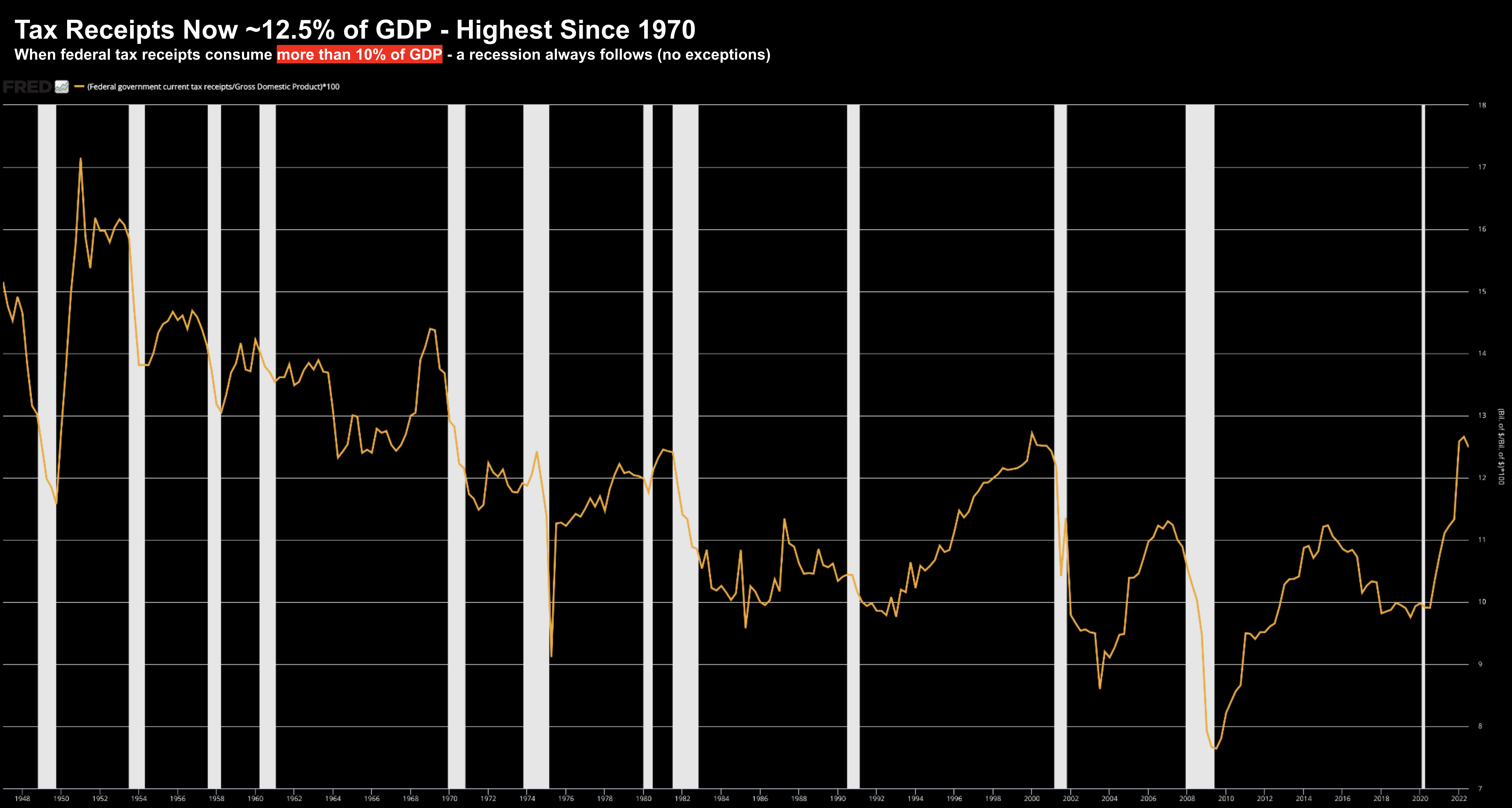
Taxes as a function of GDP are rising at an alarming rate – despite the current Administration stating they are not raising taxes.
As you can see, they are now as high as they have been since the 1970s.
Yes, inflation in non-discretionary items such as energy, food and rent are biting. Consumer savings rates are now pressing all-time lows – forcing them to use credit (where credit card rates sometimes push 16%+)
However, now they are forking out more in taxes.
Here’s the thing:
When the government takes too much money out of the economy (in the form of taxes) – it means there is not enough left for productive and/or investment purposes.
Again, this will most likely cap gains in equities.
Now your read may be different to mine, but I don’t see Congress showing any inclination to reduce taxes.
If anything, all I hear from the President is taxes still need to increase?
Why?
If we get a recession (my base case) – then GDP will contract.
And if we also assume there will not be any tax relief – the ratio of Federal tax receipts to GDP will only increase.
That’s recessionary.
As a complete aside, government don’t have a revenue problem.
As the chart shows above, they confiscate ample resources from the private sector (as much as we have seen the past 50 years)
The two problems facing government are (a) excessive spending; and (b) efficiency.
There’s far too much waste.
Long-term prosperity will never come from greater wealth confiscation (i.e. increased taxes), higher debts and government boondoggles.
It comes from getting smarter with the (ample) resources we have – whilst incentivizing the private sector to invest.
S&P 500 – Leaning Bearish
Weighing the bullish and bearish arguments outlined – for now I lean bearish in the near-term (next 12 months)
That said, I don’t pretend to know what the market will do in the next few weeks or months.
However, if I feel there is more risk to the downside vs upside reward.
To be clear, I still have a ~65% exposure long.
As I’ve written in previous posts, I’m always long (recession or otherwise). And so far, 2023 has started well (but it’s very early!)
As I said last year, whilst it’s very important we hedge against downside risks – we need to balance that against the potential for upside returns.
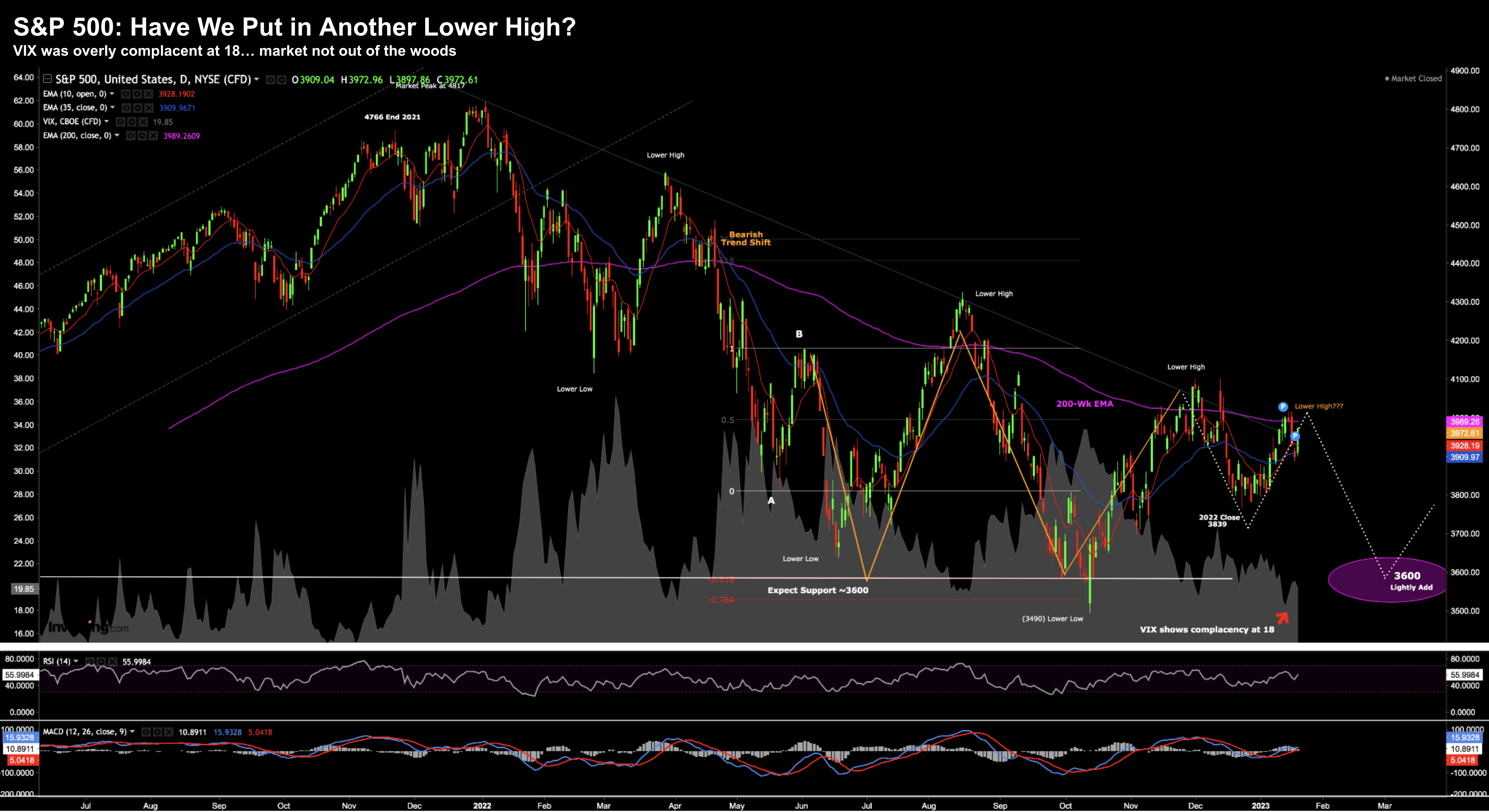
Let’s take a look at the weekly chart:
Jan 21 2023
- Market is still technically bearish in this timeframe
- We appear to have put in a 5th consecutive lower high
- VIX has overly complacent at ~18 (where the market reversed)
- There is strong overhead resistance around 4100.
Technically I think it’s hard to make a strong bullish argument.
However, I recognize the momentum arguments outlined earlier. They are certainly there – meaning there is upside potential.
I can understand why some are willing to shift to a bullish stance – however I still think it’s premature.
I still think we need to see more technically and fundamentally for me to put more money to work.
For now, I’m happy with the exposure I have.
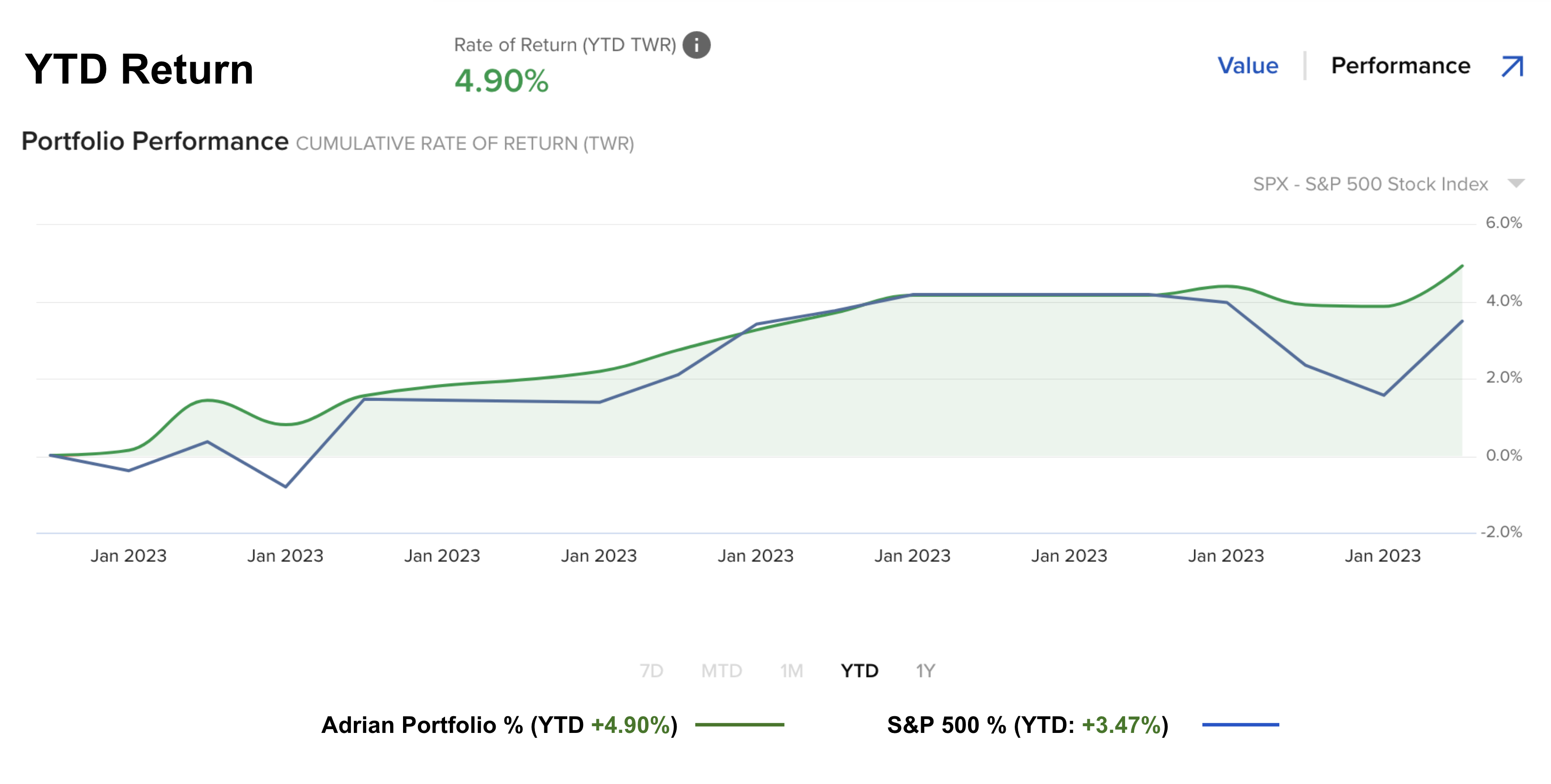
That said, it would not surprise me to see my current YTD +4.90% turn negative over the coming months (and that’s more than fine).
In fact, I am hoping we see the market test 3600, 3400 and 3200 over 2023 so I can put more money to work for the longer-term.
Putting it All Together
- A Fed which continues to tighten rates (albeit at a much slower rate);
- Balance sheet reduction (QT) to the tune of $1 Trillion in 2023;
- A strong contraction in M2 money supply;
- Generational high federal government tax receipts as a ratio of GDP; and
- The growing likelihood of a recession late 2023 / early 2024
… will all work to effectively put a “ceiling” on how far stocks can rally.
What you want to see is the Fed easing monetary policy whilst adding liquidity – where the government are lowering taxes and regulations (i.e. incentivizing investment – not taking it away)
Those kinds of conditions are more conducive for risk assets.
But that’s not what we have today.
We have the opposite in every instance.
My best guess is these headwinds could see the market give back 10-20% over 2023.
Yes, the market could rally to 4100 or higher.
But to me that represents taking a lot of risk for a ‘handful of points’ in reward.
I don’t like those odds.
Stay patient and diligent.

