- Why (real) consumer spending holds the key
- Powell positions the market for rate cuts this year
- Examining Real PCE trends from 2007 against stock market declines
Jay Powell reassured Congress today that the economy remains in ‘robust’ shape.
However it came with a caveat….
Growth is softening and unemployment is edging higher.
He cautioned Congress that if rates are to remain too high for too long – it could ‘unduly weaken’ the economy.
Here’s Powell on balancing the risks:
“… in light of the progress made both in lowering inflation and in cooling the labor market over the past two years, elevated inflation is not the only risk we face.
Reducing policy restraint too late or too little could unduly weaken economic activity and employment.”
My read:
Powell laid the foundation for a rate cut as early as September.
And from mine, should the trend of Real PCE and Real GDP continue to weaken (which I expect) – don’t rule out two rate cuts this year.
As I’ve recently highlighted – there are numerous examples of consumers feeling the acute pressure of higher prices.
Sure, inflation is said to be lower at around ~3% or so.
However, non-discretionary items are still ~30% higher than what they were 3 years ago.
And they are not coming down. They are just rising at a slower pace.
Retailers such as (and not limited to) Walmart, McDonalds, Brown Forman (owner of Jack Daniels), Krispy Kreme and Nike used words like ‘cautious’, tight‘ and ‘discerning’ when describing slowing spending behaviour.
Separately, I read today that the default rates on car loans hit highs not seen in 13 years.
The ‘trillions’ in government handouts has been spent and now they are tapping reserves.
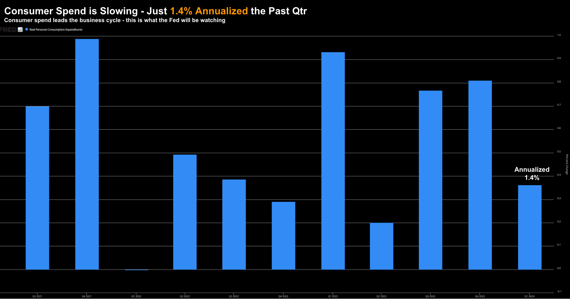
Consider the year-over-year quarterly change for consumer spend (‘PCE’ in economic parlance)
July 9 2024
And whilst one weak quarter does not constitute a trend – with most leading discretionary retailers guiding lower – expect another sub-par quarter.
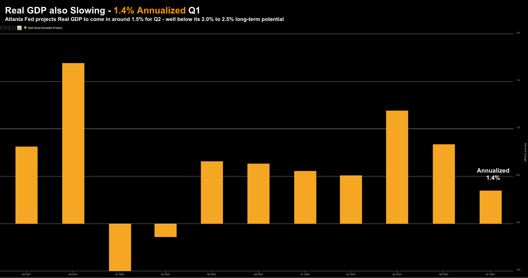
With respect to Real GDP (where spending makes up ~70%) – it’s expected to slow to ~1.5% for Q2 (according to the Atlanta Fed GDPNow forecast)
That will mark two sluggish quarters – well below the long-term rate of growth expected (above 2.0%).
July 9 2024
In an ideal world, the Fed Chair would like the financial flexibility to get in front of any material damage to the economy.
But things are not ideal…
He has inflation still trading with a 3-handle.
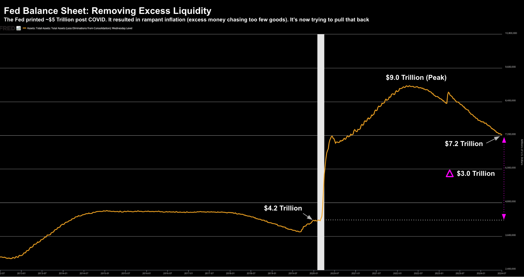
But he traded financial flexibility by printing $5 Trillion dollars.
That money effectively washed up in the form of higher goods and services (not to mention speculative assets)
July 9 2024
Therein lies the rub:
Ease rates too soon and you could reignite inflation.
However, ease too late and the (growth) pressure mounts on the economy.
$5 Trillion dollars is coming at a price.
And consumers – unfortunately – are realizing there is no such thing as a free lunch.
Assessing the Risks
Part of that equation is knowing exactly where we are in the business cycle.
For example, consider each of the following questions:
- Do you think we’re at the beginning or middle of an economic advance (with more to go)?
- Do you think we’re about to encounter a significant change in direction?
- And, if so, is that change for the better or for the worse?
I would be very interested to hear Powell’s take.
From mine, he might answer “somewhere in the middle” – but if action isn’t taken – there’s risk to the downside.
But how does this help you?
Investing at the ‘wrong end’ of the business cycle can be costly.
And are rate cuts a panacea to an economy already in reverse? What damage is already done (or is being done)?
For example, if you increased your exposure to speculative assets during 2006/07; or similarly in 1999/00 – it was a regrettable decision.
On both occasions Real GDP was well above 2.0% and unemployment was low.
But as investor – you had already enjoy stellar gains over the past few years – and were effectively chasing the “last eighth”.
However the aptly named last eighth came at the cost of taking on a lot of (subsequent) downside risk.
It just wasn’t visible (to some) at the time.
As I often like to say – it was “high negative convexity” (i.e., meaning low upside with high downside)
Are we at a similar juncture today – where investors are chasing the last eighth?
You tell me.
Now compare that with adding risk at the start of the cycle (typically when when fear is at its peak) – that is generally very rewarding over the long-run.
Timing is key.
How to Decide?
As asset speculators, we must answer the hypothetical questions I posed earlier.
You will need to have a view.
Do you trust the talking heads (like Powell et al.) that the “economy is robust” (as Greenspan and Bernanke also told us in 1999 and 2007)?
As a refresher – here’s Fed Chair Ben Bernanke ~12 months before the crisis of 2008:
As we anticipated in our July report, the U.S. economy appears to be making a transition from the rapid rate of expansion experienced over the preceding several years to a more sustainable average pace of growth.
The principal source of the ongoing moderation has been a substantial cooling in the housing market, which has led to a marked slowdown in the pace of residential construction. However, the weakness in housing market activity and the slower appreciation of house prices do not seem to have spilled over to any significant extent to other sectors of the economy.
Consumer spending has continued to expand at a solid rate, and the demand for labor has remained strong.
On average, about 165,000 jobs per month have been added to non-farm payrolls over the past six months, and the unemployment rate, at 4.6 percent in January, remains low.
This statement sounds an awful lot like Powell this week.
For what it’s worth, at the time Real PCE Q2 2007 was only 1.0% YoY (the metric was not cited by Bernanke) – barely what I would deem a “solid rate”.
If only Bernanke had the ability to see ‘around economic corners’
Regardless of how you choose to interpret the data – we’re all trying to:
- better understand the state of the economy and its health;
- dimension where we are in the business cycle (weighing future economic trends); and
- decide on whether to borrow, spend, and/or invest.
Where is a good place to start? What is considered a signal? And what’s noise?
Consumer Spending: A Good Place to Start
One of the most important things you can do with any analysis is choosing where to focus. For example, do we focus on:
- Whether inflation is coming down?
- Whether the Fed cuts rates this year?
- What unemployment is doing?
- Geopolitical events? or
- Stock valuations?
All valid questions.
And every one of these has the potential to shape the market (especially in the near-term)
From mine, our primary focus should be on what drives 70% of GDP.
And that’s the consumer.
And specifically – how much they are spending. Is that rising or falling (and at what velocity)?
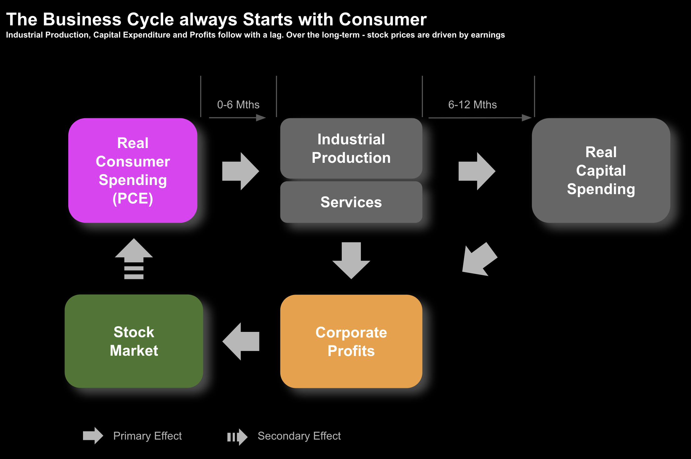
Consumer spend drives company profits.
And with company profits – we get further business investment.
This drives greater output – which in turns leads to more employment and so on.
But the point is it all starts with the consumer.
Therefore, if we can ascertain what trends we see with consumer spending – it will help us see around corners.
To be clear, understanding the trend in Real PCE is not a panacea.
Many factors will influence the market during any particular period in time. For example, in the short-term they can include:
- Investor sentiment (e.g. fear and greed)
- Geopolitical events (e.g., wars, elections)
- Fiscal and monetary policy (e.g. rate cuts, fiscal spending); and
- Valuations (e.g., multiple expansion and contraction)
However, over the long-term, investors are primarily interested in a company’s ability to generate earnings.
That’s how the stock market is priced.
And over time – they will gravitate to fundamentals (not unlike a reversion to the mean).
Earnings are the cornerstone of stock market prices.
Let me demonstrate:
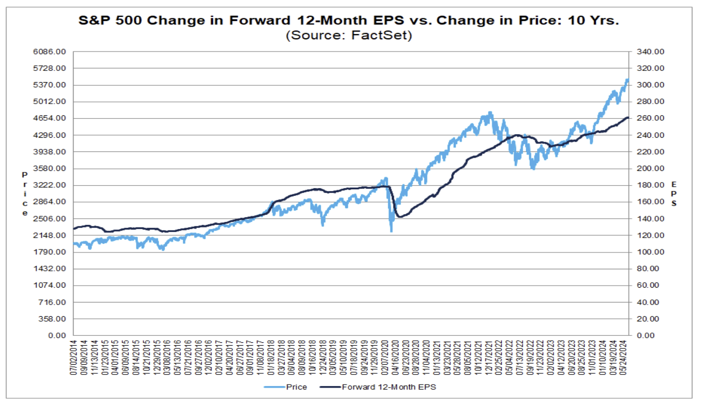
Below is the correlation between earnings per share (dark blue) vs the S&P 500 (light blue):
Despite periods of heightened volatility (owing the factors outlined above) – directionally they’re aligned.
Therefore, if earnings are said to influence the stock market’s (long-term) direction – our focus should start with the primary driver of earnings growth.
That’s consumer spending (Real PCE).
As I will demonstrate below with a study – over the long-run – spending is the one consistent, repeated relationship when it comes to forecasting the market’s direction.
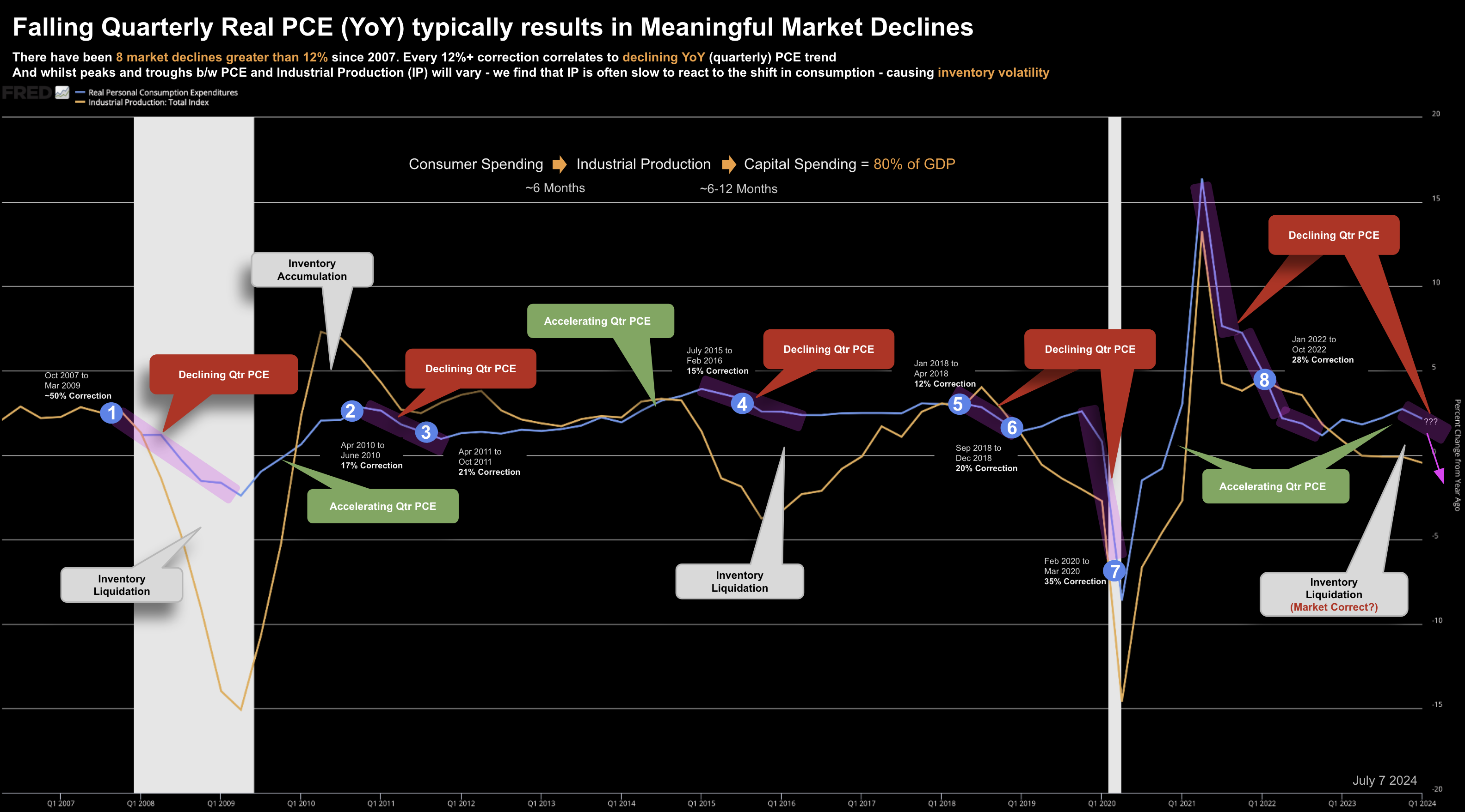
For example, since 2007, we’ve seen 8 market corrections of 12%+
Each correction has a common denominator… a declining trend in YoY Real PCE.
And you can take this same approach to analyse any period before 2007 – you will find similar (consistent) results.
I will bet that it’s not different this time.
Real PCE Case Study: 2007 to 2024
When someone tells us the ‘economy is robust‘ – whether it’s Jay Powell or CNBC’s Josh Brown – it gets my attention.
My immediate thought is to challenge it.
For example, I’ve heard this twice before from previous Fed Chairs, both could not have been more wrong.
Here I’m reminded of Francis Bacon who told us “doubt all before you believe…”
Wise counsel.
If nothing else – adopt this as your starting point (investing or otherwise) – as it forces you to think.
When doing this research, I was interested in three questions:
- Did a decline in quarterly Real PCE coincide with market declines?
- If so, what was the dimension of each decline; and finally
- What was average lag between Real PCE and Industrial Production.
I offer these questions as I said last week that soft landings should not be ignored.
Put another way, you don’t need a clear line of sight to a recession to suffer meaningful damage to your portfolio. And this could be one of those times.
But let’s get to the analysis – as I hope you find it useful.
Your content goes here. Edit or remove this text inline or in the module Content settings. You can also style every aspect of this content in the module Design settings and even apply custom CSS to this text in the module Advanced settings.
July 9 2024
To start, we find two lines:
- Quarterly YoY change in Real PCE – blue line
- Quarterly YoY change in Industrial Production – orange line
We also find 8 blue circles along the blue-line. These denote when the S&P 500 suffered a decline of at least 12% (and the duration)
I’ve labelled where Real PCE is declining (red bubbles); and accelerating (green bubbles).
Lastly, you will see comments where inventory is said to liquidated or suffers with accumulation (given the approx 6 months lag between these two forces)
8 Market Declines of 12%+ Since 2007
There have been 8 market declines of 12%+ from 2007 to 2024 (labelled 1 to 8)
- Oct 2007 to Mar 2009: ~50% Correction (Recession)
- Apr 2010 to Jun 2010: ~17% Correction
- Apr 2011 to Oct 2011: ~21% Correction
- Jul 2015 to Feb 2016: ~15% Correction
- Jan 2018 to Apr 2018: ~12% Correction
- Sep 2018 to Dec 2018: ~20% Correction
- Feb 2020 to Mar 2020: ~35% Correction (Recession – COVID)
- Jan 2022 to Oct 2022: ~28% Correction
The average correction is ~25% – where the two recessions (07/08 and 2020) saw declines of ~50% and ~35% respectively
This supports the thesis that soft landings (or growth slowdowns) can result in sizable corrections.
It goes without saying that a recession will see materially greater damage
Pullbacks Correlate to Real PCE Declines
Along the blue line (Real PCE) are purple shaded areas where the quarterly YoY trend declined.
In each we saw general market weakness. Specifically:
- 2010/2011: two declines of 17% and 21% – with 2011 volatility heightened due to debt worries in Europe; and.
- 2018 also saw two corrections – with the Fed embarking on quantitative tightening with rate increases later in the year.
I call these out as many observers will be quick to say these were the primary catalysts for the market moving lower. And it’s largely what the media will be consumed with.
Yes – they were a factor.
But from mine, we also see that Real PCE was also negative during this period.
Again, declining Real PCE is rarely the only cause — however it’s highly coincident with falling markets.
Rallies Correlate to Rising PCE
Whilst market declines typically also see falling Real PCE YoY – the inverse is true.
That is, we did not experience a material market pullback when Real PCE was accelerating.
When Real PCE was trending higher YoY (on a quarterly basis) – the market rallied.
The latest rally is a good example.
Real PCE turned positive in Q4 2022 – which marked the start of the rally.
Yes, the rally has expanded thanks to valuations and enthusiasm around AI. Granted.
Again, there are various forces at play with every market rally and decline.
But the relationship with Real PCE (and its direction) remains consistent.
6-Month Lag with Industrial Production
The final observation is what we observe with inventory trends and the lag between the two.
Typically there is a 6-month lag between Real PCE and Industrial Production (IP).
This lag results in exaggerated periods of both inventory liquidation and accumulation.
But because inventory accumulation and liquidation cycle accompanies the uptrends and downtrends in consumer spending, industrial production will generally experience larger swings.
What we see is with each upturn in Real PCE – we see a far greater uptrend in IP (note: COVID was the brief exception due to supply chain constraints)
Conversely, IP overshoots to the downside in response to downtrends in Real PCE.
In this instance, we experience inventory liquidation (in turn, discounting and negative margin impact)
Note: case in point – have a look at the outperformance of discount retailer TJ Max – who resells lquiditated inventory. It’s share price has surged this year – the opposite of its more traditional peers – who are trading at mutli-year lows in some instance.
Putting it All Together
Before I close, a quick note on the timeframes.
Tracking weekly or monthly economic data offers little insight (but it’s what we are fed from mainstream)
These timeframes are filled with noise (and generally subject to many revisions).
We see this continually with reports on employment, inflation and GDP (among others).
The same applies to Real PCE.
The investor is better served by assessing the trend over a quarterly (3-month) period observing the change year-over-year.
What’s more, the time series should be viewed over at least ten years.
The other point I will make is if you’re constructing a chart – look to include more than one data series.
In this instance, I’ve mapped Real PCE with Industrial Production.
What we’re always aspiring to answer is possible cause-and-effect.
Do you we find correlation or causation?
If you’re plotting a data series on its own – whilst it may offer information (e.g. Real PCE came in at 1.4%) – typically it leaves unanswered questions.
In summary, I’ll be paying very close attention to what we see with the consumer (and their spending)
Again, this is two-thirds of the economy.
We’ve already been issued stern (profit) warnings from many of the nation’s retailers. Some are trading at COVID lows (e.g., Nike); others pressing new 52-week lows (e.g. Starbucks and McDonalds).
As an aside, I’ve recently take half positions in each of these names. They are not full positions (e.g. were a full position could be as much as 4-5% of my total portfolio) – as I expect these stocks to fall much further. I don’t expect to be able to call tops or bottoms. I also expect to hold these names for at least 3 years… allowing time for the investment to work.
In summary, when an expert suggests the economy is “robust“… it warrants your full attention.
Again, as Francis Bacon reminded us “doubt all before you believe”
If nothing else, this is a very useful starting point.
