- Market now only sees one cut this year
- Unemployment rate hits 4.0%
- Three arguments for lower bond yields
Just as market participants were starting to get hopeful rate cuts could be coming – that door was slammed shut.
Yields surged opposite a stronger-than-expected monthly payrolls number.
Heading into the print – the market was looking for softness in the labor market – with maybe 190K jobs added.
Recent data had suggested jobs were slowing – paving the way for the Fed to cut rates as early as July (with a 70% chance assigned to September)
As it turns out, monthly job gains were said to be 272,000…
From CNBC:
Nonfarm payrolls increased by 272,000 for the month, considerably higher than the Wall Street consensus of 190,000 and well above April’s comparatively muted gain of 165,000. In addition, average hourly earnings rose 4.1% over the past 12 months, more than expected. Beyond signaling a still-vibrant labor market, the data at the very least adds to the narrative that the Fed doesn’t have to rush to lower interest rates.
All year I’ve consistently asked the question what would give cause for the Fed to cut?
I could not see it.
I could not see it when the market argue for six rate cuts; nor when it argued for three.
In April I asked this question “How About Zero Rate Cuts this Year?”
At the time the market expected three rate cuts… those expectations are now barely above one.
Bond Yields Spike…
It was tough day for bond bulls – with the US 10-year yield climbing back to above 4.40%.
Bond prices trade inversely to their yields.
But it wasn’t just the short-end of the curve – we also saw the 2-year at ~4.9% – implying the Fed is likely to stay put (for now at least)
However, there was ambiguity in the jobs report…
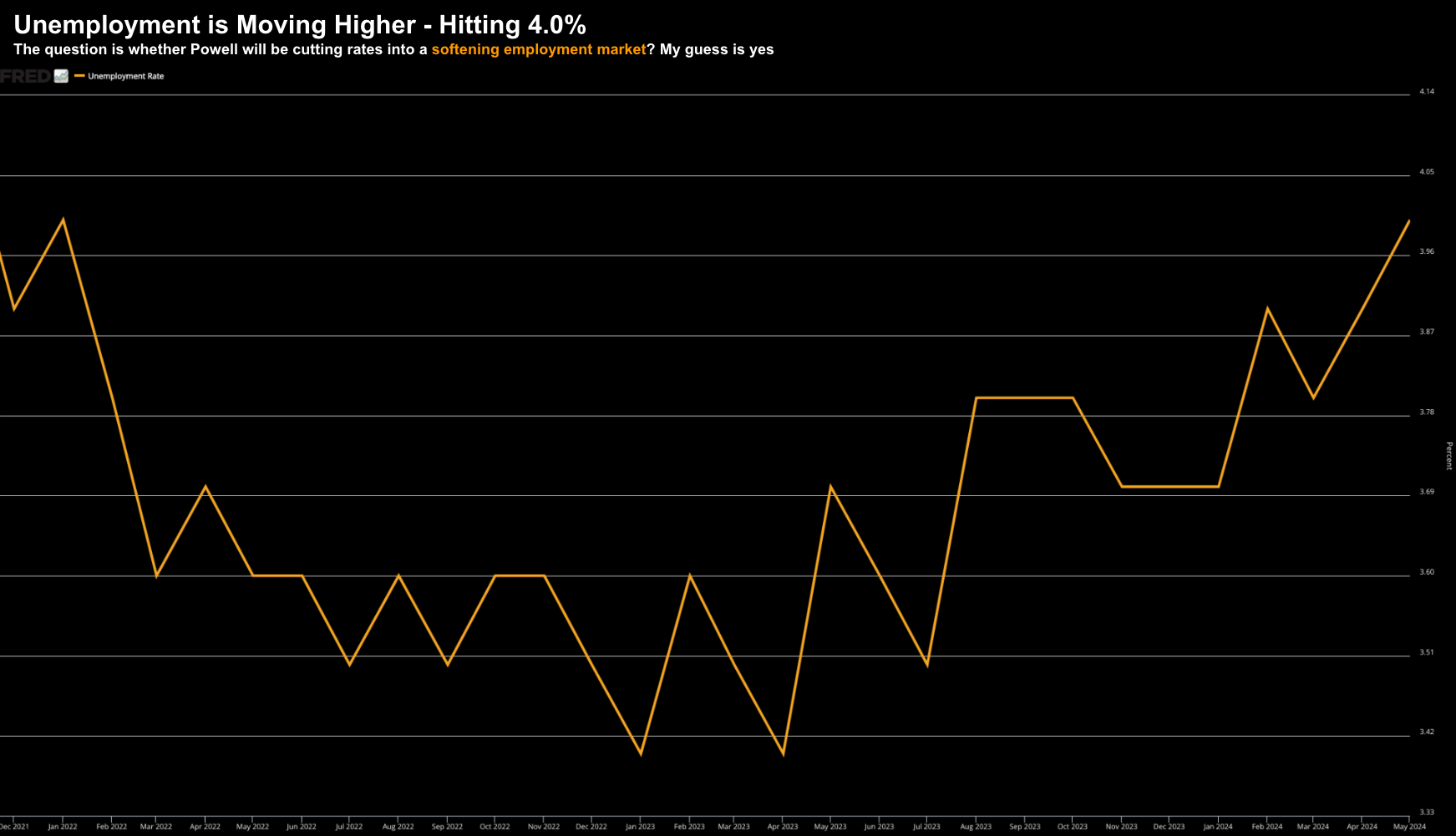
The unemployment rate rose to 4.0% – its highest level since January of 2022.
This matters for investors…
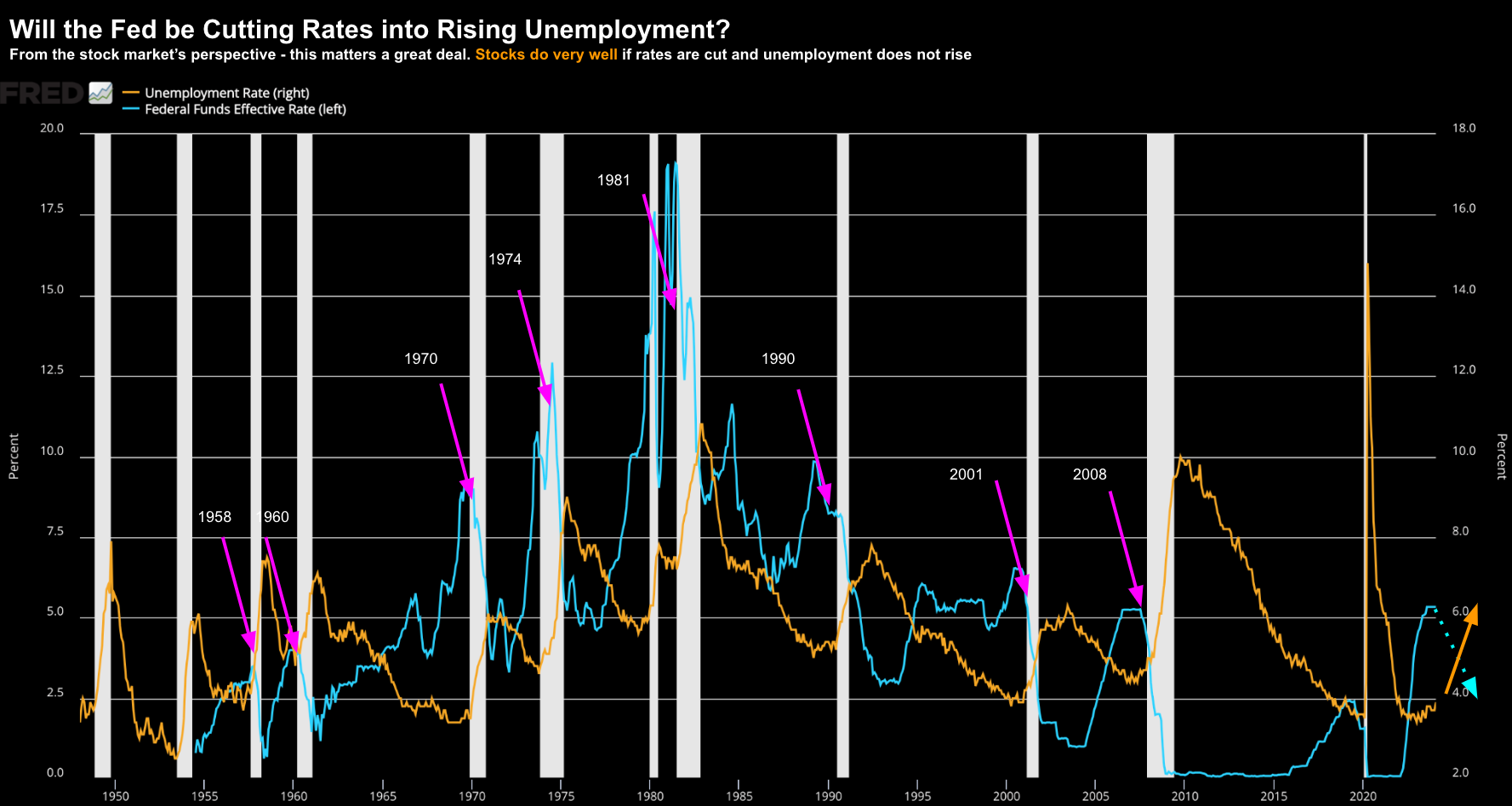
A couple of months ago, I asked whether the Fed would be cutting rates in to rising unemployment (looking for the rate to move above 4.0%) vs cutting into stable employment?
For example, take a look at this from March 21
Here’s why this matters:
If Powell is cutting rates where unemployment is not moving higher – this potentially bodes very well for stocks.
On the other hand, if Powell is cutting where unemployment is getting worse, this is when the stock market typically does poorly.
And here we draw from 70+ years of price data:
- During the months when the Fed cut rates while the unemployment rate stayed flat or declined, the S&P 500 Index enjoyed a 17.4% average annualized percent price gain;
- When rate cuts were associated with a rise in the unemployment rate, the S&P 500 monthly average annualized price gain was a very disappointing 4.7%.
- In addition, if unemployment rose during a monthly rate cut, the S&P suffered a loss nearly 40% of the time.
Based on the trend – my best guess is the Fed are likely to cut rates where unemployment is heading higher:
Just for clarity – the unemployment chart is what the Fed will be focused on.
Put another way, they won’t spend much time mulling over another ‘noisy’ jobs report – which was mostly part-time work.
Case in point:
In the last two years – jobs are said to be up by 6.6 million.
However, of those 6.6 million – full-time employment is only up 0.6 million.
Something doesn’t add up.
The Fed see that…
What’s more, we should always be mindful of where the jobs are being added (as this matters too)
And no surprises there:
- Government (46K jobs)
- Health services (86K jobs); and
- Hospitality and Leisure (42K jobs)
Where are the job gains in the sector that actually produce something?
As an aside – I’m yet to see a single month where the public sector is cutting jobs – they only seem to expand.
Curious isn’t it.
Why I Think Yields Will Fall…
Despite a rough week for bonds – the bond bulls should not lose faith.
And shortly I will explain why…
However, as a preface, next week we will hear from the Fed.
And whilst the market doesn’t expect rate cuts this month or next – their tone will be important.
From mine, they have very few reasons to lean dovish (apart from the higher unemployment rate)
To be clear, Powell wants nothing more than to cut rates (he’s a closet dove) – but he has very little leverage.
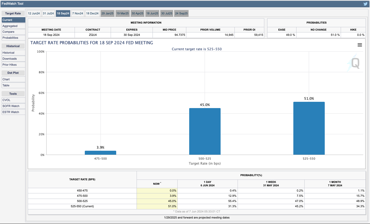
Based on the latest employment data – the market has cut the odds of a rate cut in September to just 45%.
Yesterday this was 55%.
And whilst the yields leapt higher across the curve today – I think they are too high.
Put another way, I see bond yields falling / bond prices rising over the next 12 months.
And whislt not exhaustive – let me offer three charts.
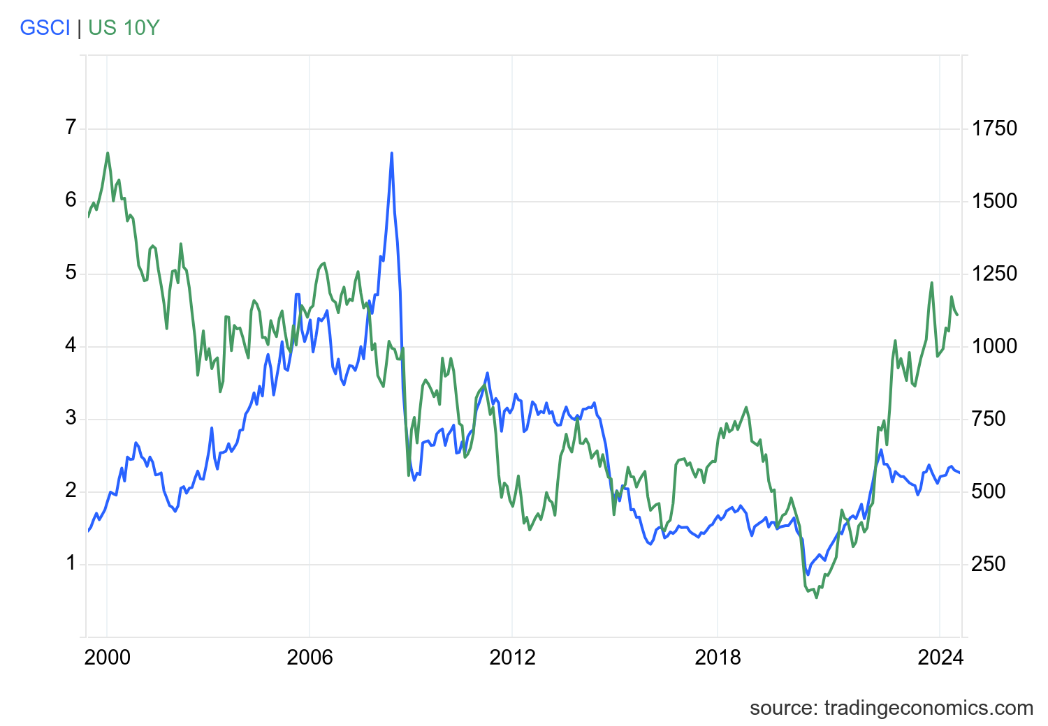
#1. 10-Year Yield vs Commodities
The GSCI Commodity Index consists of 24 sectors – energy products, industrial metals, agricultural products, livestock products and precious metals.
Energy carries the greatest weight in the Index.
Over the 20 years – this Index enjoys a close correlation with long-term (10-year) bond yields:
Of late, we’ve seen these two asset classes diverge strongly.
The last time we saw something similar was 20-years ago.
Since mid-2022 – when the price of commodities and CPI peaked – bond yields have proceeded to trend higher despite lower commodity prices.
For example, commodities have declined by ~35% over the last two years – however the 10-year yield has risen from about ~3% to ~4.4% at the time of writing (peaking at 5.0%)
From mine, I think we see yields decline (vs commodities rise)
#2. 10-Year Yield vs Nominal Growth
If commodities are a proxy for economic growth (and demand) – the following correlation draws from a similar bow.
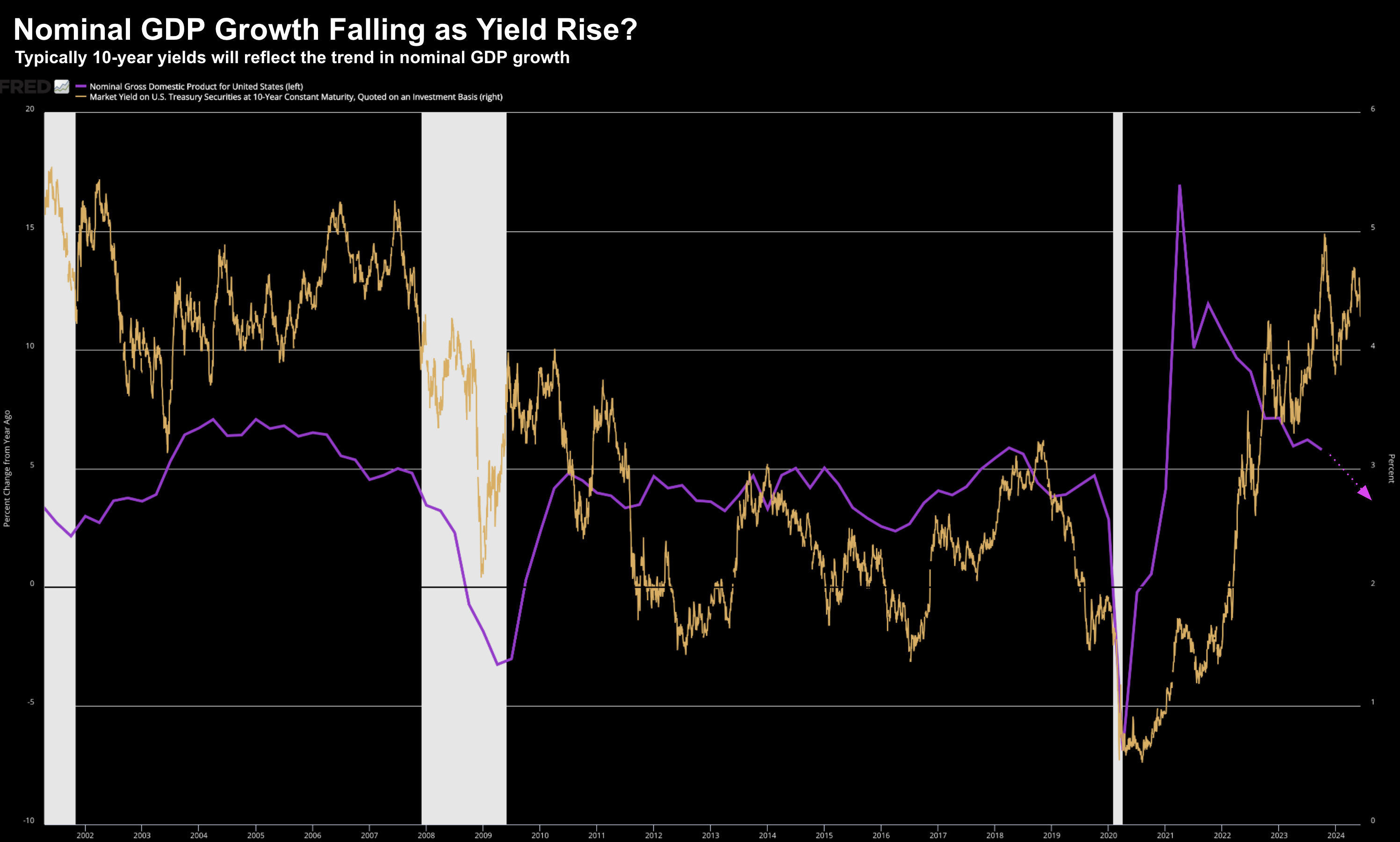
Here I compare the change in nominal GDP growth (purple) the 10-year yield (orange)
At its core – yields are a function of the pace of overall economic activity.
Since peaking in early 2021 (as a result trillions in government spend – where every cent counts as a “positive contribution” to GDP) – growth has been trending lower.
But look at what we see between 2010 to 2019…
Here we find US nominal GDP growth fluctuated between about 3% and 6%. During this time, the 10-year yield traced its movements – trading in the range of 1.5% to 3%.
When nominal economic growth fell below zero in 2020, the 10-year bond yield collapsed to a record low of about 0.5%.
And when GDP surged post-pandemic, so did the 10-year bond yield.
Today nominal GDP is slowing back to its pre-pandemic norm – but this is not reflected with bond yields.
For example, since Q4 ’21, nominal GDP growth has slowed from 11.9% to 5.4%. However, the 10-year bond yield has risen from 1.5% to 4.40%
My guess: yields fall.
#3. 10-Year Yield vs CPI
One final chart…
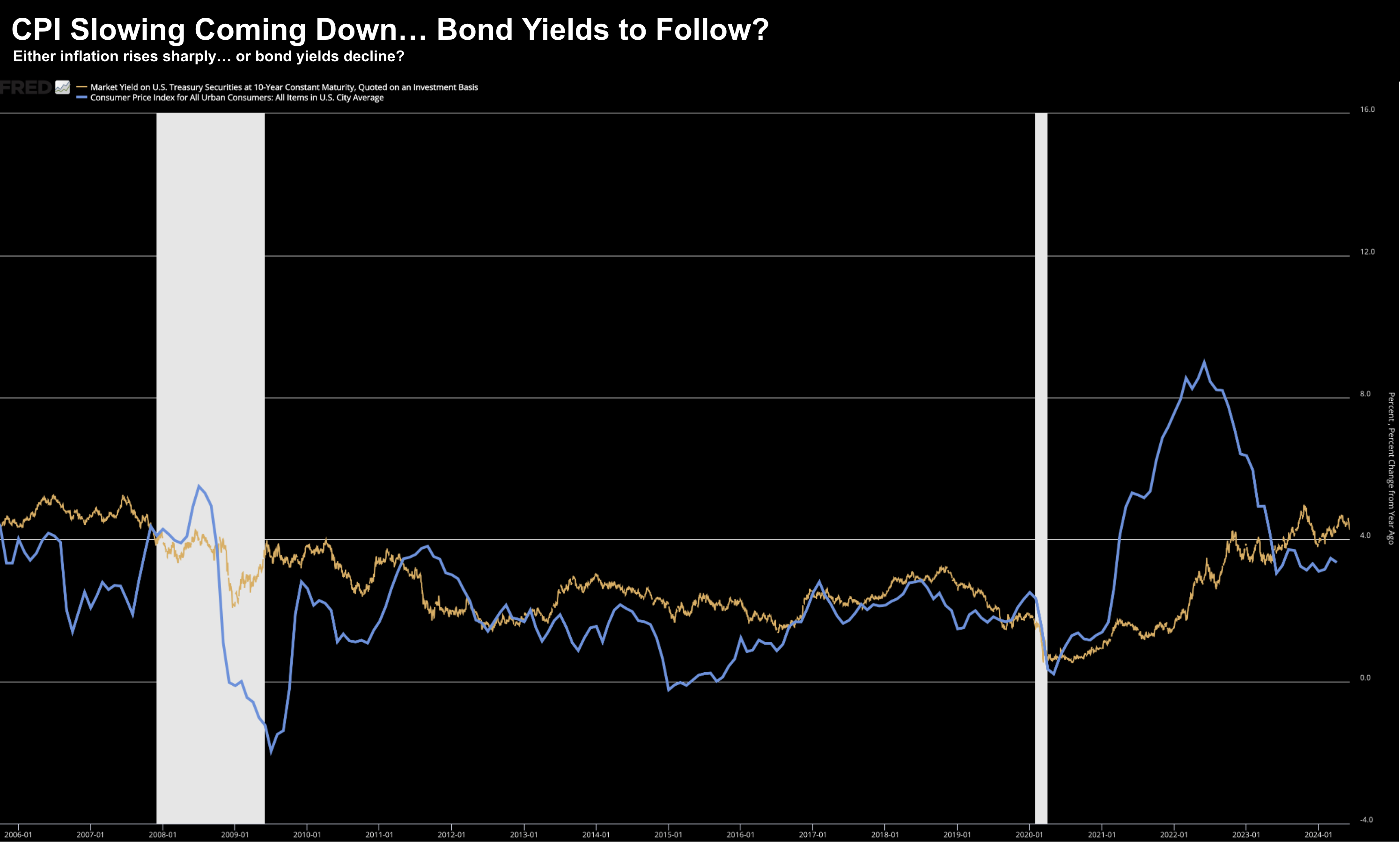
Below we find the change in Consumer Price Inflation vs the US 10-Year:
Whilst CPI has fallen from its June 2022 high of 9% to ~3.3% at the time of writing – bond yields have continued to trend higher.
My expectation is inflation will slowly but surely work its way lower over the coming 12-24 months.
If that’s true – then it follows that yields will follow suit.
Note:
We get the next monthly CPI print next Wednesday (June 12th) – the same day as the next Fed statement on monetary policy.
Putting it All Together
Whilst history can act as a guide – it’s not a panacea.
Sometimes we find these so-called divergences continue for many months and years.
What’s more, there are times when relationships break down.
Put another way, we get a “new normal”
Many relationships have broken the past couple of years given the unprecedented amount of government intervention.
We effectively “frankensteined” the economy – which led me to ask whether these recession indicators are broken?
They might be?
With all that said, the correlations outlined above have been reliable.
However, it remains to be seen if that continues to be the case.
From mine, yields are trading above fair value.
And that could continue to be case for many months to come – it’s very difficult to know.
High yields could be due to such things as (not limited to) extreme fiscal recklessness; a strong recovery in economic growth; or higher than expected inflation.
It’s hard to know…
However, based on the indicators I track, probabilities suggest bond yields are likely to come down over the next 6-12 months.

