- The power of time in the market
- 5 great lessons from history
- 2023’s banner year may not set up well for ’24
Greetings from LAX!
As I wait for my flight to Melbourne… a few thoughts on the year ahead in addition to one of the most compelling long-term charts I’ve seen in a while.
The chart below was courtesy of Barry Ritholtz – who writes the blog “The Big Picture“
Source: Barry Ritholtz
At first glance, there’s a lot going on.
It’s certainly not one you would use with your next powerpoint presentation!
But if you take the time to study it – it offers many lessons and some important metrics.
Let’s try and simplify it…
1. Historical PE Ratios
At the top of the chart (in green) we see the historical price to earnings (PE) ratio for the S&P 500 from the 1920s through to today.
- The median is around 18x.
- The average however is around 15.5x
- When PE ratios ran too far (e.g., in excess of 20) – subsequent yearly returns generally lower
- When PE ratios were low – subsequent yearly returns were high (i.e., you’re paying a lower premium for assets)
Today the forward PE for the S&P 500 is ~20x (possibly slightly higher)
For example, pending what you assume for the “E” next year – the PE could be higher or lower.
Personally, I think it’s closer to 21x, where earnings will be pushed to hit $230.
For example, 4700 / $230 per share equals 20.4x
That said, there are some who think earnings will be as high as $245 – which equates to a PE of 19x (still not cheap)
Now if we happen to have a recession – forget $245. In that scenario – $230 EPS will be a great outcome.
From mine, with the forward PE in the 20x realm – it feels like subsequent 5 to 10-year returns run the risk of falling below the long-term average of a 10.5% total return (more this shortly)
For example, if you look at 1982 when the forward PE ratio dropped all the way to just 10x – subsequent 10-year returns were ~18.5%
It’s pretty straight forward – you buy when things are cheaper – not when they are priced at a premium.
For example, buying the market in 1999, with PE ratios around 40x, saw subsequent 10-year returns at negative 0.7%
My personal approach – look to add exposure closer to 17x to 18x. It will improve your longer-term risk/reward.
However, buying at “20x or above” forward earning carries far greater risk.
2. Inflation vs Prime Rate
- Whenever the prime rate starts to turn lower (i.e. the central bank is cutting rates) – a downturn in the market typically follows;
- On the other hand, when the prime rate is steady or increases – stocks typically resume their upward path (as economic conditions are typically sound);
- It begs the question: if the Fed is close to cutting rates – one should ask why?
This is consistent with what I’ve been saying lately about “late cycle investing”
If you’re adding meaningful exposure at this stage of the game (e.g. employment getting weaker; demand easing; inflation falling etc) – the risks are not in your favour.
And whilst you may squeeze ‘5-10% upside’ (certainly possible) – we know the Fed easing cycle is likely to commence at ‘some point’ in 2024 (e.g., likely in the second half).
A lower rate cycle is typically not great for stocks (as the long-term performance chart shows)
3. Bull & Bear Markets
This is my favourite chart within the chart. Some takeaways below:
- This shows how much time the market spends in a bear market (where it’s said to lose 20%) vs being in a bullish trend;
- Those who perpetually bet on bearish outcomes (who I call permabears) are typically playing a lower probability game
- Yes, they may get it right once every 20 years (even a broken clock is right twice a day) – but over the long run betting against stocks is a losing game.
- Stocks will rally far more than they fall. And those rallies always eclipse the losses over time.
- As Warren Buffett would tell you – the secret is time in the market.
4. Price & Performance Chart
- US stocks typically average a CAGR of ~10% (total return – which includes dividends of around 2%) – eclipsing growth, balanced and international risk assets.
- Income based portfolios (e.g. credit etc) have returned a CAGR of ~6.3%
- Property has returned a CAGR of ~4.9%. (i.e., 100 to 5849 over 87 years) vs gold at ~7.2% (35/oz in 1965 to ~$2100 today)
- Longer-term bonds have returned a ~4.8% CAGR (higher than the 10-year yield today at ~3.9%); and finally
- Inflation has averaged ~2.9%
Note – this CAGR tool is useful for calculating annualized returns.
Here’s the key point:
Very few asset classes (if any) will deliver you a total return of ~10% annualized over time.
Not gold, property, cash or bonds.
The majority of your asset speculation (not all) should always tilt in favour of stocks.
And specifically – US stocks.
Yes, you can also have some exposure to property, gold, cash or bonds – that’s fine – but returns from those asset classes will not outperform stocks over the longer period of time.
That’s fact.
What’s more, I’ve always said it’s very difficult for most people to beat a return of 10% over many years consistently.
It takes a lot of time, energy and focus.
What’s more, it takes discipline.
Sure, you may get lucky “every other year” – but to beat it consistently (over many years) – takes work.
My advice to most people who don’t have the time or expertise – is simply buy an S&P 500 Index Fund (there are a few) and let it sit for 10+ years.
It takes very little work (vs say the hard work required for an investment property) and the returns are unmatched (by a long, long way)
Probabilities are you will do very well (and better than most professional fund managers)
5. Time & Risk
The last graphic I will comment on talks to the impact of time.
It compares 1-year rolling periods vs 5-year rolling periods.
This is also tremendously helpful
For example, if we consider just US stocks:
- 75% of the time the rolling 1-year return is positive;
- 88% of the time the rolling 5-year return is positive
The chart reminds me of this post – where I talked to the power of compound annual returns over time.
I talked to the incredible 57-year investment record of Warren Buffett and Charlie Munger.
Over 57-years – their average CAGR is 21%.
But here’s the thing:
- 19.3% of Berkshire Hathaway’s (BRK) 57 years produced negative returns (i.e., almost 1 evert 5 years was a negative year); and
- BRK underperformed the annual returns of S&P 500 33% of the time
This year BRK will underperform the Index.
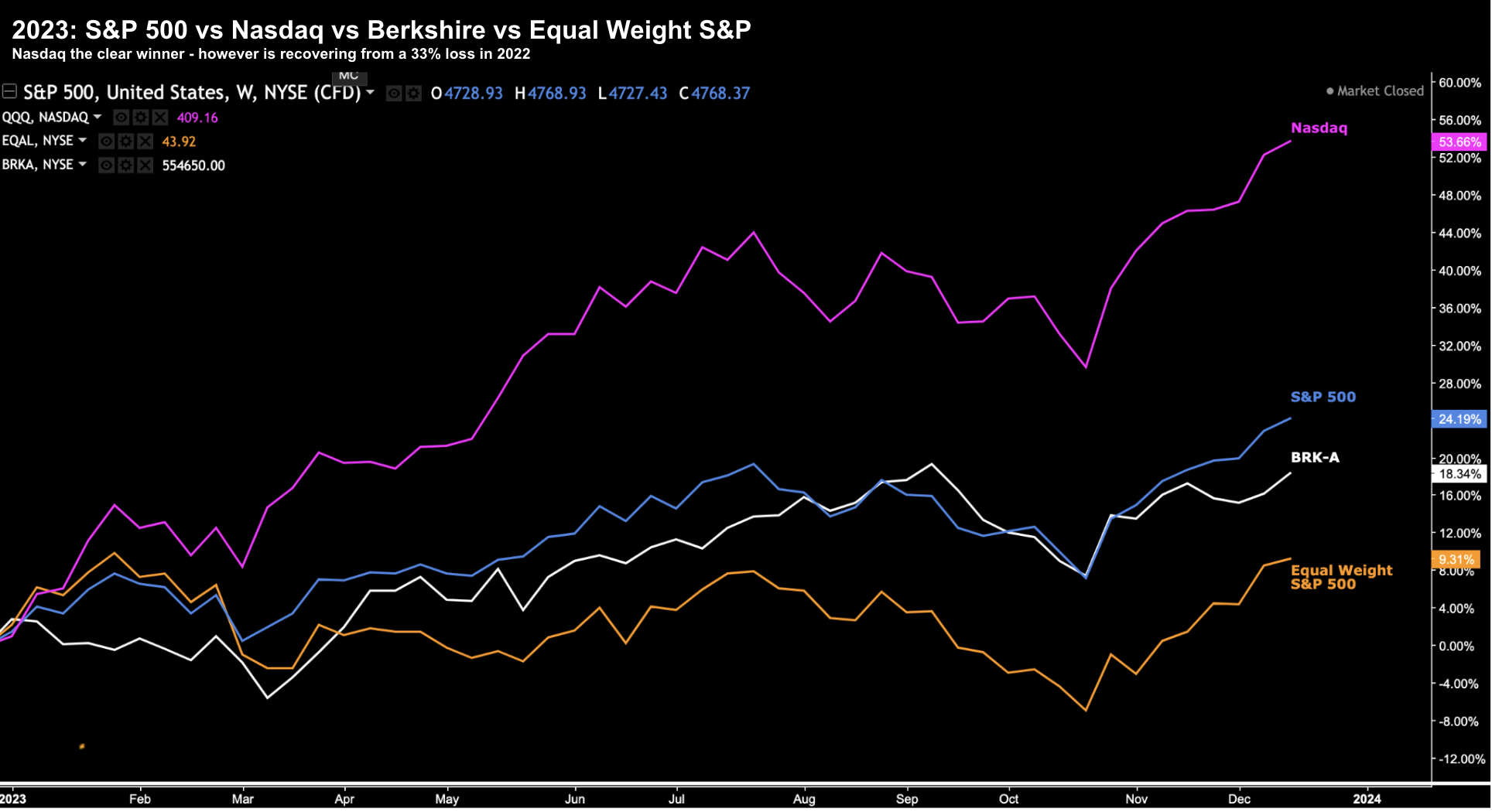
At the time of writing – the S&P 500 will likely generate annual returns of around ~24% (vs a loss of 19% last year); and Berkshire will return ~18% (vs a 4% gain in 2022)
Again, that’s not unusual for Buffet. It happens 33% of the time.
This offers an entirely different perspective.
During 2022 – Berkshire managed their risk and exposure very well.
They did not suffer the massive 20% drawdown (mostly avoiding overpriced tech) – which has seen them compound their gains this year.
Which brings me to perhaps the most important takeaway of all…
It’s the Long Game
Folks, investing is about the long game.
Period.
Asset speculation is not a game measured in days, weeks or months.
Sure you can try – but the stats speak for themselves.
As you probably already know, there is no shortage of “fast money” stock tippers bragging about their “100%+ winners” over the past two or four weeks – but very few make money consistently.
And almost none will show you their “2, 3, 5, 10-year” investment record against the Index
Note – you should always ask them to show their long term performance record if they are posting stock tips
For me this year – I will likely underperform the Index. My returns are very similar to Buffett (at the time of writing ~18%)
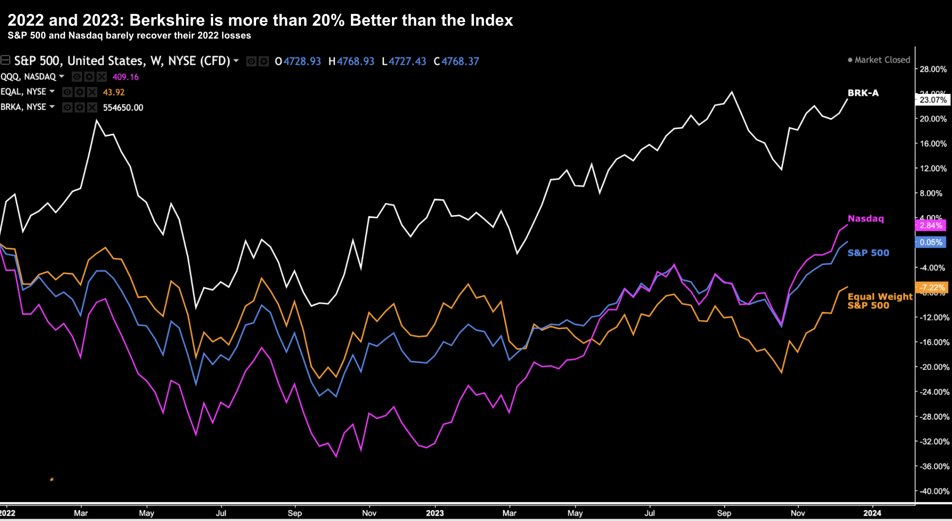
Not unlike Buffett – during 2022 – I managed to avoid the 20% drawdown. For example, consider the 2-year table:
Last year the S&P 500 lost 19.4% and the Nasdaq lost 33.1%
A 33% loss in any one year is brutal. It’s very hard to recover from.
My own portfolio (tracked here) was down -0.86% in 2022 – as I felt valuations were excessive (where forward PE’s were over 21x) coming into 2022.
Therefore, I de-risked my portfolio (especially in tech)
This year – the S&P 500 and Nasdaq will recover much of those drawdowns (as my earlier chart showed)
Whilst I’m slightly below the S&P 500 performance this year – my 2-year return is ~16.50% (significantly higher than the market)
Which Brings me to 2024…
If you’ve not read my previous post – please take a look.
As I watch the market scale some lofty heights (16.2% in just 8 weeks) – there are echoes end of 2021 / early 2022.
Technically it’s a very different set up – but I get a similar vibe (i.e., extreme optimism)
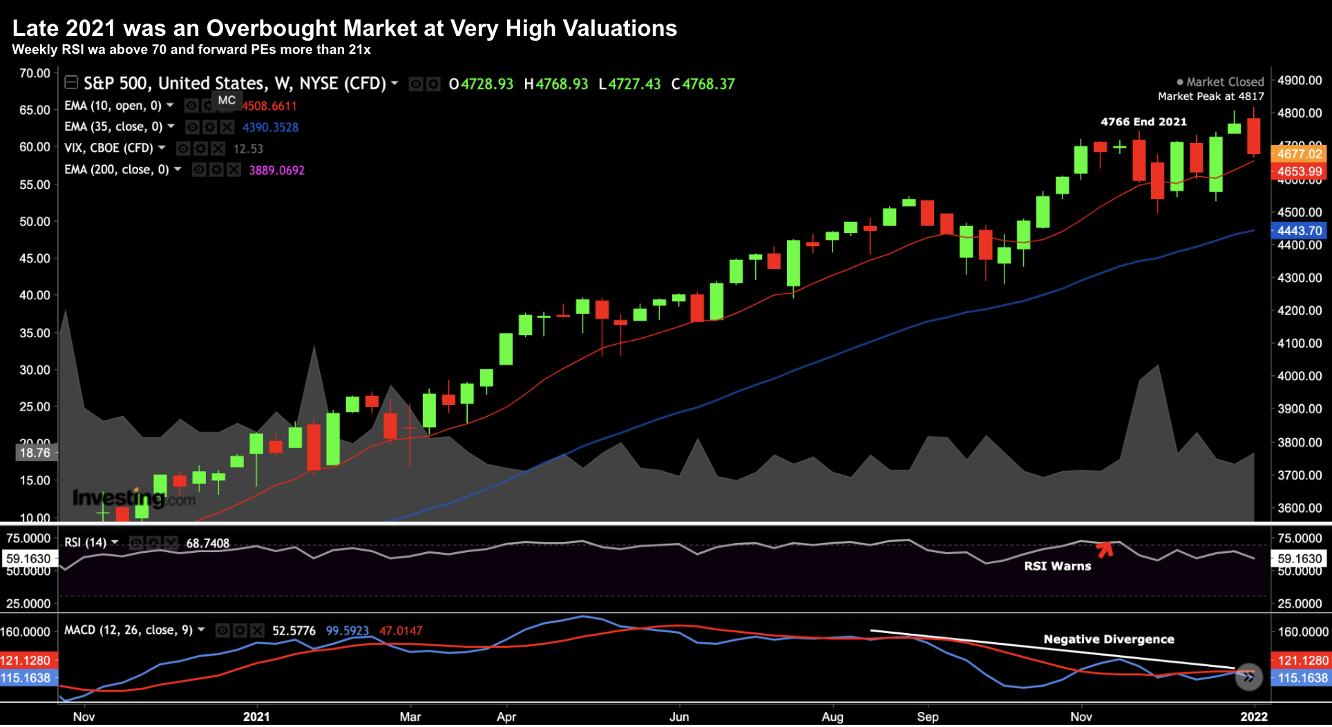
Below is the week S&P 500 chart at the time of writing:
Dec 19 2023
- We’re approaching what I think will be a possible zone of resistance – around 4800; and
- Our weekly RSI (lower window) is approaching 70 – indicating the market is overbought.
That said, I’ve watching markets stay “overbought” for several weeks. It’s not a signal to trade in isolation.
My other observation is we’re a long way removed (or extended) from the 35-week EMA.
Over time – the 35-week EMA (blue line) acts like gravity – where prices are pulled towards it.
Today it feels as though the price action is stretched to where mean reversion will strike.
And for me – that echoes of late 2021 / early 2022.
Two years ago, markets had rallied ~27% for the year (but in a more consistent fashion) – with the weekly RSI creeping into overbought territory.
From a valuation perspective – forward PE’s were high – trading in excess of 21x forward (largely due to the tech sector)
My approach was to lower exposure…
And whilst the market continued to run for about 4-6 weeks after I reduced risk – over the course of the year it was a very prudent move.
This is what led to my near 20% outperformance that year.
To that end, my thinking today is we will be given a similar opportunity in the first half of 2024.
And I think that could be as much as a 15% pullback.
It’s very hard to know what the precise pullback percentage will be – but I think it could be in that realm.
From mine, that’s the time to increase exposure.
Putting it All Together
The long-term chart shared by Ritholz was worth passing along.
Please share it…
For me, not only did it reinforce the power of time in the market with asset speculation – it also highlighted the opportune ‘windows’ to add risk (and when not to)
I think the latter is far more important.
For example, adding risk late 2021 and early 2022 was a bad move. It would have seen your portfolio drawdown by 20% or more by year’s end.
But I also know that you probably will not feel like adding risk when the market tumbles “15% or 20%”
There’s blood on the streets. And much of it will be your blood!
For example, you might be thinking it’s “2008 all over again” as markets collapse.
And the mainstream media will have you terrified (it’s how they sell ads – they sell fear).
Generally that’s the time to buy.
For example, March 2022 I issue a post titled “Why It Makes Sense to Buy Peak Fear”
This post remains one of my personal favourites.
And it mirrors a lot of Ritholtz’s chart; i.e. you add exposure when valuations are cheap.
However, today some investors are adding risk where:
- It’s very late in the business / economic cycle
- Forward multiples are at 21x (or more pending what you assme for “E”); and
- The Fed is about to ease policy…
History suggests this reduces your potential returns in years to come.
Stay patient – I think there is a better opportunity ahead.


