- Still plenty of liquidity
- However, M2 is contracting at a fast clip
- Three charts which all point to Recessionville
Many people seem puzzled as to why the market continues to trade higher.
For example, some readers have told me they missed the rally – wondering why things have not completely unravelled sooner.
They’ve chosen to sit things out for one reason or another.
And that makes sense… I am sure they are not alone.
In the near-term – they have missed out on ~9% gains YTD.
So why are markets defying gravity? And how long could it continue?
The short answer for a while yet.
And the reason is liquidity.
Despite a contraction in money supply this year – there is still ample liquidity in the system.
However, if it’s cut off, risk assets will drop like a rock.
On the flip side, if it’s there, risk assets will continue to defy gravity (despite valuations)
Let’s take a look…
Plentiful Money Supply
Whilst it’s true the Fed is still allowing assets to roll off its balance sheet (Quantitative Tightening) — there is still ample supply of liquidity.
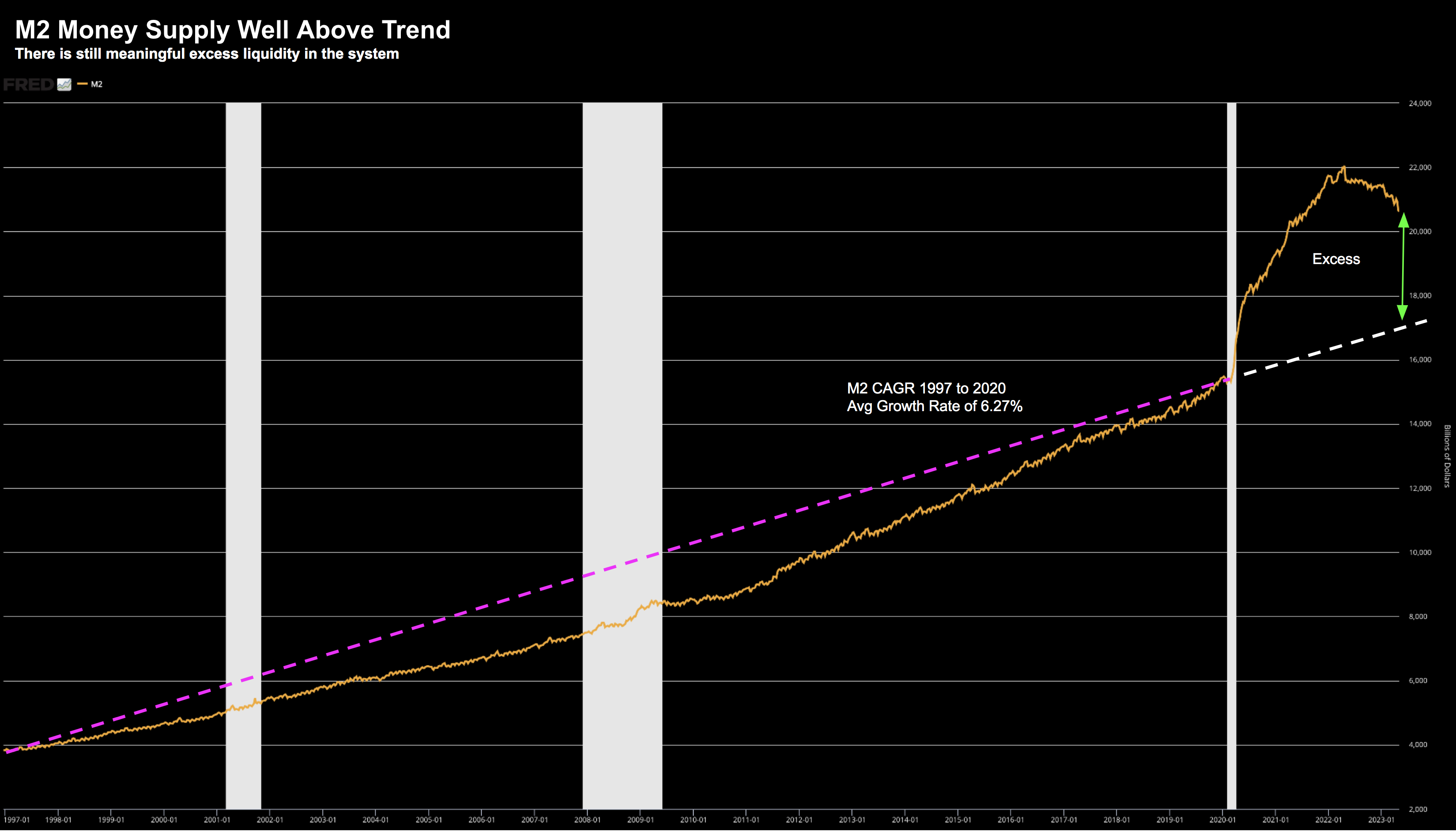
For example, take a look at the long-term growth in M2 money supply from 1997:
May 25 2023
The long running compound annual growth rate (CAGR) is ~6.27% (pink line)
However, that all changed with the onset of COVID.
Central planners set about making the greatest (financial) mistake in modern history by priming the money spigots.
From the start of 2020 though to 2023, the growth rate almost doubled to ~12% (and that’s inclusive of early stage QT)
My point is the amount of money still in the system is well above the long-term trend (white dotted line).
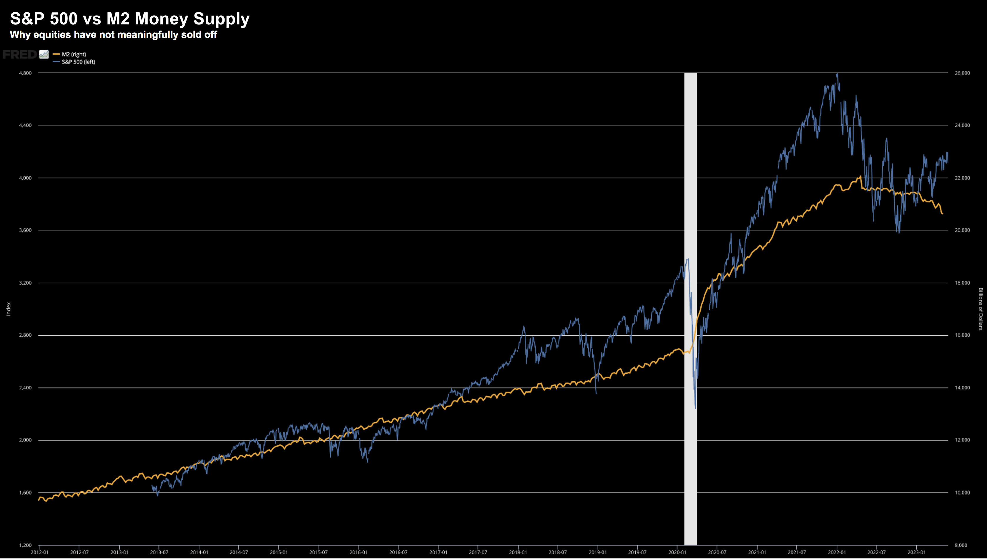
Now M2 Money Supply enjoys a close relationship to the S&P 500 (see below)
May 25 2023
The relationship is far from perfect – however directionally it’s there.
However, keep an eye on the Fed’s balance sheet.
Should QT continue (and I suspect it will) – the upside in equities will likely remain capped.
What Makes Things Tricky…
If liquidity were at more ‘normal’ levels – my conviction level on lower stock prices would be higher.
And this is what makes 2023/24 so interesting.
On the one hand we have the S&P 500 trading at 19x forward earnings… and yet… almost everything else points to the downside.
And this is why I suspect many readers are finding it difficult to pull the trigger.
Make sense… this game isn’t easy.
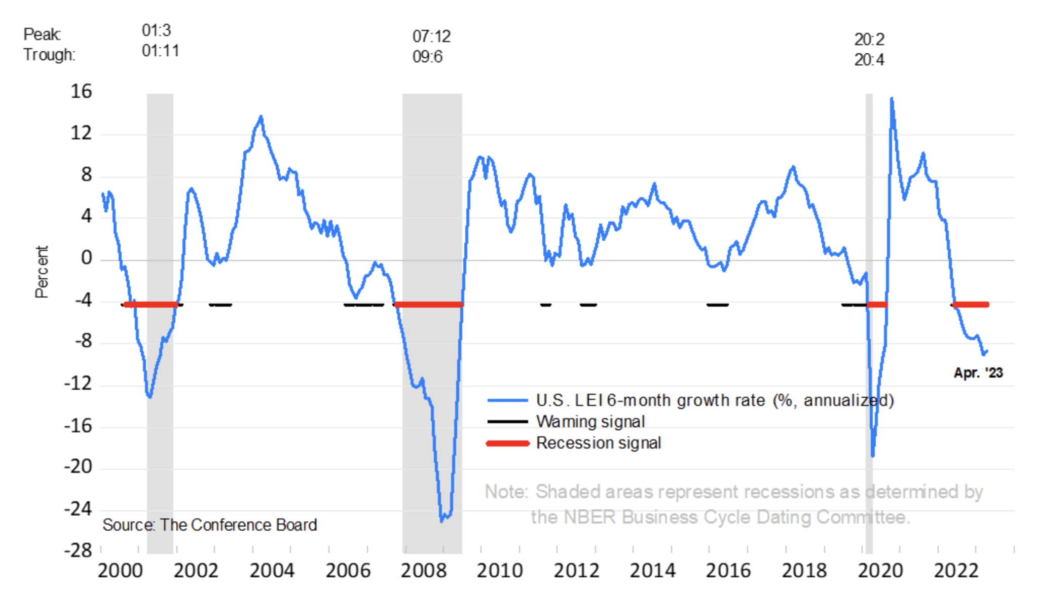
For example, three of my preferred recession measures are all flashing bright red:
- Severity of the yield curve inversion;
- Near-term money supply contraction; and
- The Conference Board’s Leading Economic Indicators
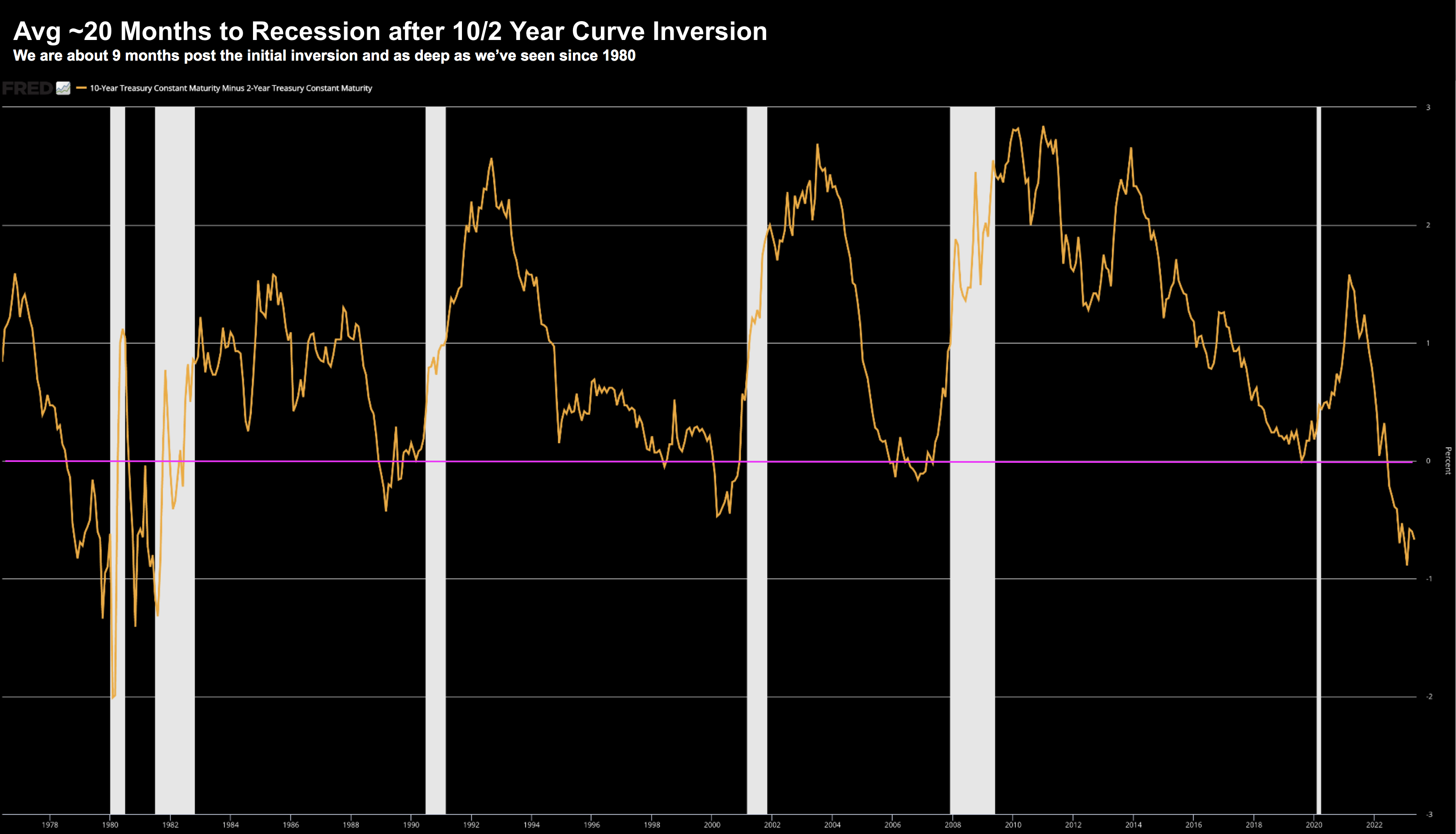
Let’s start with the 10/2-year yield curve inversion.
This is as extreme as we have seen since 1980 – where every 10/2 inversion has resulted in recession.
No exceptions.
May 25 2023
The downside to this indicator is it’s a poor timing tool.
For example, the average time to recession post inversion is around 20 months.
The current 10/2 curve inverted July last year – meaning we could be 6-12 months away.
And if we combine that with:
(a) the excess liquidity; and
(b) the Fed’s new emergency Bank Lending Facility — this feels about right.
With respect to money supply – whilst there is still ample liquidity – the contraction we’ve seen of late is sharp.
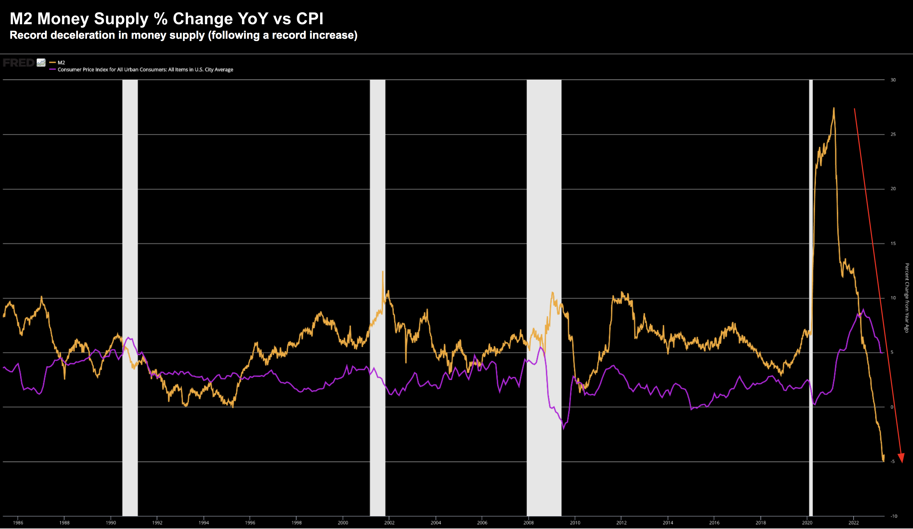
For example, M2 expressed as a percentage change year-on-year shows the velocity lower:
May 25 2023
Similar to the inversion on the yield curve – the drop is as sharp as we have seen in modern times.
When we overlay this with consumer price inflation (purple) — there is a clear relationship.
Makes sense when you consider the definition of inflation:
Excess money chasing too few goods.
In other words, inflation is a monetary problem.
As an aside, this is why I think the Fed will eventually be successful in its fight against inflation (sorry gold bugs)
Whilst it will take longer than most assume (due to wages and rents) – inflation will likely come down to their 2% objective.
And if anything, they will overshoot to the downside.
In other words, don’t think as soon as it hits 2% it will simply stop.
No.
It will have velocity to the downside and likely continue lower.
The third chart I lean into for a recession is the Conference Board’s Leading Economic Indicators:
The composite economic indexes are the key elements in an analytic system designed to signal peaks and troughs in the business cycle. The indexes are constructed to summarize and reveal common turning points in the economy in a clearer and more convincing manner than any individual component.The CEI is highly correlated with real GDP. The LEI is a predictive variable that anticipates (or “leads”) turning points in the business cycle by around 7 months.
Putting it All Together
Predicting the precise timing of a recession is near impossible.
And nor does it really matter.
For example, it’s hard to say it’s “imminent” given the strength in employment.
Unemployment sits at a 70-year low (~3.5%).
That is a country which is fully employed.
Whilst people have jobs – they will continue to spend (even if they don’t have the money)
They might be spending less – but they have a job.
That said, on the road to “Recessionville” – we are treated to small sign posts which suggest the Fed’s 500 bps tightening is having an impact.
For example, these sign posts could be:
- the loss of a couple of mid-sized banks;
- banks tightening access to credit;
- highest number of business bankruptcies to start a year since 2011; and
- credit spreads widening by ~100 bps
These are all indicative of an economy slowing… signs we are on the road to Recessionville.
However, this does not mean the S&P 500 cannot continue to trade higher.
It probably will.
Remember, in 2007 we saw three consecutive quarters of GDP at 2.5% with full employment.
Bernanke wasn’t screaming ‘look out… recession dead ahead’.
But there were signs…
In short, I don’t think we will avoid a recession.
And if that thesis is true, then we have not seen the bottom for stocks.
That said, in the near-term, it’s plausible that equities could push a little higher (should liquidity remain available).

