- Four “reliable” recession indicators which failed to materialize
- Some theories why it was “different this time”
- Recession risk remains quite low – but can’t be ruled out
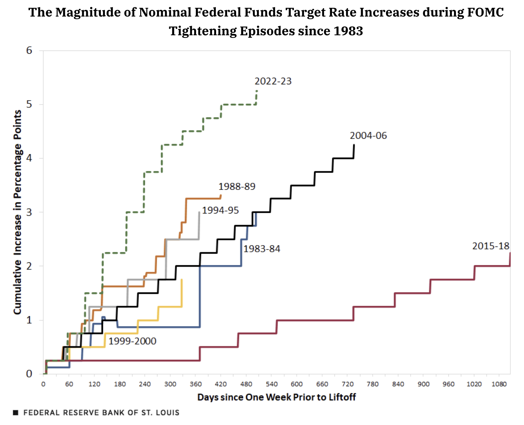
At the conclusion of their July 26 ’23, meeting, the Federal Open Market Committee (FOMC) voted to raise the target range of the federal funds rate by 25 basis points to 5.25% to 5.50%
The S&P 500 traded around 4,000 points at the time – some 16% off its ~4800 January high.
Markets had good reason to be worried…
Investors had not seen the Fed this aggressive at any time in the past 40 years…
It took the Fed ~500 days to raise rates 550 basis points.
What the market didn’t know was how many more rate hikes were in store?
The answer was none…
However, financial conditions were considered tight and Powell told us to brace for potential “economic pain“.
It was not a choice of words the Chairman used lightly.
At the time, a recession felt like a high probability outcome – with estimates in the realm of 18 to 24 months after the Fed first raised rates.
I put myself in that camp.
After all, we’ve seen this script repeat many times over the past 50+ years. What’s more, most leading economic indicators suggested as much.
Why would this time be any different?
We’re now 26 months since rate “lift off” and there’s no sign of a recession (not this year at least)
For example, recent Goldman Sachs research suggests the consumer still remains strong (and they’re far from alone).
[We] continue to see consumer spending as a source of strength and forecast above-consensus real spending growth of 2.6% in 2024 in Q4/Q4 terms.”
First quarter GDP growth report shows a still-strong consumer. Domestic demand growth proceeded at a strong pace of 2.8% annualized – a prerequisite perhaps for sustained strong fundamental growth.
As I mentioned, approximately 12 months ago – most leading (reliable) financial indicators offered reason(s) to exercise caution.
So what happened?
Have the long and variable lag effects of monetary stimulus been extended?
I will share various hypotheses below… however it’s very hard to know why it’s different this time.
What I know is getting the timing right with respect to macroeconomic forecasts is near impossible.
And in the game of asset speculation – if you don’t get the timing mostly right – you are wrong.
It’s that simple.
Suggesting you were mostly right with your thesis but your timing was out is not acceptable. You were wrong.
Let’s review what indicators worked… and what didn’t.
Inflation Spike without a Recession
Let’s start with inflation.
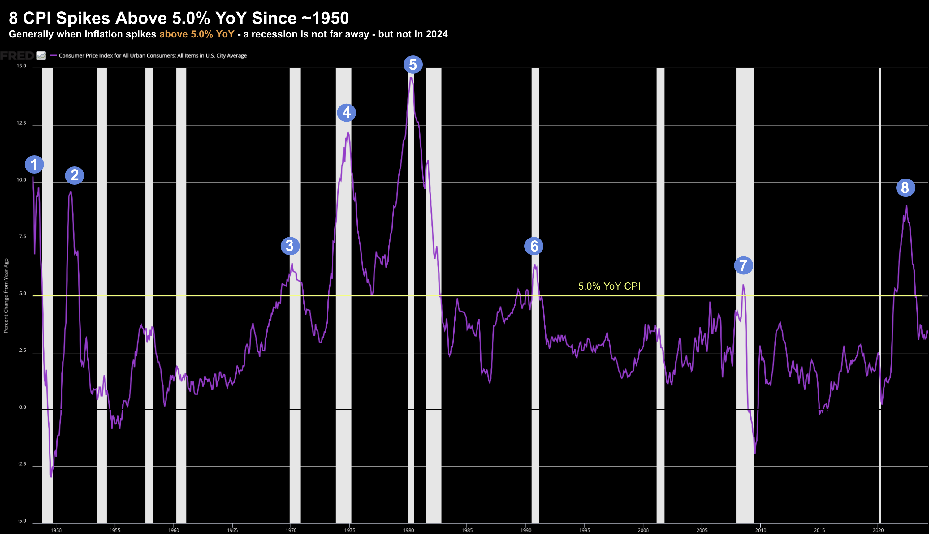
As the long-term chart shows – we’ve seen eight inflation surges above 5.0% YoY since 1950.
However, what we also find is inflation spikes typically coincide with recessions (blue dots)
May 18 2024
But as we know, this has not been the case this cycle.
Why not?
Again, I will share some thoughts on why shortly.
Yield Curve Inversion
Of all the leading financial indicators – the yield curve (and its ‘inversion’) is probably the most widely cited.
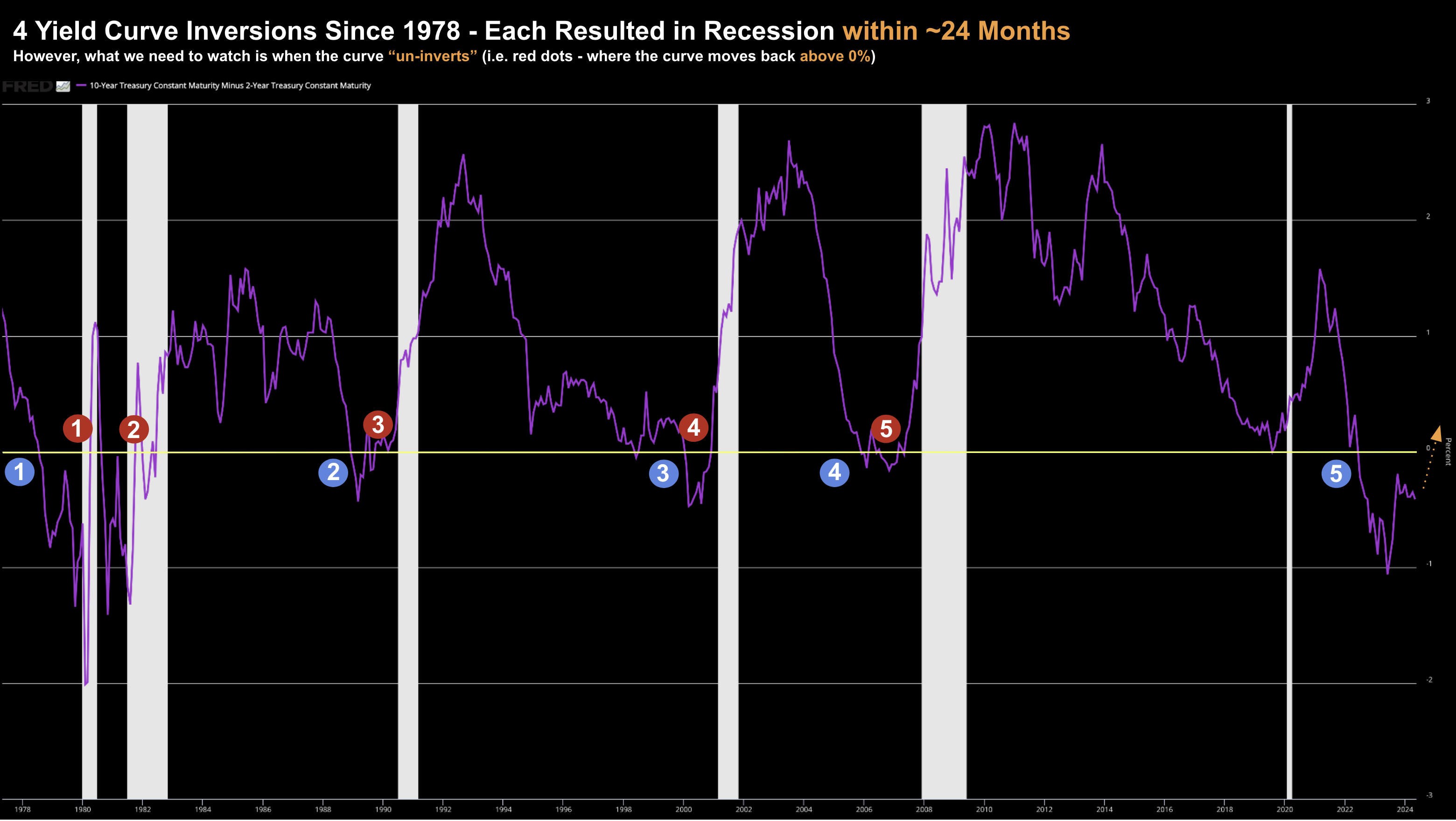
And whilst it has called every recession since 1950 – it’s not a particularly accurate timing tool.
For example, there is an ~12-18 month lag effect between the point of yield curve inversion and the start of a recession (indicated by the blue dots below)
May 18 2024
For what it’s worth, we are now about 18 months inverted.
However, the fact an inversion has occurred is not necessarily the cause of any recession.
It’s when the yield curve begins its re-steepening (or un-inversion) – things typically start to tighten.
Repeating a portion of my post from August last year:
Generally this steepening (from inversion) doesn’t bode well for the economy.
The reason this happens is investors tend to avoid the long-end of the curve (ie., they sell longer duration bonds) – seeking more attractive returns at the shorter-end (which comes with less duration risk).
This has the effect of pushing longer yields higher.
To be clear, it’s not typical to see this. However, they do tend to occur prior to recessions.
Each red dot shows when the yield curve worked its way back into positive territory – which proved to be the recession trigger.
When (not if) this transpires – we will find the financial media becomes ‘less obsessed’ with the inversions, but more focused on (inevitable) steepening.
For now, the curve looks set to remain well below zero (with short-term rates higher for longer with inflation trading with a mid-three handle)
Leading Economic Indicator Index
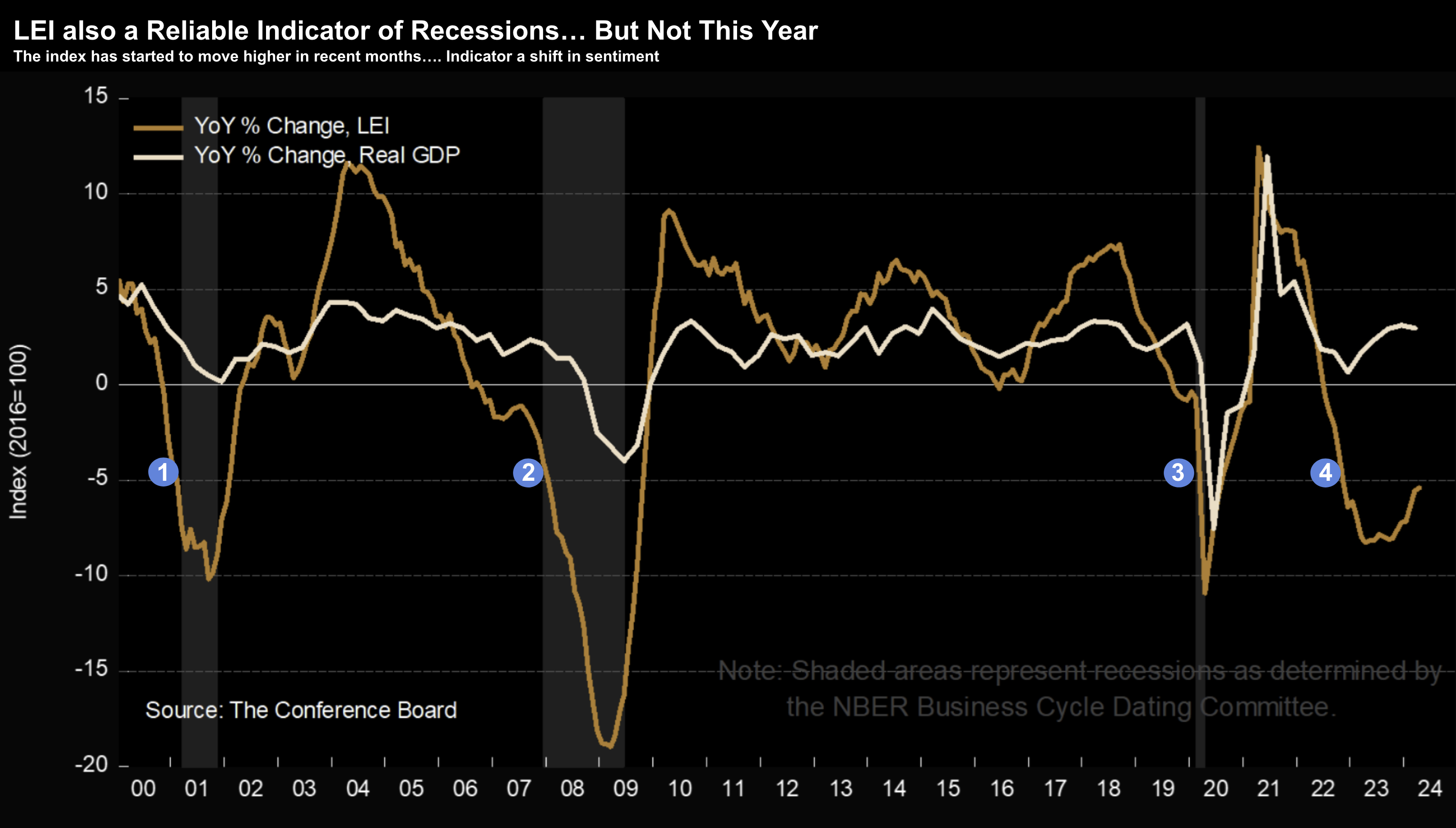
The Conference Board’s Leading Economic Indicator (LEI) Index is also an often-cited indicator of recessions.
The LEI provides an early indication of significant turning points in the business cycle and where the economy is heading in the near term.
May 18 2024
Now given yields are one of several inputs into the LEI index – it’s not surprising to find this well below zero for almost two years.
This is also the longest we’ve seen the LEI negative without a recession resulting.
Again, more on why this indicator may need to be revised shortly.
Sahm’s (Unemployment) Rule
I last talked to Sahm’s Rule here:
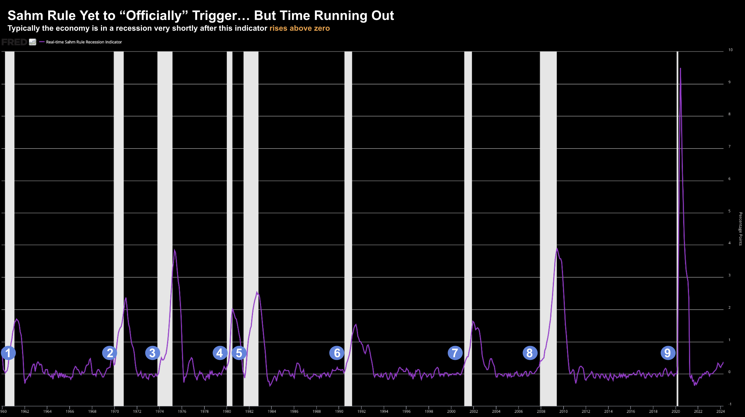
The Sahm Recession Indicator signals the start of a recession when the three-month moving average of the national unemployment rate (U3) rises by 0.50 percentage points or more relative to its low during the previous 12 months.
The Sahm Rule is currently at 0.37% so it has not yet officially triggered.
From mine, this rule in addition to the un-inversion of the yield curve are the only two indicators still in play.
As the chart shows, the economy is typically in a recession very shortly after this indicator rises above zero.
May 18 2024
Today the unemployment is 3.9%
My thinking is if we see the unemployment inching towards 4.5% – the probabilities of a recession sharply increase.
What’s more, this kind of move would ‘trigger’ the Sahm Rule.
As I say, this indicator still has a chance of proving to be accurate – however unemployment will need to increase sharply.
Four Hypotheses on Why These Failed
Further to my preface, the business of forecasting is a fool’s errand.
Very few get it right (just look at the Fed).
And when so-called “reliable” indicators seem to fail – it doesn’t help.
To that end, one’s efforts are better spent on identifying good risk/reward long-term (3+ year) opportunities in quality stocks (vs sweating the macro)
If you do happen to get the macro forecast right – it’s probably more good fortune vs skill.
Many things need to go your way.
I know I rarely get it right.
And that’s fine….
But it should not stop you taking measured risk – and capitalizing on higher convexity opportunities when presented.
With that, what follows are four theories on why some of the more widely-cited leading economic indicators “failed”.
But they’re nothing more than theories – there could be any number of other reasons not cited.
Theory 1: We’ve Had the “Recession”
At the end of the day, a recession is a function of how we choose to define it.
And as it turns out – that tends to be a moving target.
For example, during most of the post-war era, a recession is defined by two or more consecutive quarterly declines in real GDP.
Using this definition, we experienced back-to-back contractions in early 2022 – when real GDP declined by –2% and -0.6%
Technically that was a recession.
That said, the current government told us that it was not a recession (given the low levels of unemployment and strong levels of spending).
Here’s Biden’s comments after two straight quarters of GDP decline:
“There’s going to be a lot of chatter today on Wall Street and among pundits about whether we are in a recession,” Biden told a group of business leaders gathered at the White House on Thursday afternoon. “But if you look at our job market, consumer spending [and] business investment, we see signs of economic progress in the second quarter, as well.”
Put simply, Biden changed the goal posts.
Some then started calling it a “rolling recession”…. where we saw expansion in areas and contraction in others.
For example, in late-2022, Ed Yardeni used this term, citing examples such as:
- Manufacturing and industrial production falling whilst retail sales grew;
- Commercial real estate falling – while residential real estate surged; and
- Several regional banks being forced to close whilst larger banks thrived;
- Energy showed weakness (where earnings dropped over 20%) however the travel sector boomed.
This raises another question:
Are more traditional recessionary indicators still representative of today’s diverse economic mix (and outsized levels of government intervention)?
I don’t know the answer.
Theory 2: Lower Reliance on Debt
Whilst the government gorged on unprecedented levels of debt post COVID (more on this with Theory #4) – it was not the case in the private sector.
Now in the past – this was largely the reverse.
The public sector kept debt-to-GDP ratios well below 80% – however the private sector was generally highly leveraged.
However, with less debt on their balance sheets this cycle – home borrowers and business were far less vulnerable to the tightening cycle.
Consider the mortgage market…
Something like ~82% of all home borrowers secured 30-year fixed rates below 5.0%
And some 90%+ of borrowers secured rates below 6.0%
That’s not something we have seen at any time in recent history.
Therefore, when the Fed jacked up rates, there was little to no impact to consumption.
Household debt service levels (principal and interest payments as a percent of income) is close to its lowest level ever recorded (below 10%) since they began reporting the data in 1980.
But it’s not just home borrowers…
We also find that corporations were far less dependent on leverage than previous cycles.
Non-financial corporate debt to equity was typically in the range of 70% to 90% during the 1970s and 1980s.
Today that figure is around 20%.
This explains why the Fed’s tightening measures from 2022 have had negligible impact.
Theory 3: Awash with Liquidity
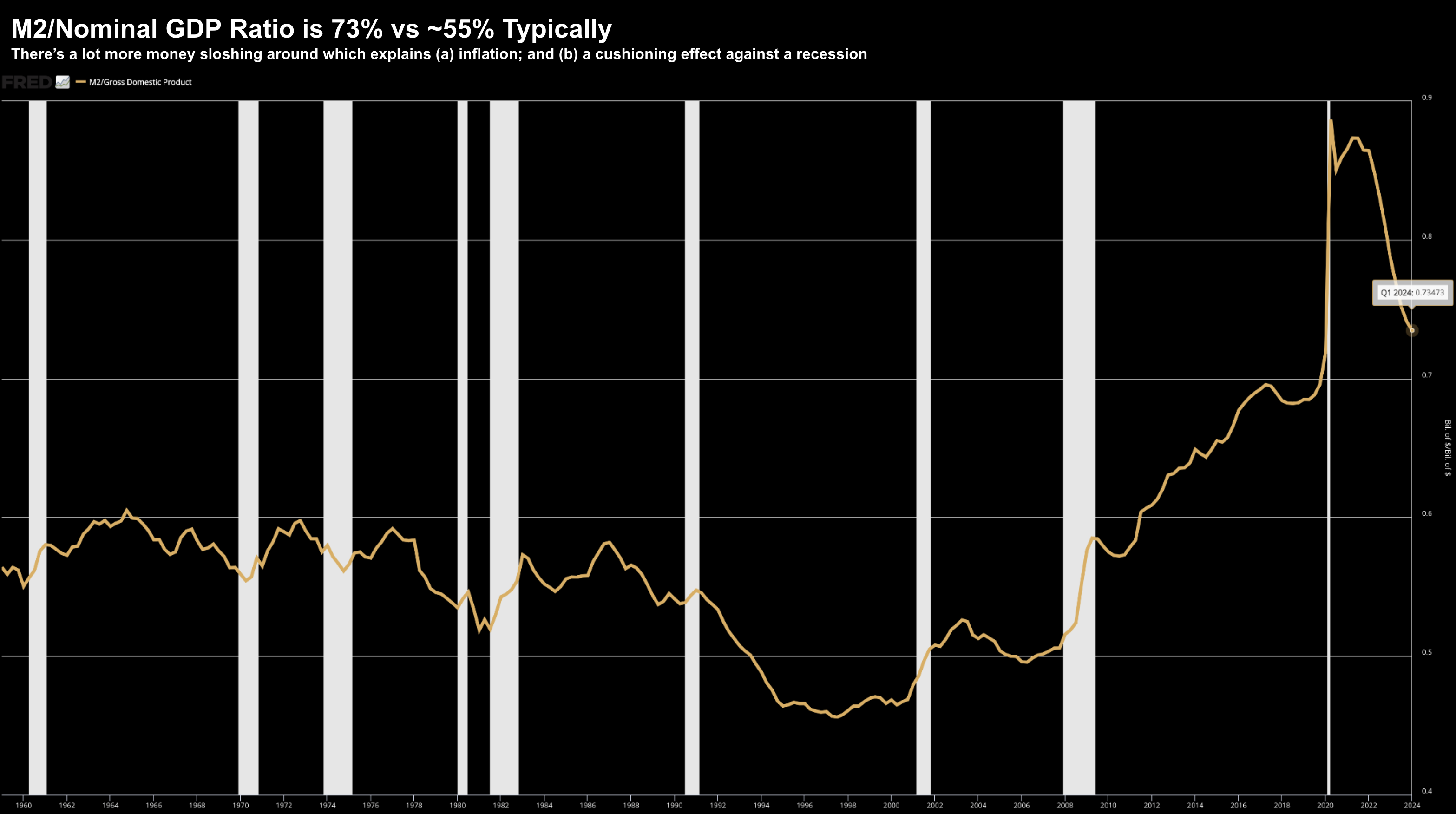
Until 2010, the U.S. money supply comprised about 45% to 60% of nominal GDP.
However, the fiscal stimulus applied during (and post) COVID saw this soar to unprecedented levels.
For example, as of last quarter, M2-to-GDP was a whopping 73% (which is down from its 90% peak)
But have a look at how this compares to the past few decades:
May 18 2024
Post the pandemic, retail money fund balances hit a record $2.5 trillion dollars and corporate net cash flow to GDP is higher today than at any time prior to 2010.
Put another way, with all this fresh liquidity pumped into the economy, the traditional vulnerabilities of the private sector to higher interest rates were largely negated.
The trade-off was higher inflation (i.e., with excess money chasing fewer goods).
Theory 4: Record Deficits & Fed Balance Sheets
So let’s now come back to my point about excess leverage on the public ledger (vs the private sector).
What we have seen over the past four years is “war time” spending from government – enabled by the central bank.
Let’s start with the enablers…
From 2009 to 2022, the Fed kept the funds rate at zero in 9 of the 13 years (far too long in my view)
What’s more, M2 money growth surged to a record high of 25% in 2020 – as the Fed’s balance sheet touched $9 trillion.
As the Fed made the new money available – the government was quick to spend it.
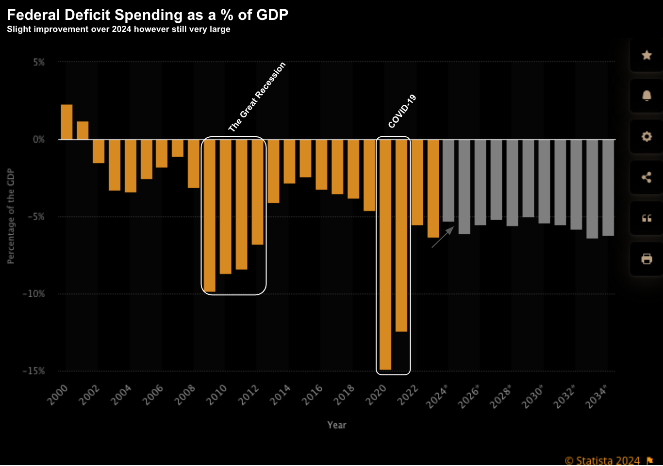
The Federal Deficit to GDP ratio blew out to ratios not seen since WWII – and far exceeding what we saw in 2008.
I shared this chart the other week:
The levels of borrowing and spending are unprecedented during peace-time eras.
And whilst the Fed have implemented some of the fastest rate hikes in recent history – it has not been enough to offset the stimulus that was added.
Without this, then it’s possible our recession indicators may have worked.
Perhaps call it a “Frankenstein” economy… one that’s simply beyond recognition.
Putting it All Together
So are these recession indicators broken?
Maybe. It’s hard to say.
Perhaps the unprecedented levels of liquidity extended the so-called “long and variable” lag effects of monetary policy?
But zooming out, it feels like the risks of recession are low over the next 12 months. However, they are there.
For example, should inflation continue to moderate (which I think will be the case) – the Fed will have more scope to ease.
That’s market friendly.
Bond yields are already starting to soften – which tells me inflationary risks are easing and/or growth is slowing.
What’s more, we’re also seeing some US dollar weakness which will help US competitiveness.
A weaker dollar is generally good for stocks.

