- Is the market getting ahead of itself with the Fed?
- Longer term chart offers useful perspective
- Two reasons to temper our bullish enthusiasm
Q1 2023 is now behind us.
The S&P 500 ended up 7.03%… led higher by technology stocks.
For example, the Nasdaq posted its best three months since 2020… up ~17%
But the ‘ride’ wasn’t straight up.
As we kicked off the year, markets surged on the false assumption the Fed was likely to cut rates.
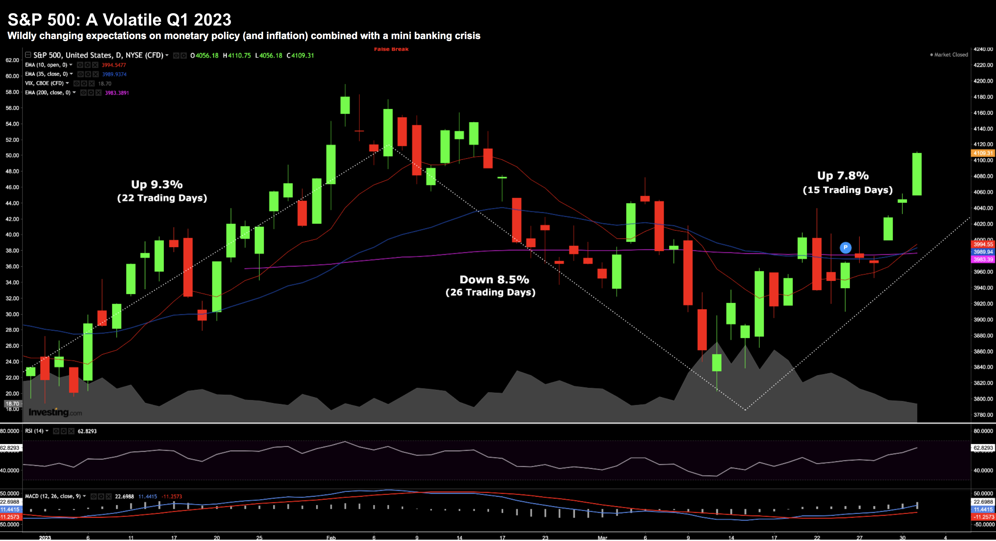
Over the first 22 trading days, the market piled on 9.3% (peak to trough)
However, hotter than expected jobs and inflation data quickly changed sentiment.
A possibility of a 50 bps March rate hike and news of two (niche) regional bank collapses saw the market give back all its gains.
However, confidence in the banking sector was restored following decisive (and timely) actions from the Fed and FDIC.
As a result, the past 15 trading sessions saw the S&P add 7.8%
Hat tip to the Fed!
Amazing what a shot of liquidity does (more on this shortly)
Here’s a profile of Q1 using the daily chart:
April 1 2023
For those who have the skills (and time) – it has been a very tradable market.
I tip my hat to you if you were able to time the rallies and the falls.
But that’s not me….
Neither do I have the skill or the time.
I can’t tell what stocks will do tomorrow, next week or next month.
It’s never been a skill I have.
Therefore, I simply maintained my 65% long exposure – adding to bank and energy stocks after the (steep) sell-offs.
My short-term timing on these trades may prove to be sub-par (which is normal for me) – but my lens is 3+ years.
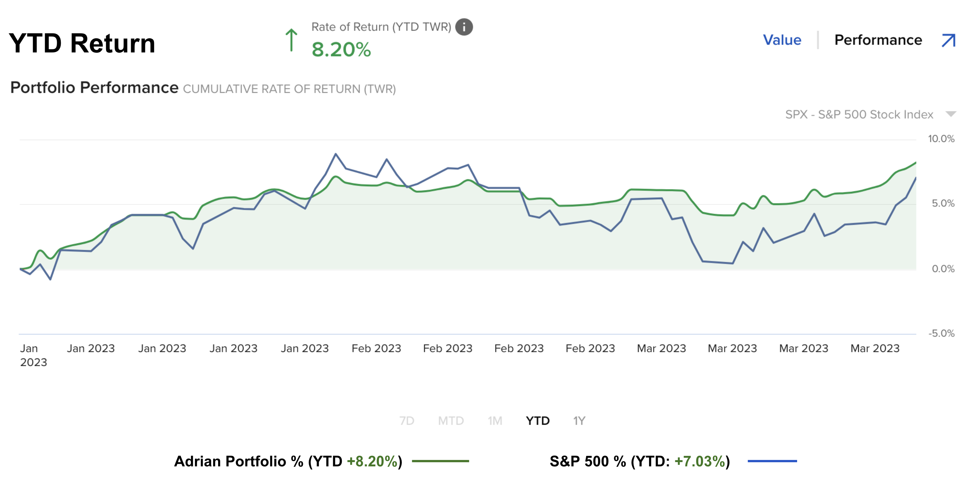
In the end, my portfolio did reasonably well over Q1 – posting gains of 8.2% (vs the S&P 500 7.03%)
April 1 2023
Now anytime you outperform the S&P 500 over a multi-year basis (e.g. 3+ years) – it’s considered a win.
But only a fool would read too much into one quarter (or anything less than a year)
My guess is this pace will not be sustained.
For example, annualized gains of 32% would be an incredible result… but it’s not what I expect.
Let’s take a look at what I’m watching…
Longer-Term Charts Deserve Attention
From time to time, it pays to look at the longer term picture.
Now my ‘go-to’ chart for the short-term is typically a weekly timeframe.
However, I know that chart contains a lot of noise (forget about using a daily chart!)
Here I like to use a monthly timeframe to offer perspective.
For example, using this horizon demonstrates the advantage of time.
Yes, I am sure it’s tempting for some of you to trade in-and-out as the market moves up and down “9%” within a quarter.
Again, good luck to you if you can do that.
But to consistently do that profitably is very hard (I’ve never met anyone who can — but no shortage of people who claim to!)
In my experience, I’ve learned that the shorter your timeframe – the lower your chance of success.
You may win any one week or quarter… but over the course of ‘years’ is hard.
However, I can tell you the longer your timeframe, the greater your chance of success.
And it’s not hard to explain…
Over time, stocks are more likely to rise than they are to fall.
Period.
This is one of the (many) reasons I have no time for permabears. Over time, statistically they’re on the wrong side of the trade.
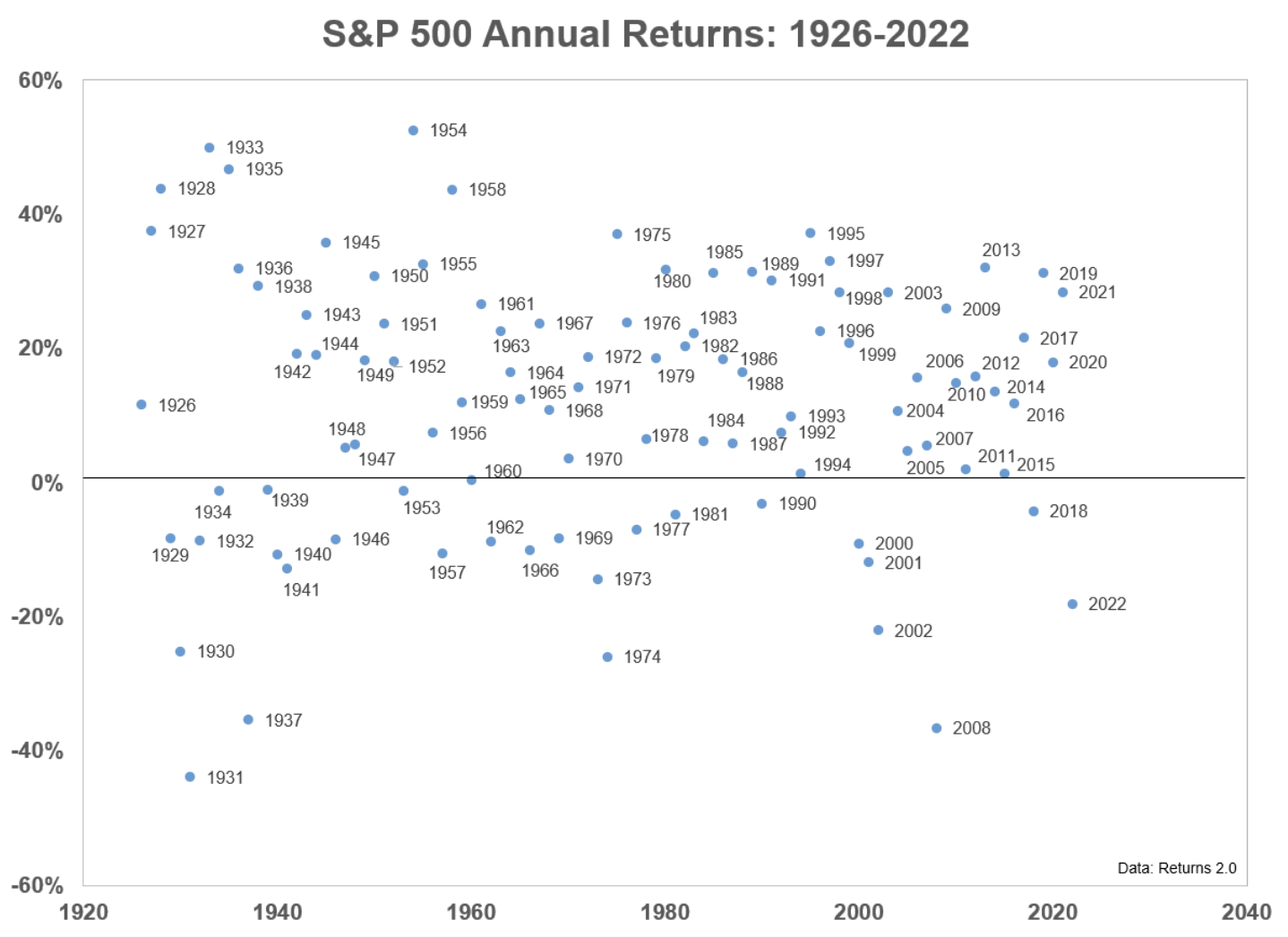
In this post, I cite research from Ben Carlson’s blog – ‘A Wealth of Common Sense‘ – using this chart:
Permabears are always betting on the lower half of the ledger.
But look at the frequency of events above the 0% line.
Yes, occasionally (like last year) we get a result which falls below 0%.
And that’s fine… we expect it.
But betting on that outcome year in year out (hence the term ‘perma’) is a losing bet.
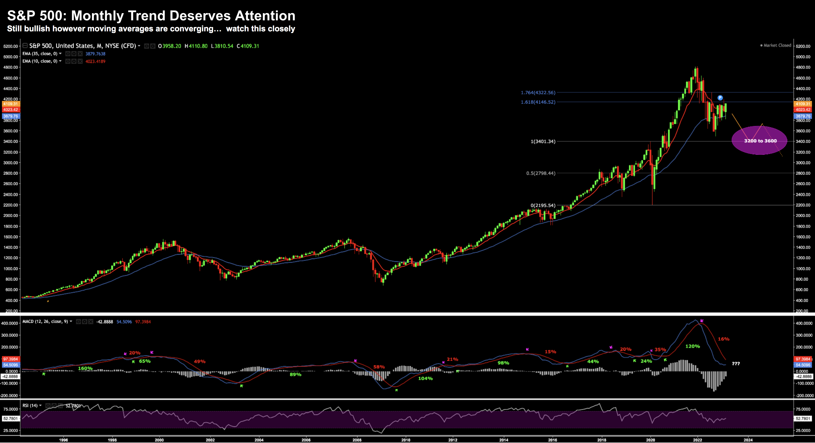
Here is what the above ‘plot’ looks like as a trend over the past 30 years.
April 1 2023
As they say, it’s “up and to the right”.
What’s more, it’s not a trend you want to be always betting against.
But many do.
If we look up close to 2023, I see why bears have a small spring in their step.
The sharp pullback from the extreme (overbought) levels of 2021 is still playing out.
And if we find the bullish trend (which began in 2010) rolls over – lower prices could be ahead.
Let me start by talking to two technical things I’m watching (using the monthly timeframe).
And then I will follow with a more fundamental (macro) observation.
1. Moving Average Trend
Regular readers will know I typically plot two exponential moving averages (EMA) to my weekly chart.
One is the 10-period EMA; and the other the 35-period.
You may choose your own parameters (eg 20, 50 and 200-period are very popular) – whatever works best for you.
The chart above uses the 10 and 35-period EMA with a monthly timeframe.
What’s interesting here is only twice in 30 years we’ve seen this trend turn bearish.
This is where the red line (10-period) falls below the blue line (35-period)
That was in 2000 and 2008.
And as we all know, the market lost around 50% (peak to trough) before regaining its feet.
At the time of writing, the 10-month EMA trades 4023 and the 35-month at 3879
That’s bullish.
However, should we find the 10-month EMA close below the 35-month – probabilities suggest lower prices.
Permabears will be salivating at this prospect (as they have done since 2008) – mark my words.
And whilst the delta between the two moving averages is closing – we are not there yet.
Needless to say – it deserves our full attention.
2. Monthly MACD
The monthly-MACD is in the middle window (the RSI in the lower window).
This is also a momentum indicator however they are not two moving average lines.
In the case, the two moving lines represent:
- The “MACD Line” (blue)
- The “Signal Line“ (red)
The MACD Line is the difference (or distance) between the 12 and 26 month exponential moving averages.
This is considered the “faster” moving average.
The Signal Line is the (smoother) 9-month moving average of the MACD Line.
This is obviously a noisier signal than our basic moving averages plotted in the price chart.
I say that because it’s issued 8 signals over the 30 years (green and pink arrows).
And one signal can remain in play for many years…
For example, in 2003 it triggered a buy which remained positive through to 2008 – good for 89% gains.
And whilst it’s noisy – its accuracy has been ‘solid’ using this timeframe.
For example, I find it less reliable for a weekly timeframe (i.e. far too whippy)
Today the MACD is yet to turn bullish.
Our signal line turned bearish in the first week of February – where the S&P 500 was trading close to 4400.
Now if I was to increase my bullish conviction – I would like to see this turn around.
We are not there yet.
(As an aside, one reason I removed exposure late 2021 was this signal)
Reasons to Temper Optimism
These are some of the things I’m weighing technically.
And technical signals are certainly helpful (for me anyway)
However, combining a technical lens with what we see fundamentally is also important.
And ideally the two line up (which is not always the case).
Now one of the errors the market could be making is investors assuming we’re going to go straight back to a period of abundant cheap liquidity (with the banking crisis mostly over)
I think that’s presumptuous.
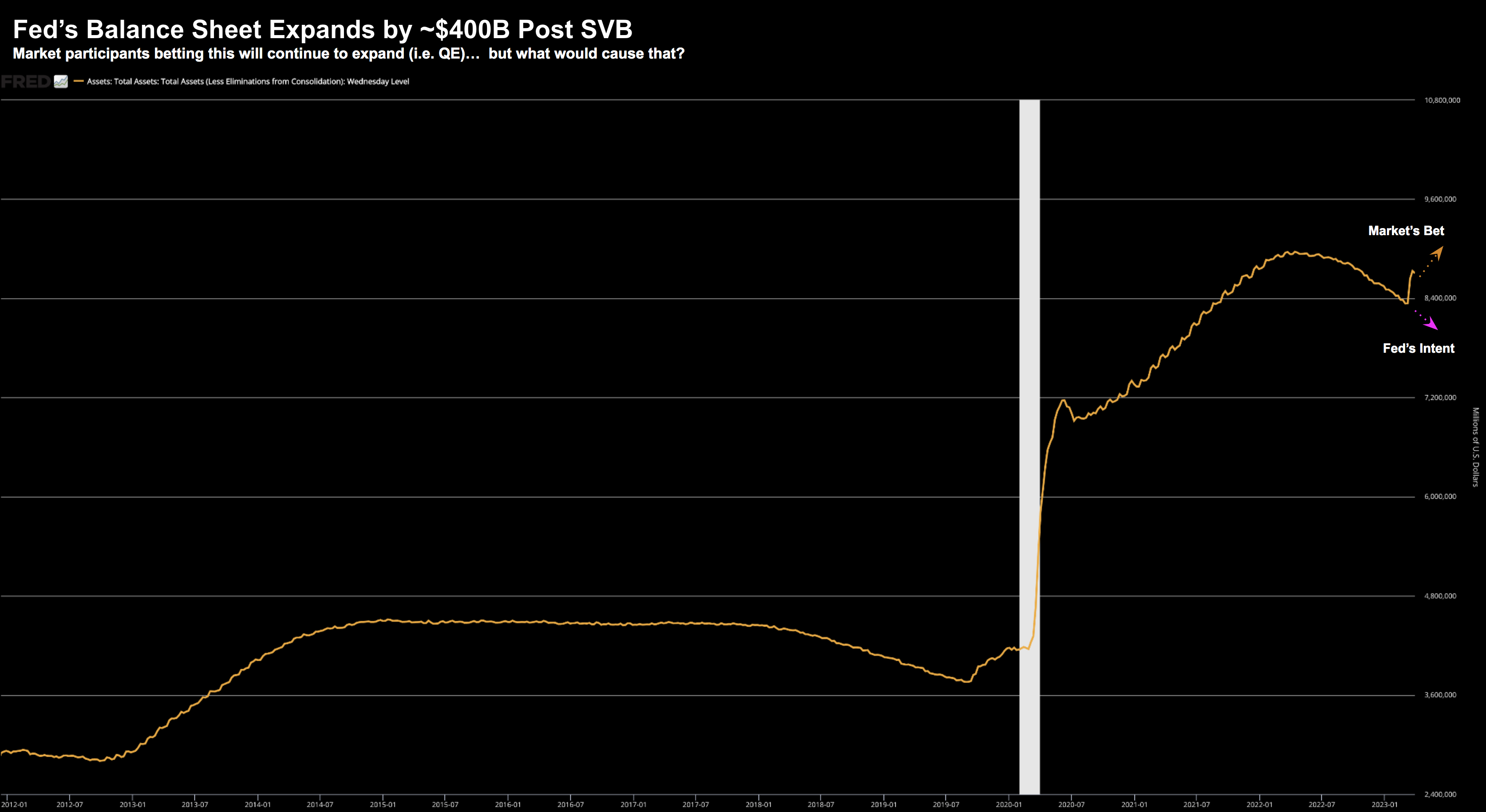
For example, based on the past three weeks’ price action, they see the Fed ramping their liquidity spigots (as they expand their balance sheet) – slashing interest rates – partly because of issues we’ve seen with banks.
Sure, we have seen the Fed inject ~$400B – ensuring banks had adequate liquidity to meet their needs:
April 1 2023
That said, ~$400B is SVB’s long duration (treasury) assets going straight onto the Fed’s balance sheet.
But is this velocity of balance sheet expansion likely to continue?
I don’t think so.
However, it’s this sentiment which has given rise to the surge in equities (especially longer duration risk assets (like tech) opposite lower rates)
As an aside, last week saw the Fed’s balance sheet decline by $28B (good news)
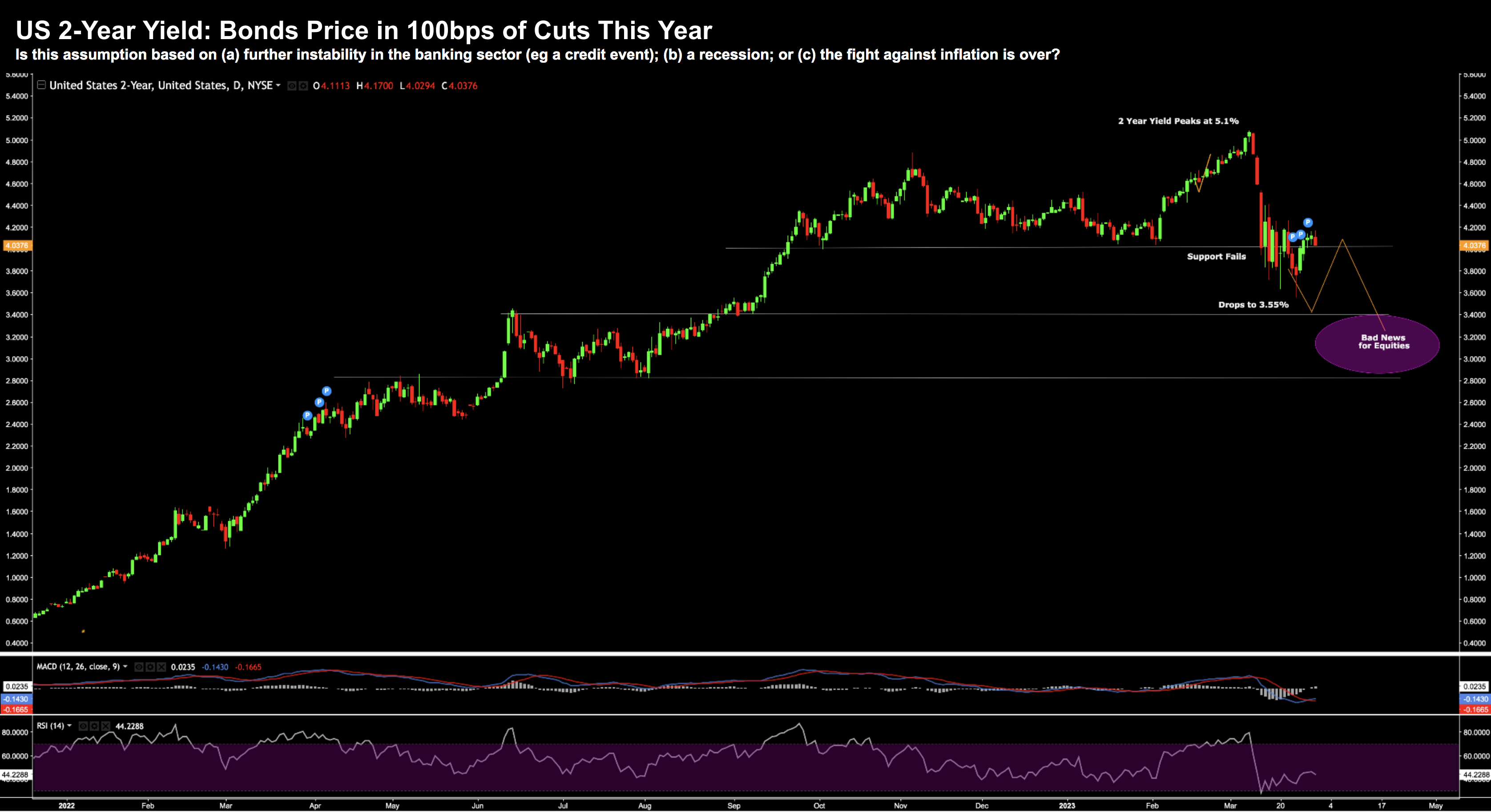
Now in terms of interest rates, the bond market pricing in the prospect of 100 bps of cuts this year:
Look no further than the plunge in 2-year yields.
April 1 2023
But as I have asked recently – what would give rise to the Fed slashing rates by 100 bps in the near-term (e.g., next 9 months)?
For example:
- A credit event / crisis of liquidity?
- A recession?; and/or
- The Fed declaring victory over inflation?
I think we can rule out the latter (more in a moment) – but are either of the first two events positive for equities?
Not from my lens.
But you would think so given the 8% rally in stocks!
With that, here are two things I’m mindful of:
1. Inflation is Still Hot
Yesterday we received the latest print on PCE inflation (the Fed’s preferred measure)
From CNBC:
An inflation gauge the Federal Reserve follows closely rose slightly less than anticipated in February, providing some hope that interest rate hikes are helping ease price increases.
The personal consumption expenditures price index excluding food and energy increased 0.3% for the month, the Commerce Department reported Friday. That was below the 0.4% Dow Jones estimate and lower than the 0.5% January increase
On a 12-month basis, core PCE increased 4.6%, a slight deceleration from the level in January
Including food and energy, headline PCE rose 0.3% monthly and 5% annually, compared with 0.6% and 5.3% in January
The market obviously “cheered the news” – as it was slightly lower than expected.
But look at the levels relative to the Fed’s goal:
Core PCE at 4.6% and Headline at 5.0%.
My immediate reaction was not “here come the rate cuts”... it was the Fed has a full green light for another 25 bps May 2nd
Core PCE is still more than 2x the Fed’s objective.
Put it this way:
Let’s say we didn’t have financial instability – would the Fed choose to pause here (let alone cut rates)?
Perhaps the one argument in the Fed’s favor is banks are now (finally) doing some of the Fed’s work by tightening credit conditions (great news against the inflation fight)
But is that enough for them to pause?
Finally, we also learned that wages rose 0.3% – above expectations.
This isn’t what the Fed want to see.
Which leads to my second concern — is the market is ahead of itself with respect to monetary policy?
2. Tighter for Longer
Things seem to be calming down in the regional banking sector.
That’s good news.
The “crisis of confidence” (as I preferred to call it) appears to be on the mend.
Sure, there will likely be more shoes to drop (First Republic comes to mind) – however deposit outflows have slowed
Again, we saw the Fed reduce its balance sheet by $28B last week.
That’s a sign of stabilization – however I will continue to monitor the Fed’s progress (and any movement of customer bank deposits)
But as I outlined, equity markets could be getting ahead of itself thinking the Fed is about to slash rates as soon as next quarter – whilst continuing to add “hundreds of billions” to its balance sheet.
Yes, $400B was added because of SVB.
But is SVB systemic or something which is quite ‘unique’?
The answer is we don’t know…
And it’s arguably still too early to answer definitively.
However, if you’re betting the Fed will be ‘forced’ to add further liquidity (a net positive for risk assets) — what would cause that?
But here’s something else:
With the S&P 500 piling on over 7% this quarter – what signal does that send to the Fed?
For example, is it the market saying “go right ahead Jay Powell – do your worst”?
If so, it takes me back to Powell’s Jackson Hole moment last year.
He basically told the market “if you are that confident in risk assets… I will continue to raise”
Granted the Fed has done a lot of the heavy lifting since then – getting the effective funds rate to 5.0%
And in theory – he doesn’t need to go too much further.
(Note: last year I said the market will ‘cry uncle’ around 5.0%)
However, with market surging, it could give the FOMC greater scope to at least hold rates at “5.0%” for longer (especially if we have Core PCE at more than 2x the Fed’s objective)
Something to bear in mind…
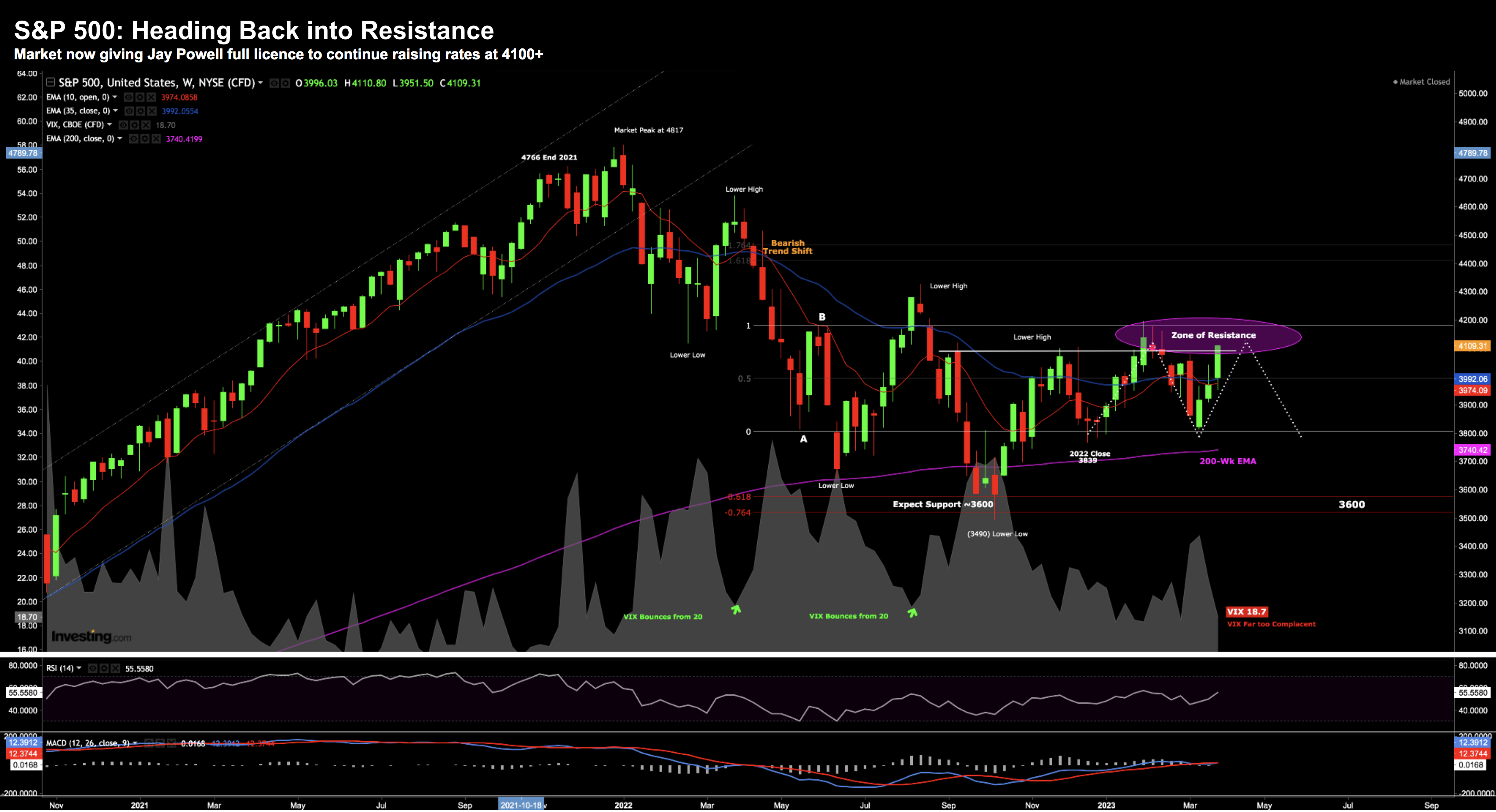
S&P 500: Zone of Resistance (4200)
April 1 2023
Here we can see the v-shaped three week resurgence.
Again, look no further than the reasons I provided above.
The market is convinced the Fed is set to slash rates whilst keeping the liquidity spigots wide open.
Good luck with that…
Technically, we find the market facing the same litmus test it did ~8 weeks ago; ie the zone of 4200
For example, if we’re to take a firmly bullish stance, the S&P 500 needs to meaningfully bust above 4200 and sustain that level.
It failed miserably last time.
Will we see something similar?
The other thing sounding caution is what we see with the VIX.
It finished the week around 18.7 – a sign of widespread complacency.
For over 12 months – whenever the VIX tested a zone below 20 – a sell off wasn’t too far away.
Now given the following unknowns:
- Earnings quality
- Inflation outlook
- Monetary policy; and
- Geopolitical tension
… should the VIX be trading with an 18 handle?
Not for me.
In closing, whilst I’m not adding to positions here, I am not selling either.
This proved to be a winning decision over the past quarter – with my own portfolio outperforming the S&P 500.
However, this is not a time to be complacent.
Putting it All Together
Net-net it was a good quarter.
I will happy take the 8.2%
However, I don’t feel good about where the market is.
My thinking is the more than market rallies – the more scope it gives the Fed to continue holding rates where they are.
What’s more it’s premature to think with Core PCE at 4.6% YoY – the Fed is thinking about either rate cuts; and/or reigniting liquidity spigots.
And if they do – it will be due to stress in the system.
Could that be coming?
Potentially.
But if it does – I don’t see how that is a net positive for equities.
Earnings season is the only thing I didn’t touch on today – however I shared my thoughts on that here.
With the market trading at a current PE above 18x… that’s not cheap.
I’m looking forward to hearing how corporate America is navigating the current climate – and specifically what measures they’re taking to maintain profit margins.
My guess is for revenue growth to slow with margin compression… but happy to be wrong.

