- Why ‘value’ names could benefit more from rate cuts
- 12 Bull Markets post 1957 vs Fed Easing Cycles; and
- Are rates ‘that’ restrictive today?
Here’s today’s exam question:
Are rates restrictive?
And if they are – how do you know?
That’s the question the Fed will address tomorrow – but it’s not easy to answer.
For example, on the one hand there’s a (large) cohort who believe the Fed are falling ‘behind the curve’ – therefore increasing the odds of a recession.
They feel that growth risks are to the downside – and do not need to wait for both inflation and employment data to confirm what’s ahead.
On the other side of the coin – there are those who think we still run the risk of higher inflation if acting too early.
For example, why rush to cut rates when we have:
- risk assets (stocks and and houses) at record highs;
- unemployment around 4.0%;
- inflation around 3.5% (we will get a read on that tomorrow); and
- wages growing in excess of 4.0% YoY?
Therefore, if rates are said to be ‘restrictive’ – it’s barely showing in the data which matters to the Fed.
Restrictive?
Tomorrow afternoon Jay Powell will provide the FOMC’s lens on the economy and monetary policy.
Now Powell has told us repeatedly that with the benchmark rate ~5.33% — the highest in over 20 years — rates are restrictive.
Given that, inflation should continue to come down over time.
But not all Fed officials are as convinced….
Dallas President Lorie Logan said recently that “… it may be that policy is just not as restrictive as we think it might have been relative to the level of interest rates before the pandemic.”
Logan has a point – especially when weighed opposite the trillions in stimulus added to the economy.
She wants all options on the table.
Irrespective of whether rates are considered restrictive or not – the (coming) Fed easing cycle matters for investors.
As I’ve explained in previous posts, if the Fed intends on easing into a stable (or improving) employment market – that’s great for stocks.
However, if it’s a case where unemployment is getting worse, stocks don’t fare well.
Why the Easing Cycle Matters
Whilst Powell will most likely lean dovish – we should expect the Fed will sit tight for the next two meetings (minimum).
I say that because the data is yet to confirm the trends they need to see with inflation and employment.
Sure there are signs of softening in the labor market (good news) – as that will result in less demand.
Less demand will see prices move lower.
But there’s more to do… with wages still rising at more than 4% year-on-year.
That said, when the Fed eventually decides to ease, it will have implications for investors.
And shortly I will demonstrate why…
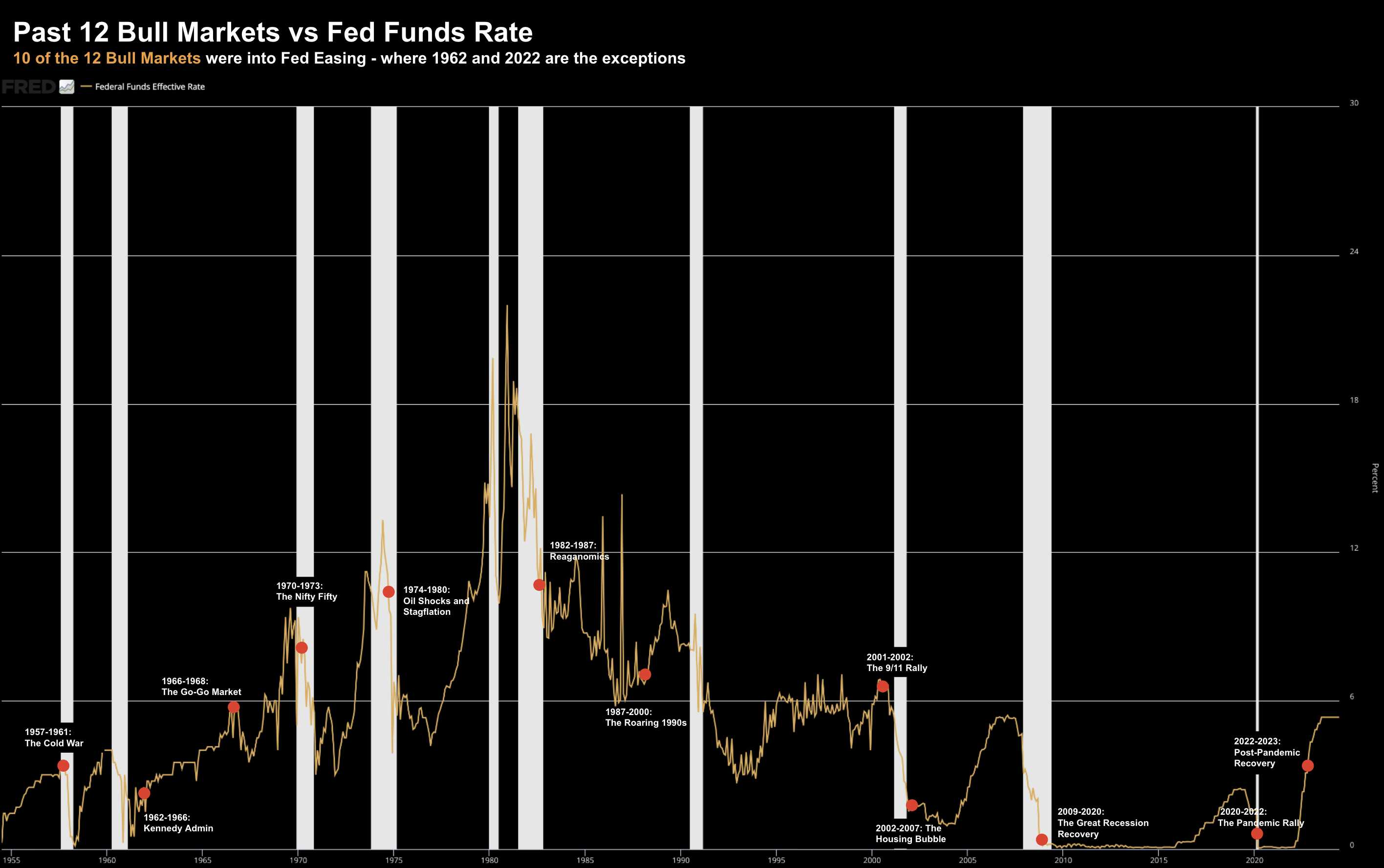
For example, based on the 12 bull markets since 1957 – most cycles benefited handsomely from Fed easing.
12 Bull Markets Since 1957
For those less familiar, a bull market is a period of time during which the stock market (e.g. the S&P 500) gains 20% or more from its last long-term low point.
Bull markets are characterized by positive investor sentiment which leads to higher prices.
The current bull market (i.e., the 12th since 195) started October 22 – which is now up ~54% (from that low)
Hat tip to the Fed and the trillions in stimulus…
But let’s take a moment to:
(a) dimension each of the 12 bulls (i.e., their duration, overall return and drawdown); and second
(b) map the timing of those bull markets to changes in monetary policy.
For example, the average bull is said to last around 55 months (or almost 5 years). The current bull is 20 months and counting.
They average upside around 160%; with the average drawdown of ~13%
Let’s summarize each:
#1. 1957-1961: The Cold War
- Length: 50 months
- S&P 500 Return: 86.4%
- Maximum Drawdown: -13.9%
#2. 1962-1966: Kennedy Administration
- Length: 44 months
- S&P 500 Return: 79.8%
- Maximum Drawdown: -10.5%
#3. 1966-1968: The Go-Go Market
- Length: 26 months
- S&P 500 Return: 48%
- Maximum Drawdown: -10.1%
#4. 1970-1973: The Nifty Fifty
- Length: 32 months
- S&P 500 Return: 73.5%
- Maximum Drawdown: -13.9%
#5. 1974-1980: Oil Shocks and Stagflation
- Length: 74 months
- S&P 500 Return: 125.6%
- Maximum Drawdown: -19.4%
#6. 1982-1987: Reaganomics
- Length: 60 months
- S&P 500 Return: 228.8%
- Maximum Drawdown: -14.4%
#7. 1987-2000: The Roaring 1990s
- Length: 147 months
- S&P 500 Return: 582%
- Maximum Drawdown: -19.9%
#8. 2001-2002: The 9/11 Rally
- Length: 3 months
- S&P 500 Return: 21.4%
- Maximum Drawdown: -4.4%
#9. 2002-2007: The Housing Bubble
- Length: 60 months
- S&P 500 Return:101.5%
- Maximum Drawdown: -14.7%
#10. 2009-2020: The Great Recession Recovery
- Length: 132 months
- S&P 500 Return: 400.5%
- Maximum Drawdown: -19.8%
#11. 2020-2022: The Pandemic Rally
- Length: 21 months
- S&P 500 Return: 114.4%
- Maximum Drawdown: -9.6%
#12. 2022 – Ongoing: Post-Pandemic Recovery
- Length: 20+ months (in process)
- S&P 500 Return: 54+% (in process)
- Maximum Drawdown: -7.8% (in process)
Let’s now add value by mapping each these 12 bull markets (red dots) against Fed monetary policy (i.e., short term rates)
In all but two instances (1962 and 2022) – the 20%+ rallies in the market have occurred into a coming easing cycle.
For example, the timing of Fed “front running” varies – ranging anywhere from 0 to 27 months before a new bull started.
However, the average lead time is approx 10 months.
Irrespective, typically the Fed acts as a major catalyst when igniting the “animal spirits”.
What’s more, in 9 of the 11 previous bull markets, the Fed continued to cut for several months after equities surged.
What curious about today’s market is we are ~20 months into a new bull market (from October 22)
That’s highly unusual.
This cycle has seen equities advance despite tightening.
But this curious development can be (partially) explained…
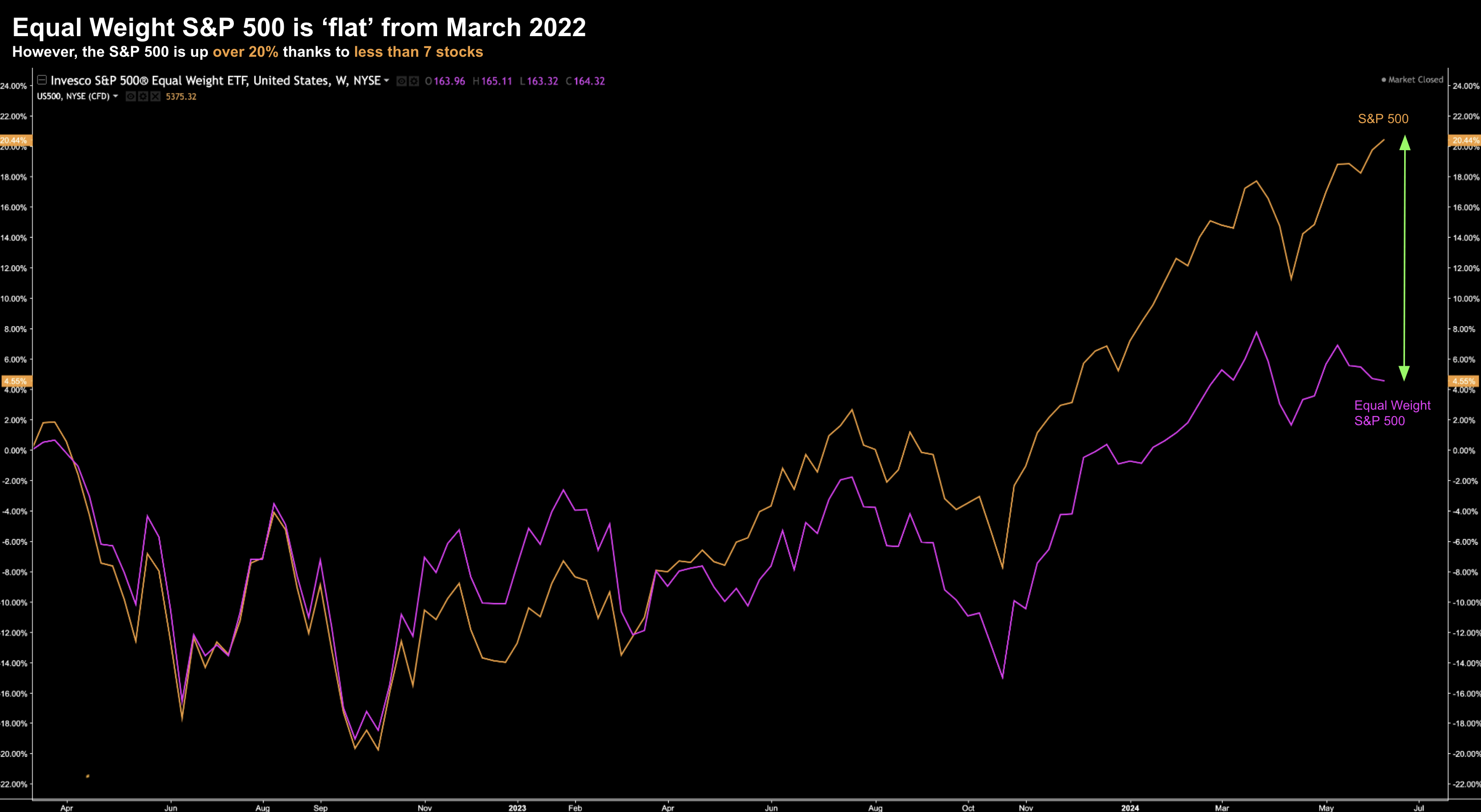
Whilst the “index” is said to have gained more than 50% from the October ’22 low point – those gains have come from less than 7 stocks.
For example, take a look at the Equal Weighted S&P 500 (purple) vs the S&P 500 (orange) from March 2022:
June 11 2024
This time last year the Top 3 stocks by market capitalization – constituted 16% of the total S&P 500.
The Top 7 stocks (also known as the “Magnificent 7“) comprised over 30%. At the time I was commenting on how concentrated the market was… saying it suffered with “bad breadth“… something we saw during the dot.com bust of 2000.
Fast forward to today and the Top 3 now make up ~20%.
This year’s gains have mostly been driven by what we see in the large-cap tech space… specifically “AI” names.
21% of the total gain in the S&P 500 year-to-date is due to Nvidia alone. This market is as narrow as I’ve seen in my 27+ years trading.
So let’s connect the dots…
If perhaps ~450+ stocks have missed the rally of the past 20 months – could rate cuts see these equity gains start to broaden?
I think so….
The stocks that have fallen ‘victim’ to higher rates may start to benefit from the easing cycle.
This doesn’t mean that large-cap tech will fall – not at all.
You should still maintain exposure to these (very high quality) names.
However, the Fed easing cycle could mean they start to underperform vs other ‘value’ sectors.
In other words, I will be looking for the Equal Weighted S&P 500 to close the large divergence we see in the chart above.
Something to think about…
Putting it All Together
The current bull is around 20 months old.
That’s not old…
The average bull since 1957 has lasted around 55 months – with the average upside in the realm of 160%
We might be only “half way” (or less) into the 12th bull since 1957?
Assuming we don’t see a recession next year (which is still a big risk) – the current run could go a lot further.
But therein lies the rub…
From mine, the most important metric to watch going forward will be unemployment.
Remember:
Should the Fed start to ease when unemployment is rising… then this will cap market gains.
However, should unemployment remain well below 4.50%, Fed cuts could see the market finally start to broaden.
And value names – which have been mostly overlooked – may start to be re-rated.


