- 216K jobs added for December – does that equal “red hot”?
- ISM Services data trending lower – specifically services employment
- Challenge your assumptions with critical thinking
People will typically choose to hear what they want to hear.
For example, they will subconsciously listen to news and/or opinions which best align with their existing beliefs.
Consider politics.
Most right-wing leaning people will typically listen to Fox News. And on the other hand, most left-leaning folks will choose CNN.
However, adopting this kind of thinking can also lead to being dismissive of facts (and/or views) which may be viewed as contrary.
That leads to blind spots / sub-optimal decision making.
Whenever I read a news story (or opinion) – I’m always mindful of at least two things:
- There will always be information (hidden or otherwise) that I don’t know; and
- The report I am reading can also have a bias.
Therefore, our job is to challenge everything we read or hear (which includes this blog!)
My opinions are simply my interpretation of the data I have read.
Not only will I not have all the information which is available – I may also suffer a bias (conscious or otherwise) when making a decision.
As a result, I am aware that any forecast I make will probably not turn out the way I expect.
And that’s more than okay.
I don’t need to be right.
Which leads me to the data we received last week on monthly US jobs and the less-anticipated ISM Services data.
The headlines immediately read “red hot labor report”
CNN’s lens on this story is the labor report was exceptionally strong.
Was it?
Monthly Jobs – Below the Surface
When I first saw the headline print of “216,000 monthly jobs” – I thought that’s perhaps ~16K higher than the market expected.
For example, last week I said the number is likely to be in the realm of “170K to 200K” (consistent with previous months – also allowing for the resolution of the UAW auto strike)
That said, I give very little weight to a headline print (whether it’s jobs, inflation, GDP etc etc)
For example, what I want to know is:
- Specifically where are the jobs are being added (e.g. public vs private sector and what sectors);
- What are people being paid per hour (and is it rising or falling – as it could mean less money in consumer’s pockets);
- Are people working longer hours (as part time work doesn’t pay a mortgage); and finally
- What’s the prevailing trend (as one month’s data doesn’t account for much)
A headline number tells us nothing about this… rendering it mostly useless.
But it won’t stop the media (or poor analysts) jumping to the conclusion that “216K jobs added” automatically means “red hot”
Note: I don’t mean to single out CNN specifically – almost all media (irrespective of their political bias) makes the same error.
First up, the number is far weaker than what the headline reads.
Let’s start with full time employment.
Since March 2023 – the economy has now lost 1.59 million full time jobs (as revisions to earlier months continue to come down)
- Nonfarm Payrolls: 1,760,000
- Employment Level: +359,000
- Full Time Employment: -1,091,000
Over 2021 – monthly jobs additions average 606K.
For 2022 – they fell to 399K per month. And so far this year – monthly job additions are around 225K.
However, what receives far less attention are the sharp revisions lower on previous months.
For example:
- The change in total nonfarm payroll employment for October was revised down by 45,000, from +150,000 to +105,000
- The change for November was revised down by 26,000, from +199,000 to +173,000.
- With these revisions, employment in October and November combined is 71,000 lower than previously reported.
This is becoming a consistent pattern of lower revisions.
Therefore, my expectation for next month is we will see December’s report revised lower by perhaps 20K to 40K jobs.
Let’s now shift to part time vs full time work.
I think this is important – as failure to gain full-time work adds more pressure to working families.
Below is a summary:
- Average weekly hours of all private employees fell 0.1 hour to 34.3 hours.
- Average weekly hours of all private service-providing employees was flat at 33.3 hours.
- Average weekly hours of manufacturers was down at 0.1 hour (with a negative revision taking away another 0.1 hour) to 39.8 hours (note: this was above 40 hours prior to the pandemic)
Now whilst a decline of a tenth of an hour (6 mins) per week does not sound high – across over 160 million workers – it removes ~$30B of potential spending power from the economy.
With respect to earnings:
- Average Hourly Earnings of All Nonfarm Workers rose $0.15 to $34.27 – a gain of 3.94%.
- Average hourly earnings of Production and Nonsupervisory Workers rose $0.10 to $29.42 – a gain of 4.3%.
For example, if we remove the 6 mins lost from weekly hours – that’s $3.42 p/wk (assuming an avg hourly wage of $34.27).
Over 1 year – that’s $177.84 per person (52 weeks x $3.42)
With ~160M Americans in the workforce – that’s ~$28.4B removed from consumer’s wallets.
Finally, we need to ask the important question of where jobs are being added.
Are they mostly in the private or public sectors?
The answer is the government sector continues to expand consistently (to the tune of 50K to 60K monthly new jobs) – however the private sector is reducing jobs (more on this later when I look at ISM services)
One of these sectors adds to tax base (helping to reduce debt) – the other consumes it.
Last month saw ~52,000 new government jobs and another 38,000 in health care-related fields such as ambulatory services and hospitals.
Outside that, part-time services such as leisure and hospitality contributed 40,000.
Construction and Retail just added just 17,000 respectively.
In summary – the headline figure of 216K jobs added feels weaker than what the headline (and media) suggests.
The ‘good news’ is jobs are not falling off a cliff (thanks to demographics).
That’s the soft-landing script.
But the decline in full time employment of 1.5 million is meaningful and is yet to make a headline.
Why not? Narrative?
From the Fed’s perspective – the monthly rise in average hourly earnings does not support the market’s hope for imminent rate cuts.
That YoY rise of 4.1% is more than 1.0% higher than what the Fed are targeting.
ISM Services Slump
Whilst the market will choose to adopt its own lens on the jobs print – the ISM services data was unequivocally weak.
For those less familiar, the ISM surveys non-manufacturing (or services) firms’ purchasing and supply executives.
The services report measures business activity for the overall economy; above 50 indicating growth, while below 50 indicating contraction.
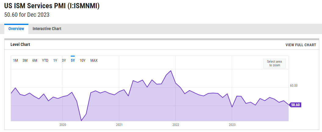
The headline services index was 50.6, well below the 52.5 expectations and last month’s 52.7
However, note the trend of the past two years:
New orders sank to 52.8, also well below the 56.1 expectation and last month’s 55.5.
Now the bulls could argue there is still expansion (as a number above 50 indicates growth)
However, the trend is lower and weakening.
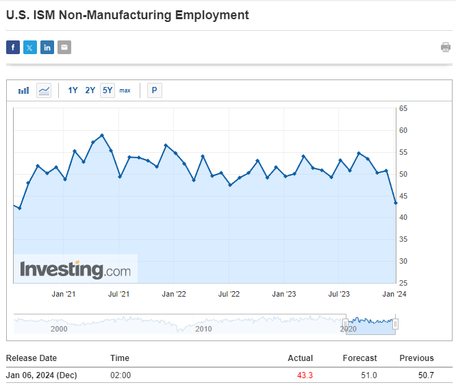
But the real surprise was the ISM Services Employment reading.
And this echoes my point about fundamental weakness in the (private) market:
As the chart shows – that came out at a stunning 43.3
The market was looking for 51.0 (i.e., jobs added in services).
This is a massive miss.
Here’s the thing:
The 90,000 jobs added in the government sector and health-related industry masks this weakness.
However, the bond market (less so equities) were quick to connect the dots.
For example, yields on US 10-year moved back below 4.0% on the ISM Services Employment data – as rate cut expectations increased on this news.
What’s Your Lens
When evaluating data like ’employment’ or ‘ISM’ – it’s important to look below the surface.
We try to remove any biases we have coming into the print – looking for data which may contradict (or validate) any existing hypotheses.
For example, my existing thesis (which I’m not wedded to) is the Fed are likely to cut rates perhaps up to three times this year.
My assumption is wage growth will remain sticky (well above the Fed’s target of 3.0%) – and core inflation will remain persistent (however below 3.0%)
However, both of those assumptions could prove false.
But that’s not the market’s expectation.
The stock market is pricing in the possibility of five to six cuts by December (according to the CME Fed Watch Tool)
For December 2024, the market sees a 34% probability of the Fed funds rate trading between 3.75% to 4.00% (vs 5.25% to 5.50% today)
Therefore, my question is what is the state (or health) of the economy should the Fed funds rate fall 150 basis points?
I doubt it will be expanding.
And from there – if we assume it’s not expanding (or at best mostly flat) – what will that do to corporate earnings?
Are earnings for the S&P 500 likely to grow 12% per year (as the market assumes) if we fail to see strong economic expansion?
These are some (not all) of the questions I’m asking.
Putting it All Together
Your interpretation of the job market (and ISM Services) will likely differ to mine.
For example, I see underlying weakness in the labor market which gives rise to the recession argument.
That’s not what markets are pricing in.
If that’s true – it could increase the chances of more rate cuts (not less)
For example, perhaps my thinking should be updated from three rate cuts to four?
I don’t know.
I say that because that also assumes the Fed are pivoting from targeting unwanted inflation (e.g., where wage growth is 4.1% YoY; and core inflation remains well above their target) and are focused more on the business cycle (which is clearly slowing).
But can I make that assumption?
Put together, there remains a large amount of uncertainty.
Where there are unknowns – there is always uncertainty.
Therefore, it would be unwise to make definitive decisions (or forecasts) like the ‘hedgehog’.
Instead, we think more like a fox and revise our probabilities. This makes for more accurate decisions (and fewer mistakes)
From here, all eyes now turn to this week’s CPI and PPI reports.


